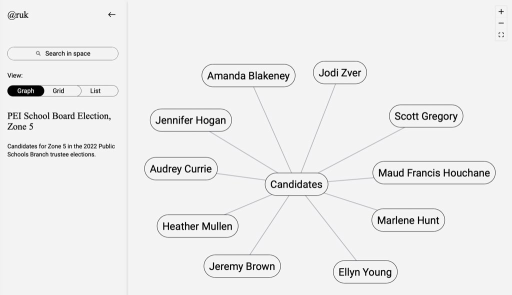
By way of trying out Sane, I pulled some information from the PEI Home and School Federation candidate profiles for the Public School Branch trustee elections and put it in a graph.
It was a helpful exercise: not only did I learn a lot about the candidates—there are some estimable people standing for trustee—but I got a chance to get frustrated by, and excited about, Sane. I’ve signed up for a product walk-through tomorrow with an eye to expressing both.

 I am
I am
Comments
I find the "grid" view of
I find the "grid" view of that page to be more useful, because it shows the tags you've given to the candidates, and that appears to be the most useful glanceable data you have. The graph itself doesn't seem to add much value.
When I’m logged in and
When I’m logged in and editing the “Thought Space” in Sane, there’s an option to “Filter by tags” that isn’t available, for some reason, in the publicly-shared view; this makes the “Graph” view of some utility.
Reading it as a headline:
Reading it as a headline: “Zone 5 PSB Candidates Insane.”
We’ll, maybe a couple. Don’t know them. But there’s an opportunity to vote for a diverse board, what with immigrants, women, tradespeople, retired people, and some sincere-seeming usual education mavens. God bless them all for having the gumption to run!
Curious to hear more about
Curious to hear more about your experience with Sane. Is it a walled off garden, or is integration with other tools in the workflow possible/encouraged? Sane is on my list of things to explore, but haven't yet.
I had a good product walk
I had a good product walk-through and discussion with one of the co-founders this morning, and would encourage you to do the same.
Add new comment