
Last year I had the pleasure, along with Jenni Zelin, Rob Lantz and Laura MacPherson, of judging applications to the City of Charlottetown’s Community Microgrants program. After a long process of deliberation, we awarded grants to “Tulips for your Thoughts” (a project to plant tulips along Upper Prince Street; tulips that are about to spring into bloom any minute now), an after-school theatre program at the Murphy Centre, and a project to transform the section of Richmond Street from Pownal to Queen into a “sustainable streetscape.”
The streetscape project was supposed to happen last fall, but the weather intervened, and now it’s scheduled to happen from May 11 to 19, 2012.
I’d been thinking about this project over the winter — newly resident as we are overlooking Richmond Street — and about a month ago I had a sudden vision of a poster to promote the project — a black RICHMOND ST on top with a green RICHMOND ST below — and so in the time-honoured tradition of unauthorized advertising, I’ve been crafting this together for the past couple of weeks. Here’s the result:
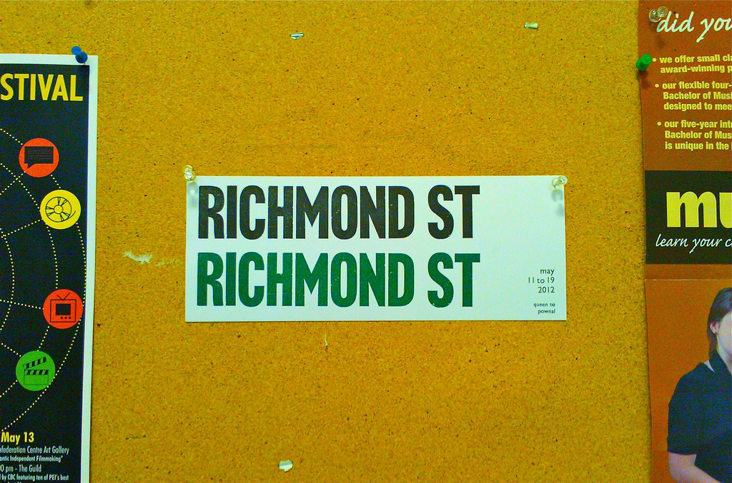
I dipped into the Holland College font of Akzidenz Grotesk for the large RICHMOND ST, and used M&H-cast Gill Sans in 18 pt. and 12 pt. for the date and location. Kwik Kopy in Charlottetown generously donated a Tim Hortons coffee cup of green ink. The paper is inexpensive white 110 lb. card stock from Staples.
Two recent arrivals to the print shop aided significantly in the printing of the posters, both ordered a few weeks ago from NA Graphics in Colorado.
First, a set of three Kort Adjustable Quad Guides. These aren’t cheap — about $10 each — but they are the Cadillac of gauge pins, and once I learned how to insert them into the tympan — there are handy instructions included that need to be followed carefully — I was left with a fantastic immovable paper-holding force:
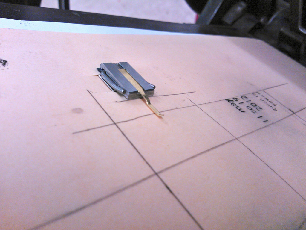
It’s hard to overstate what an aid to printing this is: in my early makeready experiments last week, using some aging and partially smashed spring tongue gauge pins to hold the paper in place, I lost as many copies of the poster to the inside of the press (falling off the pins from the sticky force of the inked type pulling off). With the new pins in place I didn’t lose a single one.
The other item from NA Graphics was a 100-sheet package of tympan — oiled paper that’s sits as the top layer of the “packing” that sits under the paper to be printed. It has the benefit of being stiff (which is great for inserted the gauge pins), sturdy (so it doesn’t easily rip) and its oily coating means that you can print a guide print on it, then wipe of the excess ink and not end up with ink on the underside of what you’re printing:
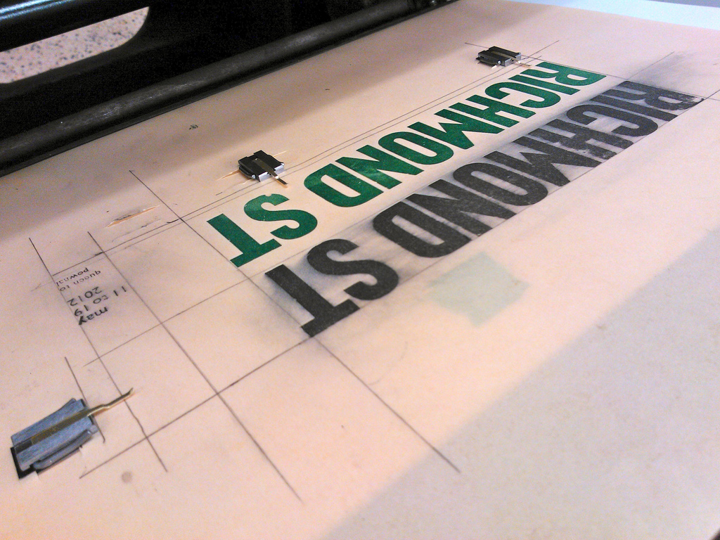
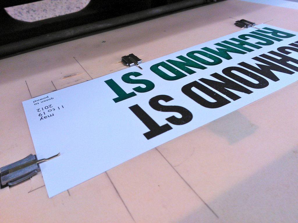
Other than an unfortunate tongue-clash incident (the brass tongue of one of the gauge pins was aligned so as to crash into the “S” in “ST”), quickly solved by some adjustments, the printing went well. I discovered that if I wear disposable latex gloves while printing it’s a lot easier to grip the paper, both from the table to the press and off the press to the table. Once I was set up and in a rhythm I was cranking out 10-15 impressions a minute.
I printed the black ink first, then the green (I’d laid out the type to facilitate simply popping out the date and location and sliding the “RICHMOND ST” down into position for the green).
Watch for the posters on a telephone pole or shop window near you. And do come out to participate in the event starting a week from tonight on May 11, 2012.
About This Blog
 I am Peter Rukavina and this is my blog. I am a writer, letterpress printer, and a curious person.
To learn more about me, read my /now, look at my bio, listen to audio I’ve posted, read presentations and speeches I’ve written, see things I’ve favourited elsewhere, or get in touch (peter@rukavina.net is the quickest way).
I have been writing here since May 1999: you can explore the 25+ years of blog posts in the archive.
![]() You can subscribe to an RSS feed of posts, an RSS feed of comments, an RSS feed of favourites elsewhere, or a podcast RSS feed that just contains audio posts. You can also receive a daily digests of posts by email. I also publish an OPML blogroll.
You can subscribe to an RSS feed of posts, an RSS feed of comments, an RSS feed of favourites elsewhere, or a podcast RSS feed that just contains audio posts. You can also receive a daily digests of posts by email. I also publish an OPML blogroll.
Instagram • YouTube • Vimeo • ORCID • OpenStreetMap • Internet Archive • PEI.art • Drupal • Github.
Comments
Nice work Peter. Great font.
Nice work Peter. Great font. Looking forward to seeing our posters posted.
Your posters
Your posters
10 years!
10 years!
Add new comment