Early last week I had a request from Abby Hyndman, daughter of my friends Nicky and Dave: she’s a student in the Holland College videography program, and wondered if I’d entertain being the subject of a short documentary about letterpress printing, her final course assignment. I happily agreed, and met Abby and her trusty assistant in the letterpress shop last Thursday afternoon for a few hours.
I needed something to print.
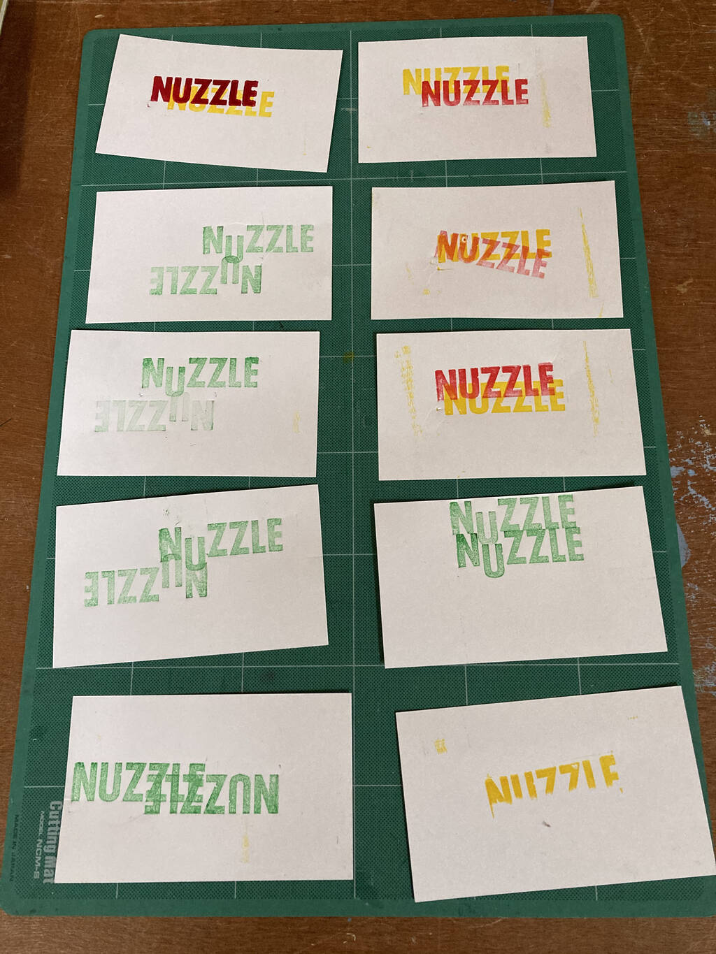
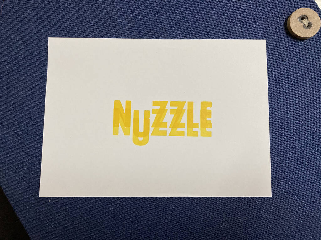
I’d been thinking a lot about the word “nuzzle” of late, and so it became my subject: I wanted to see if I could represent, in cold hard type, a sense of “nuzzlieness.”
I started off on the bench with various ink colours and improvised: red-over-yellow, yellow-over-red, upside down over rightsize up, backward and forward. Midway through my improv I tweaked things to dip the U below the baseline, thinking, perhaps, it could act as a sort of nuzzled-nose.

Once Abby was in the shop, the improvisation continued, and where I ended up was rather magical in the way that sometimes happens when you don’t plan and just let the type dance:

Abby documented the process, and so you can watch a slice of the making of the Nuzzle in the video she sent along today, kindly giving me permission to share:
If you’d like to hire Abby for her video or graphic design talents, you can find her here.
 I am
I am
Comments
That was very enjoyable to
That was very enjoyable to watch.
That’s so cool, thanks for
That’s so cool, thanks for sharing. It took such effort and skill to something that these days, like so many other tasks, is just a quick click of a button.
Love this on so many levels .
Love this on so many levels ... including the word nuzzle and what you did with it, Peter!
That was fascinating - loved
That was fascinating - loved it. And you certainly accomplished that sense of "nuzzlieness" (such a great word).
Add new comment