
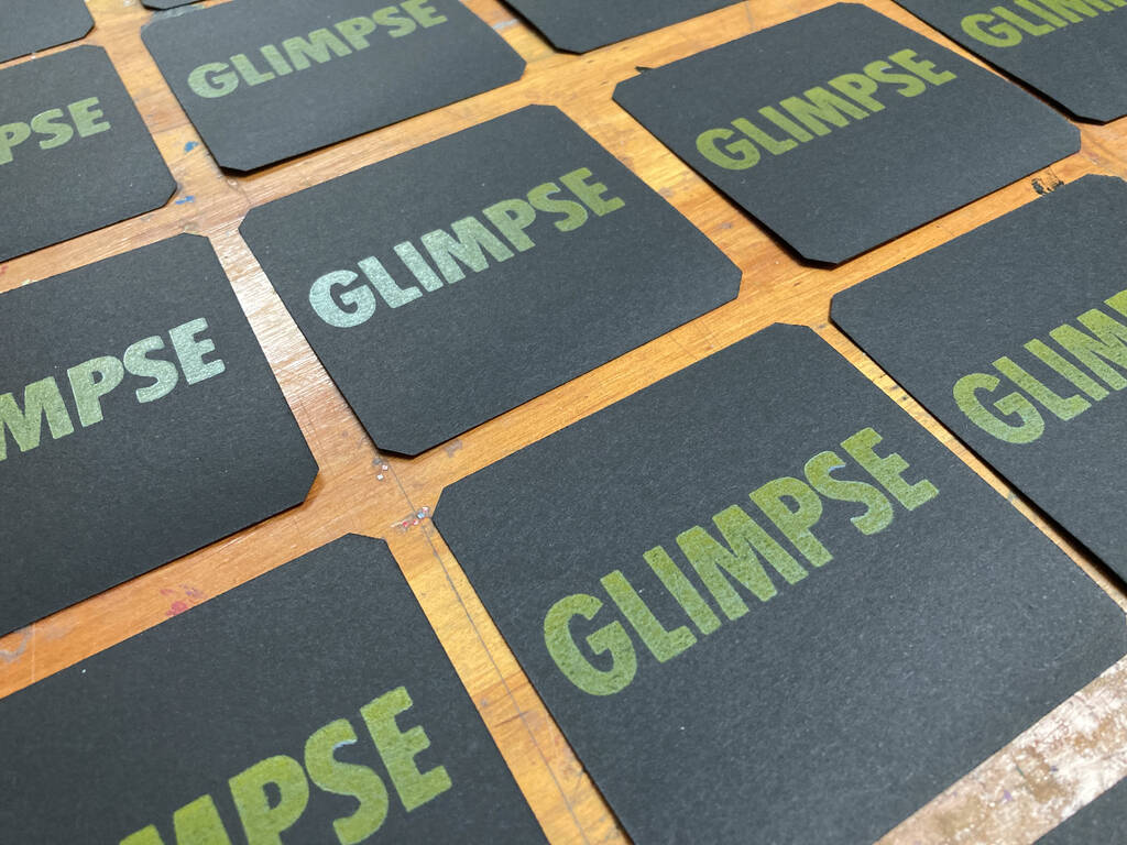
My experiment printing light-on-dark with my Golding Jobber № 8 letterpress finished up last week, and I’ve given the cards that resulted a couple of extra days to dry; they are now available for sale in the Queen Square Press shop.
Letterpress ink is generally quite transparent, and so simply printing yellow-on-black was going to result in something too faint for my tastes; I attempted to address this by printing first with opaque white ink, letting the cards dry, and then overprinting with yellow. The result is very interesting: the GLIMPSE looks different from different angles, something you can see quite clearly in the photo here. Sometimes it’s very yellow, sometimes it’s reflective to the point of looking silver.
All the various glimpses seem appropriate, given that my idea was to capture the zeitgeist, the tentative peek at the end of the pandemic.
About This Blog
 I am Peter Rukavina and this is my blog. I am a writer, letterpress printer, and a curious person.
To learn more about me, read my /now, look at my bio, listen to audio I’ve posted, read presentations and speeches I’ve written, see things I’ve favourited elsewhere, or get in touch (peter@rukavina.net is the quickest way).
I have been writing here since May 1999: you can explore the 25+ years of blog posts in the archive.
![]() You can subscribe to an RSS feed of posts, an RSS feed of comments, an RSS feed of favourites elsewhere, or a podcast RSS feed that just contains audio posts. You can also receive a daily digests of posts by email. I also publish an OPML blogroll.
You can subscribe to an RSS feed of posts, an RSS feed of comments, an RSS feed of favourites elsewhere, or a podcast RSS feed that just contains audio posts. You can also receive a daily digests of posts by email. I also publish an OPML blogroll.
Instagram • YouTube • Vimeo • ORCID • OpenStreetMap • Internet Archive • PEI.art • Drupal • Github.
Comments
This is gorgeous, Peter--love
This is gorgeous, Peter--love the GLIMPSE sentiment and the color contrast, esp how the word changes color based on the light. I'm really into high light-reflective colors. My favorite color is a silver-sage which can go from dark grey to a white-herb depending on light. Also, like those indigo blue-purples.
Add new comment