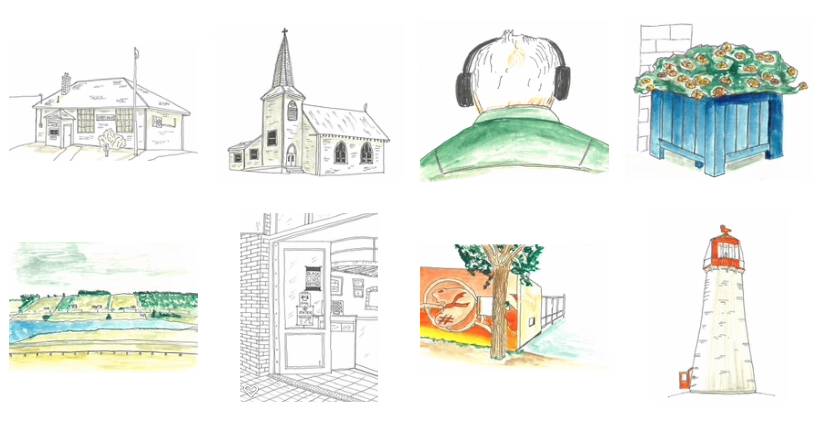
Scrolling through the updated Photos app on my newly-updated-to-Catalina Mac, I came across thumbnails of the sketches I’d posted here earlier. They have a completely different quality once shrunk down like this, and you can almost imagine them being panels in a wordless comic that involves Rob MacDonald, Cherry Valley and the East Point lighthouse.

 I am
I am
Comments
I think this must be innate,
I think this must be innate, that pictures and objects become more potent somehow when we shrink them—at least when they are recognizable things.
Add new comment