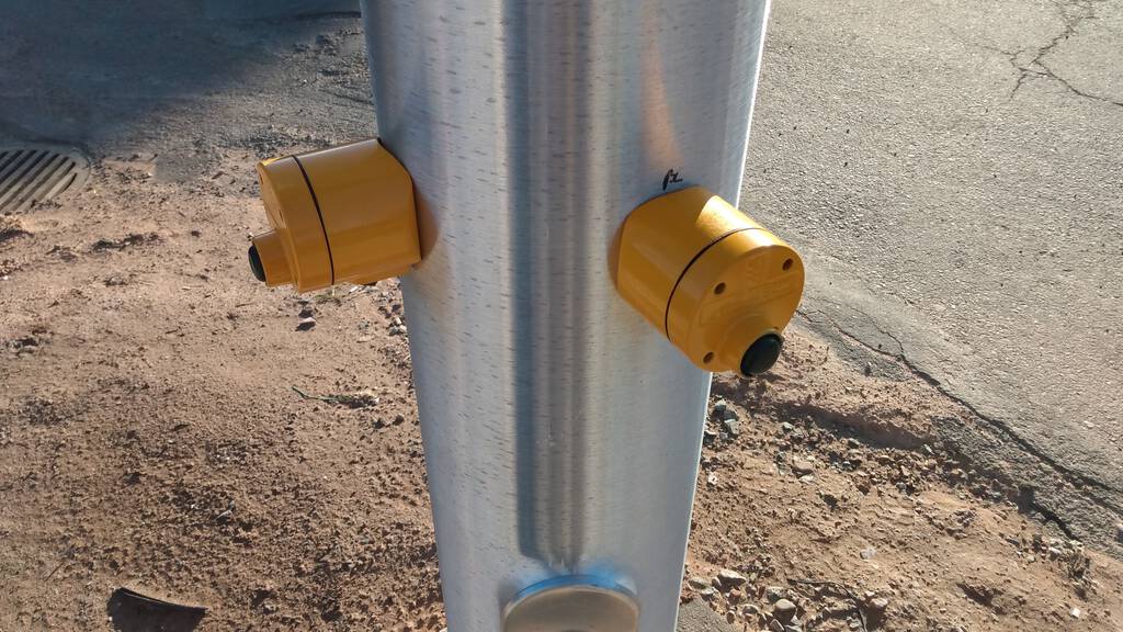
The City of Charlottetown is in the final stages of rebuilding the traffic signalling at two downtown intersections, Kent & Great George and Kent & Prince. The new infrastructure at both intersections includes pedestrian call buttons, and these are of the “jam your finger into a rubber nobbly bit to activate a button underneath” type that look like this:

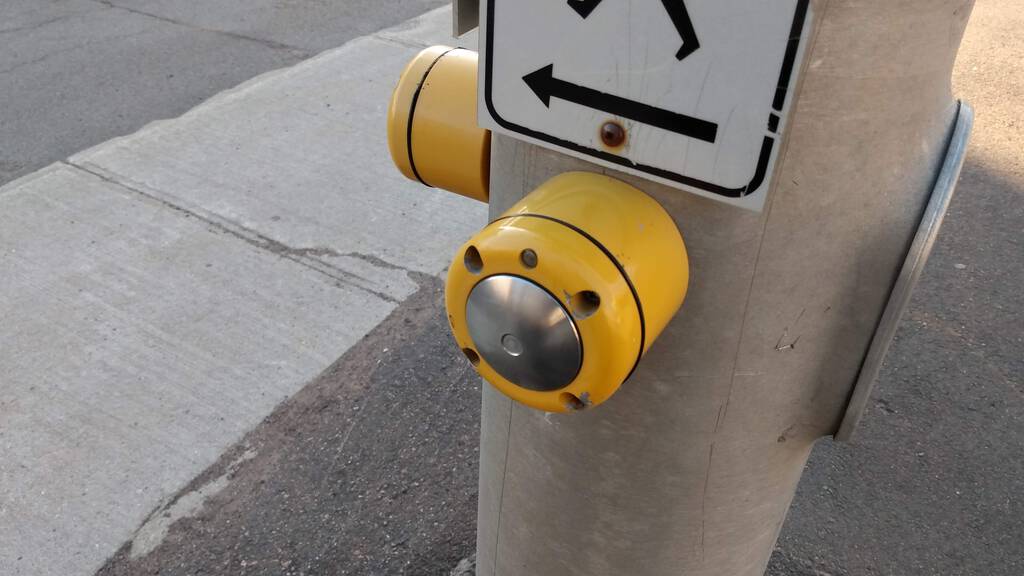
At other intersections in the city, rebuilt earlier, there’s a different kind of pedestrian call button, a large silver disk. The advantage of this type over the newer ones is that you don’t need to jam your finger into anything and, indeed, you can press the button with your wrist, your arm, your hip, your cane, or anything else. So you don’t actually need to touch anything directly:

While I like the fact that I don’t need to touch this kind of button, it also doesn’t have a lot of “travel,” meaning that most of the time I’m not 100% I’ve actually activated it: although in most cases there is an LED and and sound to provide feedback, I often remain unsure of whether my press has “taken.”
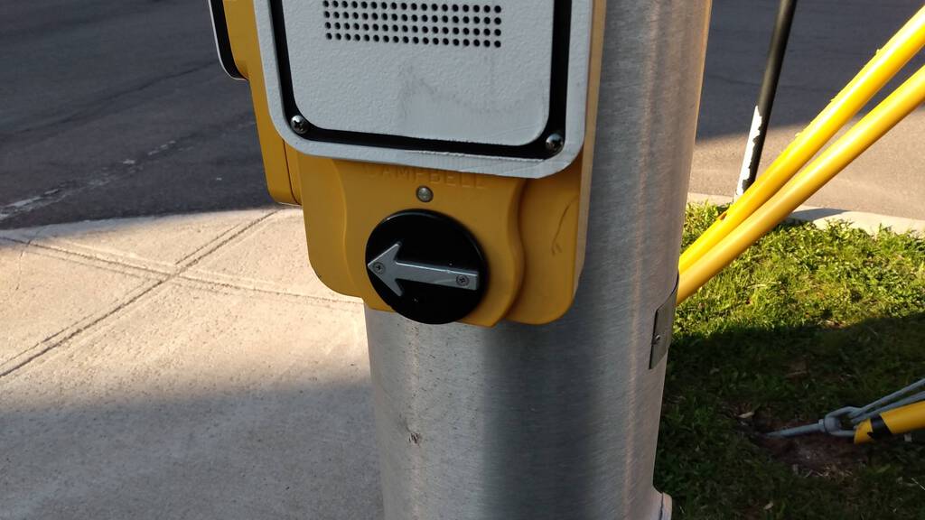
There’s a rarer third type of call button, the Guardian APS, installed at the corner of Prince and Euston when it was rebuilt some years ago. Confoundingly, these call buttons were disabled shortly after installation and have remained installed but non-functional in all the years since. While this model of button has laudable accessibility features, including audio and haptic feedback, and a design that reinforces, visually and by touch, the direction the signal activates, like the rubber-nobbly signals, they also require contact, and cannot be activated without it.

Which are the right buttons for the pandemic? Which are the right ones for accessibility? Is there a model that works for both?
 I am
I am
Comments
The best answer is, of course
IMO, the best answer is none of the above.
Next time a highway planner suggests an intersection with "pedestrian call buttons" (the term "beg buttons" doesn't appear to be popular with politicians for whatever reason) for both directions as shown in the first photo, ask them why it's needed for both directions.
If an intersection has equal traffic on both streets, surely the buttons aren't needed as you can just have the cycle repeat automatically. They might tell you that it's needed to keep the crossing signal on for long enough for humans to cross, but again, if an intersection has equal traffic, lengthening green time for both directions wouldn't result in a capacity difference.
If an intersection has less traffic on one of the streets, surely the purpose of buttons and sensors would be to keep the bigger road open and only green-light the lesser road when requested or sensed. But then why need a button for the bigger road?
(Toronto has switched the chirpy accessibility sound signal to only sound when activated by button, and in that case you might want push buttons for all directions. But the buttons in the first picture don't seem very easy to press to activate the sound. Toronto's look like this: https://spacing.ca/toronto/2018/12/20/reid-pedestrian-buttons-2-the-rise-of-the-audible-signal/, I personally find them okay to activate with elbow.)
I wish that walk signals
I wish that walk signals would simply light up automatically. I'm tired of having to figure out how each intersection works and having the onus placed on the pedestrian to navigate things safely.
It seems like the move in
It seems like the move in Halifax is to get rid of these "beg buttons" and to have the pedestrian signal start automatically ~5 or so seconds before the traffic signal turns green. It really resets the pedestrian/vehicle relationship.
Perhaps Charlottetown should just get rid of them?
The big buttoned ones don’t
The big buttoned ones don’t need a finger or skin. You can just lean into them with a hip or elbow.
Add new comment