
It seemed like such a simple job: six sheets of paper, 790 words, 4,695 letters and spaces.
Brenda Whiteway approached me in February to see if I’d be able and willing to typeset and print passages of text for her Confederation Country Cabinet. She’d found me via the man who provides us both with paper – hers for the brush, mine for the press – David Carruthers at Papeterie Saint-Armand in Montreal. Odd that it took David to connect us, as we live only a few miles apart and know many of the same people.
“Six sheets: how hard could that be,” I told myself.
There was funding to buy some new type, and the paper. The passages Brenda had selected were interesting: Jack Layton, Frank Ledwell, Emily Carr, and more.
And Brenda’s larger project, a cabinet of curiousities, tickled me in all the right places.
How could I not.
What I discounted, of course, is that despite my best efforts to cultivate post-apocalyptic neo-luddite letterpress street cred, I am but a babe in the woods when it comes to the printing office: I know the broad strokes, I can print a decent coffee bag.
But lines and lines of poetry and prose, printed evenly, accurately, and by the beginning of May?
Well, that was interesting.
Today, almost 45 days after the first tentative deadline, the final piece – a reprint of a Frank Ledwell poem, reprinted because I’d bungled the citation on an earlier printing – rolled off the press.
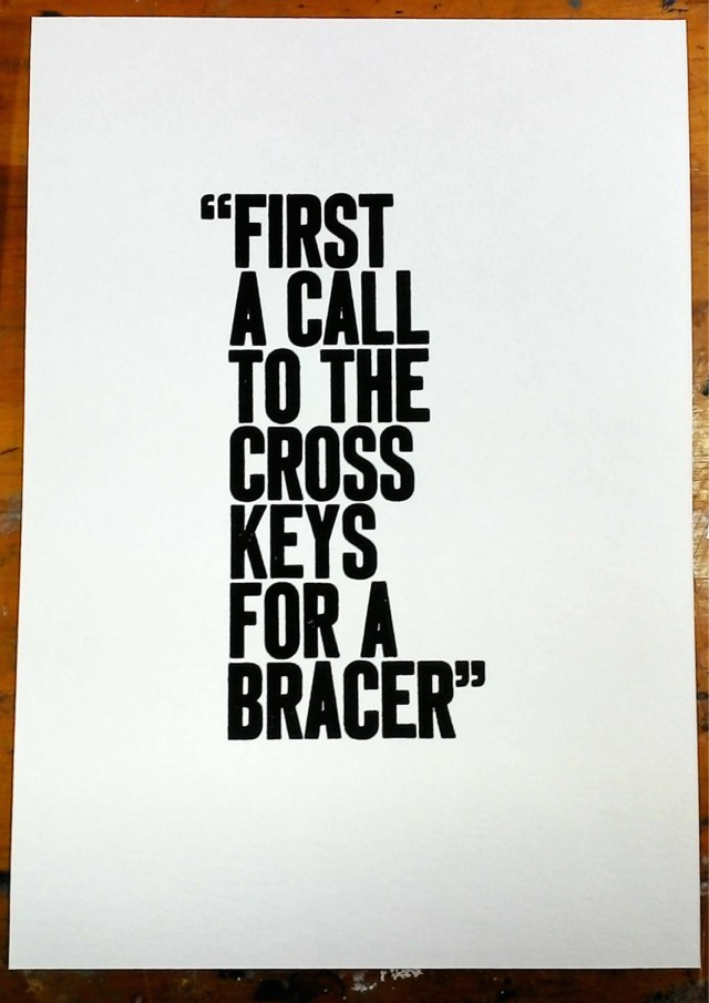
To commemorate the end I left the ink on the press and set up a celebratory piece, taking the big bold and familiar Akzidenz Grotesk out and honouring my favourite line of all those I set, from that selfsame Frank Ledwell poem, “Charlottetown Conference”:
Along the way I learned so many things.
I learned, when starting off on a new print job, to leave the chase off the press while the rollers are being inked: that way the type doesn’t get over-saturated with ink, printing is much cleaner, and the cleanup afterwards goes more easily. Unfortunately I learned this – from “General Printing: An Illustrated Guide to Letterpress Printing with Hundreds of Step-by-Step Photos” – halfway through the project, and so suffered through three jobs worth of gloopy over-inked type, something that will be polluting my type cases for years to come.
I learned – after almost 3 years – how to adjust the platen of my Golding Jobber № 8. I should have learned this a long, long time ago, but I’d been afraid that, given that it’s 99 years old, if I removed a bolt here, adjusted a thumb-screw there, the entire thing might come tumbling apart. It didn’t, and the last two jobs in the project went so much quicker because of the simple adjustments I made.
I learned that my old friend Fred Louder – we’ve know each other for almost 20 years, but have probably spent less than 2 hours in the same room – is a fount of printing knowledge, which he dispensed liberally over Facebook chat in recent weeks at times I really, really needed it. Sometimes just explaining the problem at hand to Fred led me to an answer before he replied; more often, though, his counsel proved invaluable.
I learned how to take my “makeready” – the fine-tuning process, once the type is set and on the press, but before printing can start in earnest – to the next level, employing bits of tissue paper (especially cigarette paper, which is cheap, readily available, and comes with its own adhesive; thanks, Fred). There’s years more of learning to go, but at least I know the general terrain now.
I finally, years after meeting him, got to order newly-cast type from Ed at Swamp Press in Northfield, Massachusetts, the 14 point Bodoni that I used for the body of the pieces. Figuring out how to order type had its own learning curve and language; Ed made it easy, and I’m ready for the next time.
I got to have another lovely conversation with David at Saint Armand about his paper, and ordered and quickly received a ream (give or take) of their Canal paper, which proved a joy to print on.
I learned how entering a Zen-like state aids in the sorting of type after a job is complete: if my hands didn’t know the California job case layout before this project, they certainly do now, and the challenge when sorting type back into the case is to switch my brain to an idle state so that it doesn’t interfere with what my hands can do on their own.
I learned that, at 48 years old, I had to carefully budget my time for setting and printing because it really only works when I’m well-rested, well-fed and in a good mood. Staying too late in the evening, as I did a few times, results in frustration, spilled ink and, had I unwisely stayed any longer, accidents. Pushing through without taking breaks results in errors (see aforementioned Frank Ledwell 2.0). Slow and steady. Deliberate. Careful. That’s what works. Keeping the workspace clean – which I haven’t mastered – helps too.
I learned that setting an author’s work allows me to experience it in a way completely unlike simply reading it on the page.
“Its freshness for a hundred leagues to ocean’s briny wave”
“Water was not wet nor deep, just smoothness spread with light.”
“Canada is the scent of pines.”
“Our Hero keeps a precise record of how much he drinks, to the beer.”
“Optimism is better than despair.”
All those lines mean so much more when you’ve plucked each letter from its spot in the case, manipulated it into place in the composing stick, gently transferred it to the chase, locked it into place, whispering each line a hundred times by the times it’s all done, both to double-check and to aid in the process of returning it all to the case.
I learned that Brenda Whiteway is a patient, creative, witty taskmaster, the ideal client for my first big printing job. She took each delay with good humour, and wrote very nice things about me to boot.
And so here’s what I ended up with:
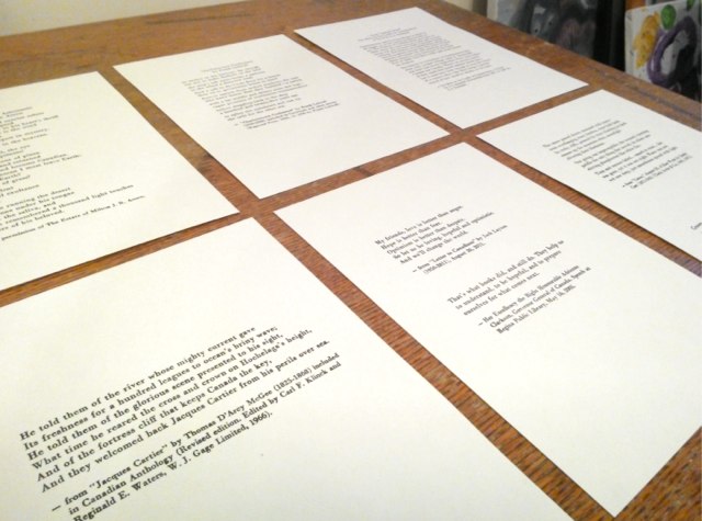
I came nowhere near perfection: the inking on the Jack Layton & Adrienne Clarkson piece is little inconsistent, the Milton Acorn inking is consistent, but with a too much ink, so that it’s bordering on looking like Bodoni bold, the “Frank Ledwell” in the citation for his poem is stands out a little too much, and the “m” in “poems” has a tiny nick in it.
But therein is another lesson to be learned: while my day-to-day life as a digital worker has a comfortable binary precision to it, and the possibility of endless iteration toward perfection, once the job is printed, the type sorted and the piece completed, well, that’s it.
There’s nothing more that I can do.
And so, for the next 50 years I’ll be walking by Brenda’s Confederation Country Cabinet in its home in the Coles Building and seeing that “a” is a little out of place, or wishing I’d staying in the shop an extra half hour that night to make the Emily Carr piece just that little bit cleaner.
Or I can, perhaps, just be satisfied that I worked hard, did the best job I could, learned a tremendous amount in a short space of time, made some new friends and cemented some others, lost some sleep, had some moments of pure printing bliss, and rest easy that in all that is where the craft lies.
Now, off to the Cross Keys for a bracer. Lord knows I need one.
About This Blog
 I am Peter Rukavina and this is my blog. I am a writer, letterpress printer, and a curious person.
To learn more about me, read my /now, look at my bio, listen to audio I’ve posted, read presentations and speeches I’ve written, see things I’ve favourited elsewhere, or get in touch (peter@rukavina.net is the quickest way).
I have been writing here since May 1999: you can explore the 25+ years of blog posts in the archive.
![]() You can subscribe to an RSS feed of posts, an RSS feed of comments, an RSS feed of favourites elsewhere, or a podcast RSS feed that just contains audio posts. You can also receive a daily digests of posts by email. I also publish an OPML blogroll.
You can subscribe to an RSS feed of posts, an RSS feed of comments, an RSS feed of favourites elsewhere, or a podcast RSS feed that just contains audio posts. You can also receive a daily digests of posts by email. I also publish an OPML blogroll.
Instagram • YouTube • Vimeo • ORCID • OpenStreetMap • Internet Archive • PEI.art • Drupal • Github.
Comments
No disservice meant toward
No disservice meant toward your printing prowess at all, but wouldn't that Frank Ledwell excerpt make an exceptional T-shirt? I just love that line so much....
PS. I enjoyed the article.
Add new comment