In the shower stall of my room at the Jack Daniels Motor Inn is a dispenser of shower gel, conditioner and shampoo. In principle this is a good idea: it keeps tiny bottles out of the landfill, it means I never run out of supplies, and it’s a lot easier to manage when showering.
Here’s what this dispenser looks like:

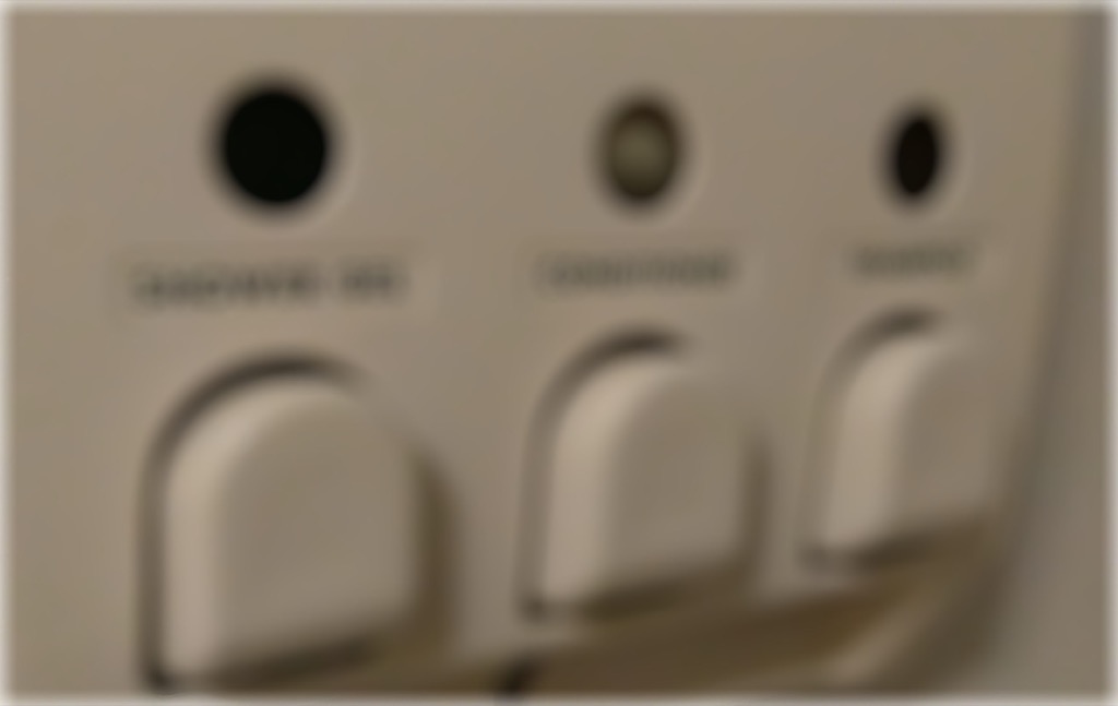
The problem is that I don’t shower with my eyeglasses on, so when I’m actually in the shower trying to figure out which handle squirts which liquid, this is what I see:

This means that, rather than being effortless, as it should be, using the dispenser requires that I memorize the order of the squirts while I’ve got my glasses on so that I can remember them when I have my glasses off (a memorization that would be a lot easier if the squirts were in the order that one might use them; but who uses conditioner before shampoo?).
I thought of this a few weeks ago when I was visiting the website of a former client.
The client had, about 5 years ago, asked me to do a high-level review of their website with an eye to making some simple design improvements. One of the things they were concerned about was making it clear, in the design, that they were not a subsidiary of the organization that was actually implementing and hosting their site for them; and so having a distinct look and feel was important to them. And at the time, that wasn’t in place.
The client went on to act on many of the recommendations that I made, including this one, and the result was a big improvement on many levels.
Which is why I was confused, when I revisited the site recently, that this distinct look and feel that they’d felt so important had disappeared.
I sent an email to the client pointing this out and, the next day, they replied that their programmer had looked into the issue, and couldn’t duplicate it: everything looked fine to them. So they recommended that I clear my cache, delete my cookies, etc.–all the things that people like me recommend to users when we think it’s their fault, not ours.
I replied that, in fact, the problem was not browser-related, that it happened in all browsers, old and new.
To aid in the diagnosis, I took a dive into the HTML of the pages in question, and, in doing so, I found the source of the issue.
What had happened was that the swapping out of one look and feel for another was something that was done in CSS: essentially the generic look and feel was the default, and the “we’re not a subsidiary, we’re an independent entity” look and feel was used to replace it by, in CSS, saying “override the default logo with this special purpose-specific one.”
The problem was that the CSS file containing these instructions was hosted on an internal server, with an internal corporate address, accessible only to people on the corporate network.
Which meant that the programmer looking into the problem didn’t see the problem because their browser could access the CSS file that solved the problem. The same thing applied to my client: they too were inside the corporate network, and so their browsers could also access the CSS file, and everything appeared just fine to them.
And so, like my problem with shampoo-blindness, the root of the issue was that the designers of a system weren’t able to take the perspective of the users of the system.
In the case of the shower stall dispenser, it’s unlikely that the designer of the dispenser, the purchaser of the dispenser, or the installer of the dispenser ever had a chance to see the dispenser without wearing their own eyeglasses. Any, indeed, it’s unlikely that the managers of the hotel have ever had cause to shower in their own rooms’ shower stalls, without eyeglasses, to experience the issue (or, indeed, perhaps none of them wear eyeglasses in the first place).
In the case of the broken website look and feel, there was no system in place to mimic all of the conditions of a regular everyday non-corporate user of the website, so problems related to inside-outside issues were unlikely to be noticed. Especially problems as subtle as a logo at the top of a web page that, to most people on the outside, looked perfectly fine.
This is a tale that we should all take to heart, not only when we’re designing or purchasing shower stall shampoo dispensers and making web pages, but anytime we’re designing anything for a broad audience.
Or anytime we’re communicating with anyone who might not share our assumptions or our language or our eyesight or our physical abilities.
Take off your eyeglasses if you want to understand me.
 I am
I am
Comments
I find this post notable for
I find this post notable for two reasons:
1. You took a photo in a hotel shower
2. The lack of glasses in a shower (a predicament that I share) reminded me of Microsoft's spectrum of inclusive design: https://twitter.com/nikmd23/status/808409344840712197
From a facing-the-dispenser
From a facing-the-dispenser-right-handed perspective, the shampoo button is, in fact, appropriately placed so the user, with eyes closed, would not have to "reach across" or "feel across" the other two buttons. Also, it is more likely a person would have eyes closed to wash hair but open when 'shower gel', consisting of two words, is needed may be easier to locate. Shampoo and gel likely get more use so are placed at either end. You see, much depends on the user's perspective. Scrub-a-dub-dub...
Add new comment