I’m talking about OpenStreetMap tonight, and I thought it would be useful to have some cards to pass out to remind people of the web address. Fortunately, I own a printing press. I really hope the ink dries in time!
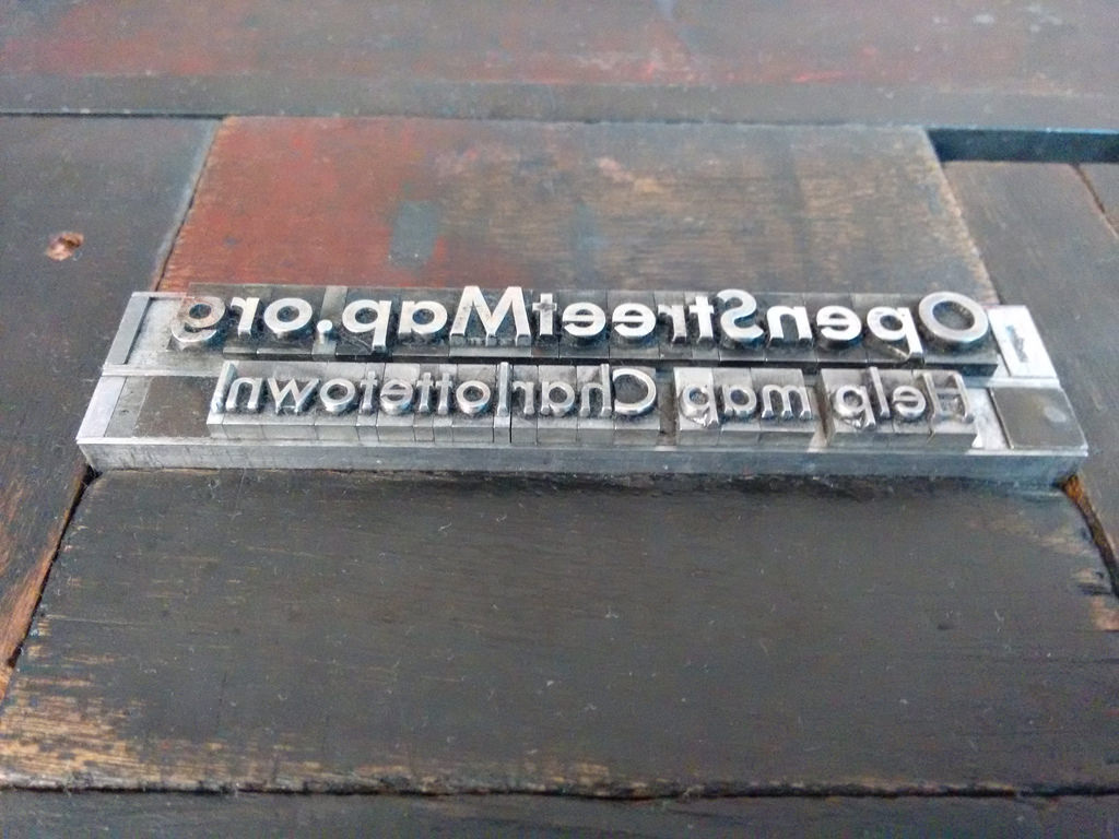
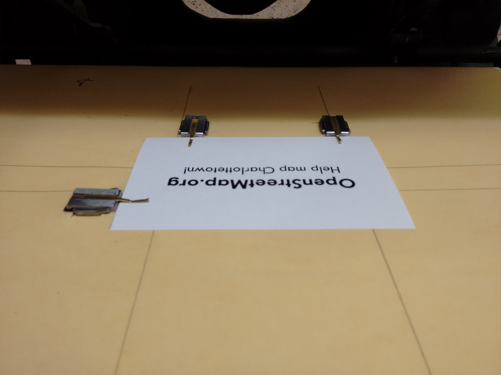
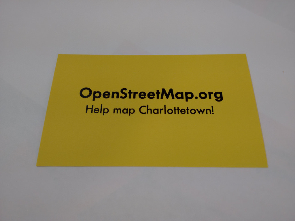
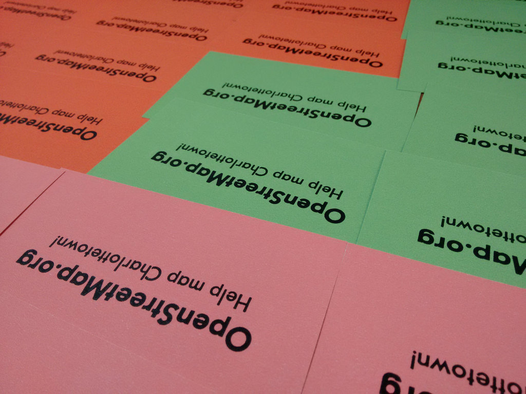
I’m talking about OpenStreetMap tonight, and I thought it would be useful to have some cards to pass out to remind people of the web address. Fortunately, I own a printing press. I really hope the ink dries in time!


Comments
I must be old fashioned for
I must be old fashioned for still liking to put either an http:// or a www at the start of web addresses in print, even though they don't serve any practical purpose. Just because with longish domain names like openstreetmap your eye has to get all the way to the end before 'hey this is an internet thing' recognition when you see the TLD.
The primary issue here,
The primary issue here, typographically speaking, is the absence of slashes in this font of Futura Bold. So even if I wanted to print http:// I couldn’t.
Also, in this case, the OpenStreetMap part of the line is playing double duty as both project name and part of an (admittedly incomplete) URL.
I own a PC and an inkjet
I own a PC and an inkjet printer, which aren't as cool, but they do still produce and offer me font choices.
Choice. Who needs choice.
Choice. Who needs choice. Rigorous limitation is where it’s at.
Add new comment