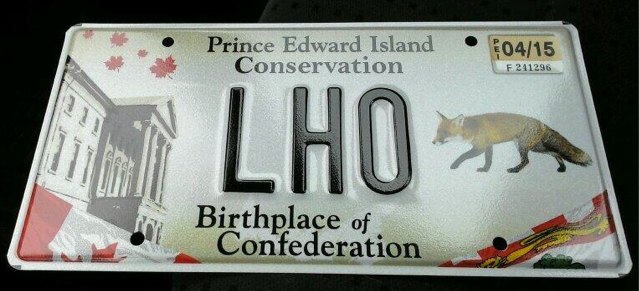
Here’s my new Prince Edward Island license plate. I paid the $10 premium to support conservation (hence the red fox) and get the special 3-letter variety (the standard is 5); the LHO was what got pulled out of the plate bucket at random, but I like it.

I’ve written in the space about PEI license plates before and their “someone sketched something on the back of a napkin and suddenly it was the design” quality and this new design is no exception; there are no less than 9 graphic elements on the plate:
- Raining red maple leaves in the top-left.
- Province House.
- Canadian flag in the bottom-left.
- Prince Edward Island flag in the bottom-right.
- The red fox (granted, that was my choice).
- The words “Prince Edward Island.”
- The word “Conservation.”
- The words “Birthplace of Confederation.”
- The small map of PEI.
It’s most decidedly from the “cram in as much as we can” school of graphic design.
Most confounding, to my eye, the “Prince Edward Island” and the “Conservation” are set in two distinct typefaces, something you can see clearly by comparing the lower case i, a, s and n in a magnified image:

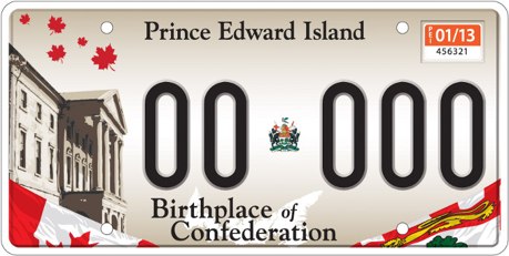
Without taking away from my commitment to conservation and the letters L, H, and O, my real reason for opting to pay an extra $10 for the conservation plate was to avoid the misuse of the armorial bearings of the province a glorified hyphen:

That was not only one-graphic-element-too-many, but the bearings are rendered much too small to be legible and, more importantly, much too small given their importance as a provincial symbol.
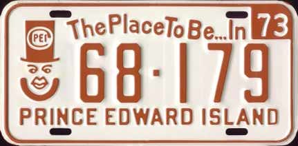
All of this is more graphically tragic given the heights to which PEI license plates have risen in the past. Take 1973, for example:

Was there ever a greater license plate design? Simple: a single graphic element, plus typography.
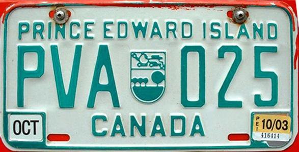
And the standard green-on-white that followed and was in place up until the unfortunate Anne situation, was similarly solid and uncomplicated (and, with its simplfiied crest, very much of the design of the times):

Meanwhile, I’m left to deal with a fox creeping up on Province House.
 I am
I am
Comments
That last image you have here
That last image you have here with the plain green version was probably our best license plate design. When traveling in the US, the large full province name and the even larger “CANADA” used to spark a lot of conversation.
Though, I’d also be up for making our license plate shaped like the actual Island - the way NWT has the polar-bear.
Here is my PEI license plate
Here is my PEI license plate Google logo…
PEI-Google-logo
http://t.co/yWhciBVrf1
I think this probably started
I think this probably started out as a great design, but got worse and worse as more people got involved. I would love to see the designer’s first draft. I bet it was just one of the elements—probably Province House. But that person’s boss brought it to a meeting where someone suggested a flag, or maybe TWO FLAGS, and this corner is empty, so LEAVES! and you know what’s missing? the coat of arms. What a great opportunity to throw it right in the damn centre.
Design by committee.
This puts me in mind of this
This puts me in mind of this article: http://www.27bslash6.com/broch…
“Laughing my Heart Out.” You
“Laughing my Heart Out.” You really are old school, Peter.
Oh, sorry. That would be LMHO
Oh, sorry. That would be LMHO.
That “of” is small and
That “of” is small and different too.
Add new comment