
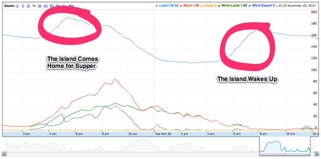
Cosm, which I’ve been using as the repository for the electricity data I’ve been logging for Prince Edward Island is a great resource, but its graphs are static and not particularly useful for dynamic exploration of data. So I’ve been experimenting with local logging of this data, and then using the Google Charts Tools to visualize the archived data.
The result is this graph, which is dynamic — you can change the time period viewed, and examine anywhere from a minute’s worth of data to a year’s worth (there’s only a week’s worth of data there now, so that’s as far out as you can see as I write this post).
By exploring the graph, you can see how Prince Edward Island’s electricity usage (the “Load” line in blue) over the course of the day and the course of the week. For example, compare a Sunday morning to a Monday morning to see what effect not going to work has on electricity usage. As the archive of data grows, we’ll be able to explore seasonal changes as well.
About This Blog
 I am Peter Rukavina and this is my blog. I am a writer, letterpress printer, and a curious person.
To learn more about me, read my /now, look at my bio, listen to audio I’ve posted, read presentations and speeches I’ve written, see things I’ve favourited elsewhere, or get in touch (peter@rukavina.net is the quickest way).
I have been writing here since May 1999: you can explore the 25+ years of blog posts in the archive.
![]() You can subscribe to an RSS feed of posts, an RSS feed of comments, an RSS feed of favourites elsewhere, or a podcast RSS feed that just contains audio posts. You can also receive a daily digests of posts by email. I also publish an OPML blogroll.
You can subscribe to an RSS feed of posts, an RSS feed of comments, an RSS feed of favourites elsewhere, or a podcast RSS feed that just contains audio posts. You can also receive a daily digests of posts by email. I also publish an OPML blogroll.
Instagram • YouTube • Vimeo • ORCID • OpenStreetMap • Internet Archive • PEI.art • Drupal • Github.
Comments
Interested to know: has there
Interested to know: has there been any noticeable change in electricity usage since daylight savings time ended?
A good question. Alas I’ve
A good question. Alas I’ve only been locally archiving data for the past week, so I can’t tell you from the local data I have, and Cosm is breaking down when I call for longer-term graphs.
The solution is to use the Cosm API to pull out the several months worth of archival data I have stored there into my local archive; then I’ll be able to answer your question.
Okay, scratch that: I was
Okay, scratch that: I was able to use Cosm to look at this.
Take a look at this graph, which shows energy load for the last 30 days; I’ve highlighted November 4, when we switched away from DST for the year. I’m pretty sure Cosm isn’t doing time zone handling properly, so the graph is off by four hours; but it still gives you a sense of the higher peak that happens immediately after that date.
Whether or not that’s due to the switch away from DST, I can’t tell you.
Thanks Peter. It’d be
Thanks Peter. It’d be interesting to map the energy usage data up against weather (wind speed + temperature?) over the winter, since an increasing number of homes are heated with electricity. How does temperature affect electricity usage? Does the energy from wind farms during a nor’easter offset the increased usage on those days?
Wind speed is already
Wind speed is already available for East Point and North Cape.
I’ve added a new Cosm feed for Charlottetown temperature.
Interesting to think of the
Interesting to think of the world circling wave of electricity usage created as sunrise races westward.
Add new comment