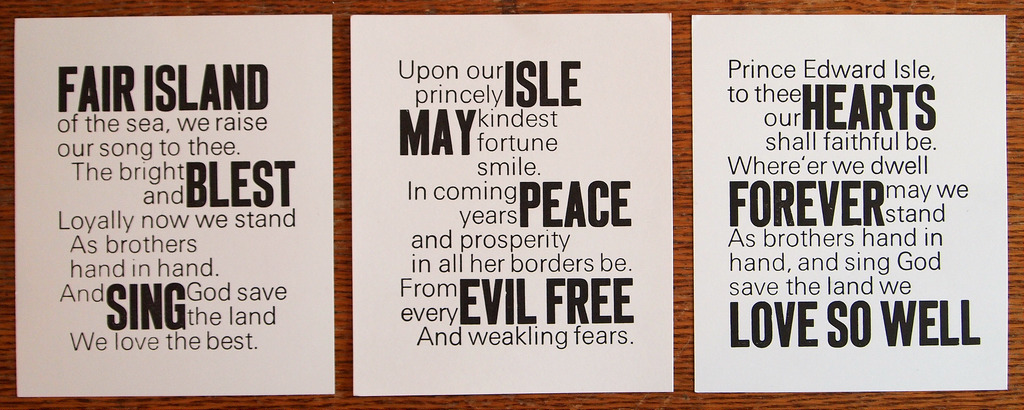
For the past month I’ve been working on a letterpress project to render The Island Hymn, Prince Edward Island’s patriotic song, written by L.M. Montgomery in 1908, in a triptych. Yesterday I finished the third panel, and here’s what the three panels look like together (each is 5 by 6 inches; the photograph isn’t the greatest):

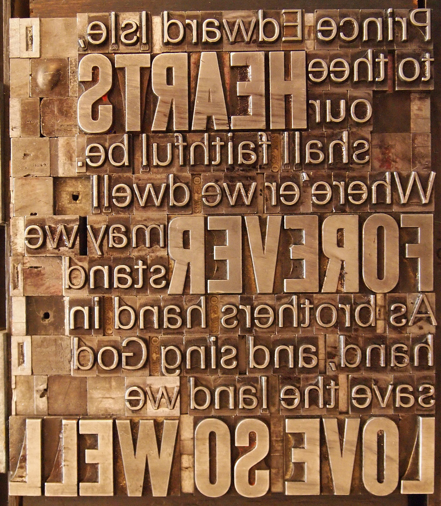
Printing the third panel yesterday was the hardest of the three, mostly because the paper had sucked up a lot of moisture overnight, and it was raining outside while I was printing, so everything was just a little more reluctant to flow together.
This project, like almost all of my letterpress work, was mostly an experiment, another job to stretch my typesetting and printing skills: every time I set time or print something I learn something new.
In this case I want to experiment with setting two typefaces together, and so I used 60 point Akzidenz Grotesk and 30 point “unnamed sans-serif face” together, using 30 point spaces to jigsaw-puzzle everything together. Because everything needed to be a multiple of 30 points, I didn’t use any leading at all, so the lines are spaced closed together than they would be otherwise. I also decided to leave no whitespace in areas where the two faces met each other, which is the only design decision I regret.
The selection of “what gets to be a big word” was informed almost entirely by happenstance and by what would fit where; that this led to “Hearts / Forever / Love So Well” on the last panel was completely (pleastantly) accidental.
On the last panel, only “Love” was to be set in the larger face, but there were a lot of words containing a lower-case l on that panel, and I ran out of that letter in the small face, so I had to improvise.

 I am
I am
Comments
This set is stunning, I love
This set is stunning, I love the mix of font sizes. I would love a set.
Thank you for the set! My
Thank you for the set! My office is becoming a shrine to all things Ruk.
Add new comment