Some time ago I came across a letterpress hack from the 1890s:

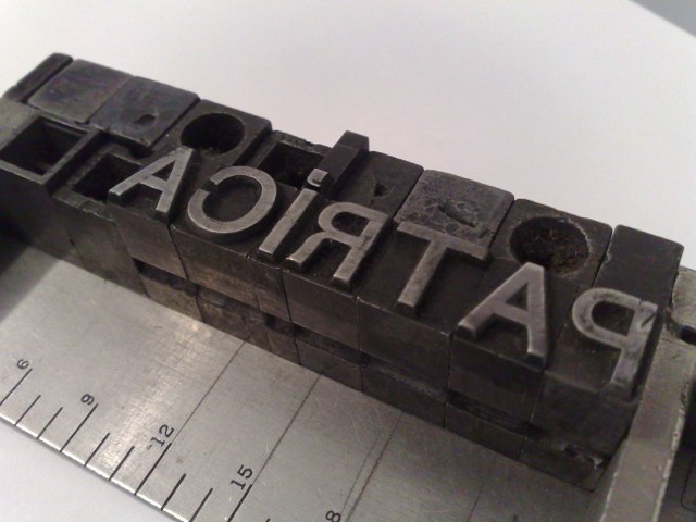
Today I had cause to consider setting the Portuguese name Patrícia in metal type (note carefully: that’s a lower-case “i” with an acute accent over it) and as I only have fonts of English and French, I lack the required accented letter and so was force to apply the aforementioned “thought and ingenuity.” The result was this:

The acute accent is a comma set on the line above; I set this in upper case because it conveniently allowed me to avoid a conflict between the dot over the “i” and the accent). This might not be the best typeface for this, as the comma is more stylized than I’d like and a simple stroke would work better. But it’s a start.
 I am
I am
Comments
Irony alert: I forgot the
Irony alert: I forgot the second (accentless) letter “i” in Patrícia. Correcting.
Yup, commas to the rescue. It
Yup, commas to the rescue. It’s 1980’s all over again for me to a time pre-computers and non accented letters typewriters ;)
Note: Hope it’s on purpose, but that Patrícia is missing the second i ;)
Okay, here’s take two, set in
Okay, here’s take two, set in Futura 30 point, with commas for the accents (just a rough proof pulled from the metal type with a rubber stamp pad):
<img alt=”Set again” src=”http://media.ruk.ca/images/pat…” style=”width: 640px; height: 440px; “/>
Add new comment