
I’ve decided that unless I block out regular times during the week to spend at the printing press, the seemingly endless digital task list will always win out, and the press will lay fallow. So every Friday morning and all day Sunday are letterpress days now.
This Sunday I decided to make use of a nice little collection of Swedish wood type that Luisa gave me when we were visiting last summer. It’s a random collection of letters and numbers, with nary a word to be made from them, so I needed to come up with something wordless and decided to make a “concentration” card game using some of many boxes of business card blanks I inherited from Campbell’s Printing.
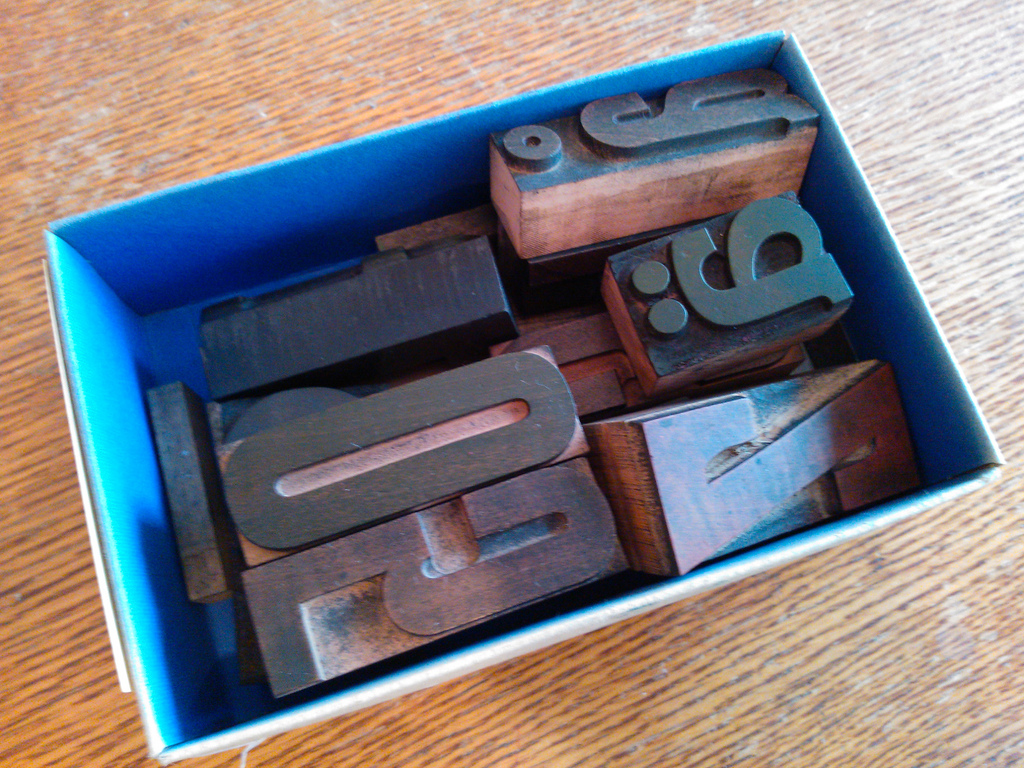
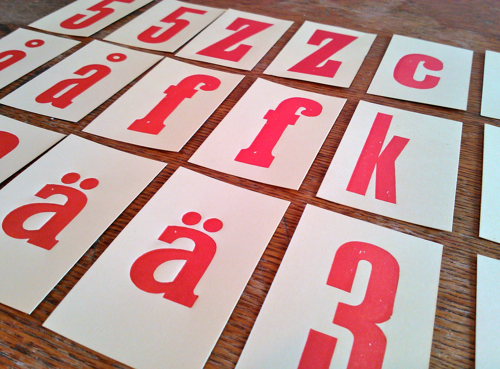
I selected my 9 favourite pieces from the Luisa collection and printed 48 copies of each on pale yellow business cards so as to end up with 24 sets of 18 cards each.
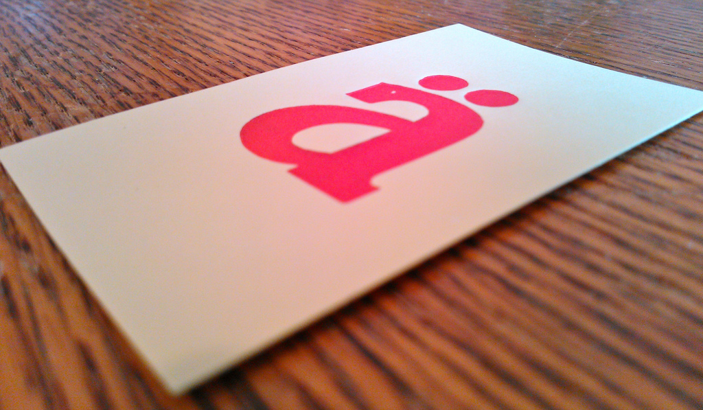
There are a nice variety of shapes and sizes and type styles in the group; the pieces of type were a little shopworn, but still in relatively good shape, and I was really happy with the results:
There emerged, however, a standards issue. North America and Europe use a different standard for “type high,” which is to say “the thickness of the metal or wood letters use to print.” In North America it’s 0.918 inches; in Europe it’s 0.928 inches. It’s not a huge difference — about a quarter of a millimeter — and it didn’t prevent me from printing. But it was enough of a difference to do this:
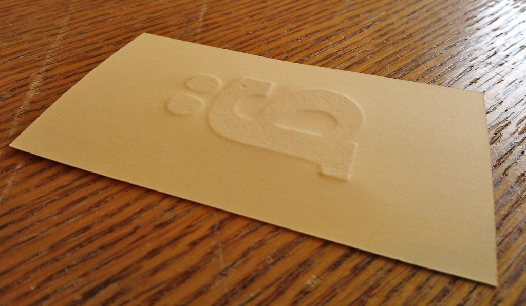
Which is to say, it made a visible impression on the reverse side of the print. Martha Stewart notwithstanding, this is a crime against letterpress humanity in many circles, and though it’s possible to consider it endearinly concrete evidence of the process, in a game of concentration it presents a serious functionality issue, as the whole point of concentration is not being able to see what’s on the printed side.
So now I have 24 sets of “Concentration” that can’t really be played. I’ll still send them out to a random collection of Mail Me Something subscribers, as the cards are beautiful in their own way. They also serve as a cautionary tale for the value of standards, and the value of turning things over before you print 432 of them.
About This Blog
 I am Peter Rukavina and this is my blog. I am a writer, letterpress printer, and a curious person.
To learn more about me, read my /now, look at my bio, listen to audio I’ve posted, read presentations and speeches I’ve written, see things I’ve favourited elsewhere, or get in touch (peter@rukavina.net is the quickest way).
I have been writing here since May 1999: you can explore the 25+ years of blog posts in the archive.
![]() You can subscribe to an RSS feed of posts, an RSS feed of comments, an RSS feed of favourites elsewhere, or a podcast RSS feed that just contains audio posts. You can also receive a daily digests of posts by email. I also publish an OPML blogroll.
You can subscribe to an RSS feed of posts, an RSS feed of comments, an RSS feed of favourites elsewhere, or a podcast RSS feed that just contains audio posts. You can also receive a daily digests of posts by email. I also publish an OPML blogroll.
Instagram • YouTube • Vimeo • ORCID • OpenStreetMap • Internet Archive • PEI.art • Drupal • Github.
Comments
Excellent story Peter. I
Excellent story Peter. I wonder how you actually manage to keep your promise to yourself to use the allotted printing press time for the printing press. Whenever I try to do the same for some of my side projects, I end up working anyway. (Also because most of my side-projects are also digital and laptop based undertakings)
Add new comment