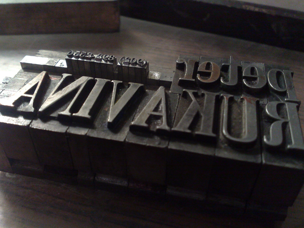
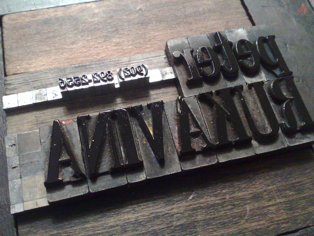
Nigel Roe was generous enough to let me back into his type cabinet at Holland College this week. It’s a challenging collection of type to wade through, having been exposed to the exigencies of students over the year, and thus missing significant things, like most vowels, for many faces.
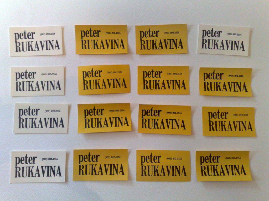
But I managed to pull together all the letters I needed to make some business cards, and I put them together this afternoon:


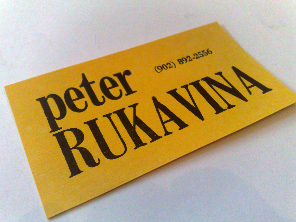
I printed both on bright yellow Artoz card stock that Catherine brought back from Halifax a couple of weeks ago and on 110 lb. Lettra in ivory. I used a variation of my “spritzing with water” technique suggested by printmaker Erin Bateman: I spritzed more heavily than usual, and then blotted out the excess water on a sheet of white card stock. The result was much damper stock, and a much more satisfying print.
You’ll notice that the final upper case A is missing its left foot: that’s an issue with the piece of metal type, which is too worn down in this area to make an impression. There’s also the unpleasant lack of kerning (“moving letters closer together so they’re more harmoniously intermingled”) between the A and the V, but, short of getting out a hacksaw, I was limited by the dimensions of the type.
The irony of all of this, of course, is that I work in a business where I seldom have the need for business cards. Perhaps it’s time to go out mingle.
 I am
I am
Comments
They look great! Off to some
They look great! Off to some mixers - great prizes to be won…that card would shuffle right to the top!!
These look great. Simple is
These look great. Simple is best.Would you ever consider taking orders for the making of custom business cards ?
Add new comment