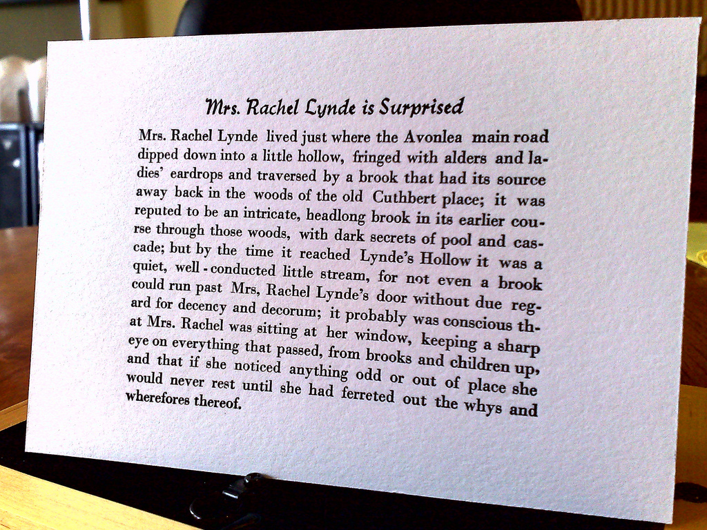
After a lot of detailed futzing around – setting the type, justifying the type, proofing, correcting, proofing, aligning the bed of the press, adding a heading – here’s the latest print of the first sentence of Anne of Green Gables I created today:

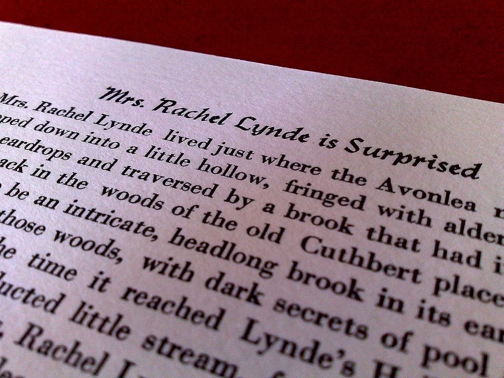
It’s printed in 12 pt. Bodoni on Crane LETTRA Fluorescent White 220 lb. cover stock, part of a sample pack I ordered from Neenah Paper. I ever-so-slightly dampened the paper before printing – I spritzed some water from an old Windex sprayer into the air and wafted the paper through the mist. Here’s what it looks like up close:

I’ve very happy with the way this turned out: I learned an awful lot about letterpress in the process of creating it. And while there’s a lot of room for improvement – to start, I need to learn a lot more about justifying type – that this print came out of a press that just a few months ago was caked with decades of ink and grime, and that I had no idea of the workings of, seems like a minor miracle.
 I am
I am
Comments
According to this video (
According to this video ( Coach House Press ), they used to do a page in half of a day. That’s rather impressive. Keep at it and you’ll get to that point.
My first attempt looked like
My first attempt looked like an eye chart. I was working for the Sparks Tribune in Nevada about 1949.
Thank goodness the linotype came along.
You could probably sell
You could probably sell framed prints of that…it looks fantastic :)
Looks great. Really. Nice
Looks great. Really. Nice work.
Brilliant.
Brilliant.
Absolutely beautiful, Peter!
Absolutely beautiful, Peter!
Add new comment