I received the following note from an Island media luminary earlier this week:
Just a note, I wanted to tell you the new blog design is leaving me a bit cold. Just for your info, not meant as a personal attack… :)
The “new blog design” wasn’t really a design at all, but rather a rough superstructure that came with the migration to Drupal. More scaffolding than anything else. So it seemed like high time to add a little plaster and trim. Still a work-in-progress and everything’s subject to evolution, but it’s already, I hope, a little warmer in here.
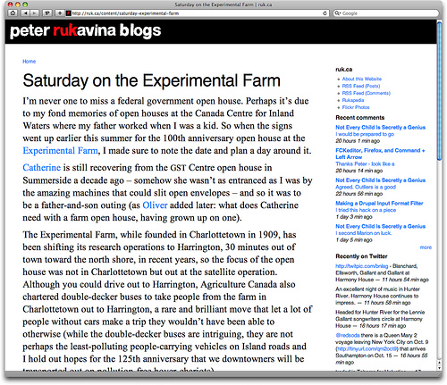
The Koloss Regular wordmark is gone – the 1930s German aesthetic was so last year. It’s been replaced by FD Helwoodica, by Brazilian designer Felipe Dário, a face that was “made through the woodblock printing of lowercase glyphs of the Helvetica font.” The hand-hewn Brazilian aesthetic is so this year. I was fiddling around with various renderings of the three-letters ruk when it occurred to me to just drop them into their context, and that’s how I ended up with “peter rukavina blogs”. I may continue to tweak this, but so far it’s working for me. There’s a new favicon to go with the new wordmark.
The other typographic banishment is Georgia, which I’ve used for almost as long as I can recall for both the headlines and body copy here. It’s been replaced by the classics: Helvetica for headlines and sidebar copy and Times New Roman for body copy. I fell in love with Helvetica all over again after Oliver Baker kindly sent me a copy of the movie for my birthday this year and Times New Roman just seems so darned readable compared to anything else that I couldn’t resist.
A bump-up in the amount of whitespace and line-spacing, and that’s where the design is at this morning; here’s a snapshot for the archives, as things may have changed by a week from now:

 I am
I am
Comments
Being impressed with the
Being impressed with the renovations. I can’t believe this is Drupal.
Add new comment