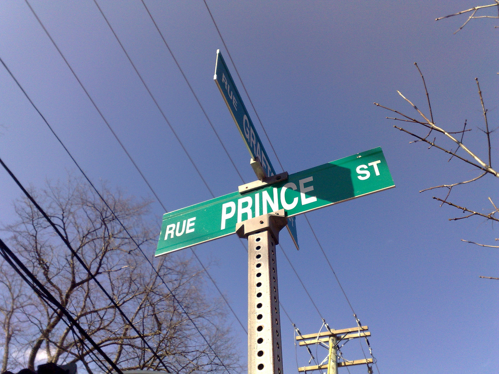
Last week this is what the sign on the corner near our house looked like:

It followed accepted standards for colour, typography and layout, and, more importantly, it was clear, easily visible both close-up and far-away and served its way-finding role well.
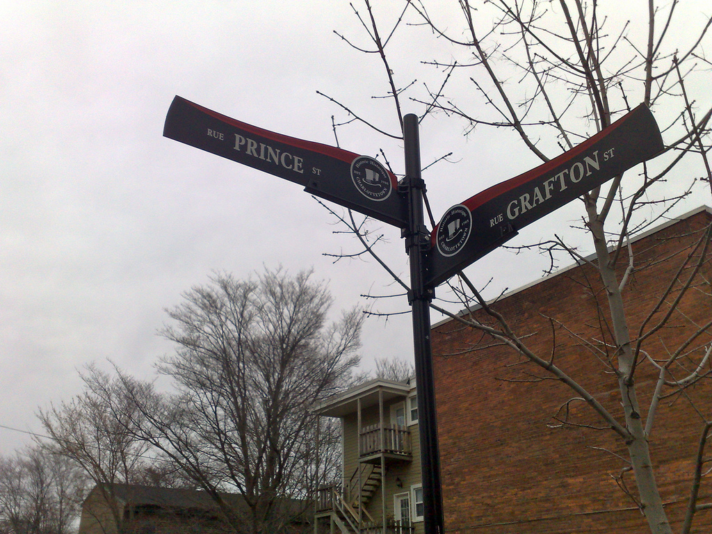
Here’s the sign that replaced it this week, part of an $22,000 effort to “brand the downtown as ‘Historic Charlottetown’ ”:

The new signs are non-standard, use considerably smaller type, colours that are much more difficult to read, and are a significant step backwards in terms of their purpose of clearly identifying city streets.
This is clearly a case where the “ye oldeification” tendencies of tourismocrats trumped principles of good design. What a shame.
 I am
I am
Comments
Agreed. I really like the
Agreed. I really like the new round black sign posts and fittings. Too bad the signs are a step backwards.
Toronto signs switched to non-standard sign a few years ago, but at least theirs are larger and more readable:
http://blog.fawny.org/2006/09/…
NYC uses a more standard design, only changing the color and adding a small bar to distinguish a neighbourhood:
http://nyc2dailyphoto.blogspot…
The irony is that the
The irony is that the visitors that we’re trying to appeal to (I assume) are going to be the ones struggling to read the signs as they drive/wander around an unfamiliar town.
The standard signs are so
The standard signs are so iconic that the image is used by a Charlottetown city councillor on his blog.
I found them easy enough to
I found them easy enough to read when I first noticed them, while driving around town on the weekend.
I was not too fond of this
I was not too fond of this design when Tourism Charlottetown Inc and their design consultants presented to council. Still not thrilled, but I can live with it. Myself and at least one other councillor were particularly irked by the stylized top hat and maple leaf. Apparently, the hat/leaf design process had been through several iterations before they arrived at the version you see now.
Keep in mind, the street signs are just one piece of TCI’s wayfinding program. Kiosks, gateway signage, historic district marketers, interpretive story boards… all yet to come.
As I read “the hat/leaf
As I read “the hat/leaf design process had been through several iterations” I can almost conjure up the voices around the board table: “it needs more historic gravitas but slightly less whimsy — how about adding a leaf!”
There’s a reason that traffic engineers should be in charge of street signage and not “design consultants.”
These are awful. I guess I
These are awful. I guess I just have to be glad I grew up here so I already know the streets.
This is another example of
This is another example of how the city shuns practicality in favor for a “ye olde” look and feel. Recall how that stupid clock at City Hall required a laptop to be sent from BC in order to set its time? Despite the cost and effort associated with setting it up(and the fact that it is indeed a digital clock), it certainly looks… old. It all seems so horribly contrived.
I vaguely remember a previous
I vaguely remember a previous attempt to brand “Olde Charlottetown” from the early 80s. The olde style lamposts were quite neat, as an 8 year old it made me want to know the boundaries of this mythic town. Now that my relationship with Charlottetown is for a couple of weeks in August as a visitor I wish for vibrancy in the downtown. It does already seem contrived but perhaps that’s partly because I know that parts of Victoria Row close for over half the year.
Good places to visit are good places to live. It really is that simple. Regardless of historical whimsy.
The other issue with the
The other issue with the “tophat” branding is that it memorializes a single week in history and effectively sets aside everything of note that happened in Charlottetown before or since.
Although these signs may be
Although these signs may be hard to read, if it means putting one at every intersection it will be very useful. I have found myself lost in downtown (as a pedestrian) and not been able to find a street sign for blocks! Granted, the new signs are probably harder to see when whizzing past on wheels. Anyone know if they are reflective like the old ones?
Why couldn’t they have saved
Why couldn’t they have saved this money and put it toward fixing up University Avenue and correcting the horrible planning mistake made when the city approved that awful development at Brown’s Court almost 10 years ago? $30,000 here and $30,000 there… soon you’re talking real money!
Absolutely despise these
Absolutely despise these signs ~ they look “pretty” enough but are hardly practical.Hard to read until you are almost on top of them and set somewhat further back than previous signs .I suspect the amount of lost visitors will rise significantly this summer….
Add new comment