
There’s a certain sort of “PIN pad” — the gizmo that you type your PIN into when paying with a debit or PIN-enabled credit card — here in Canada that looks like this:
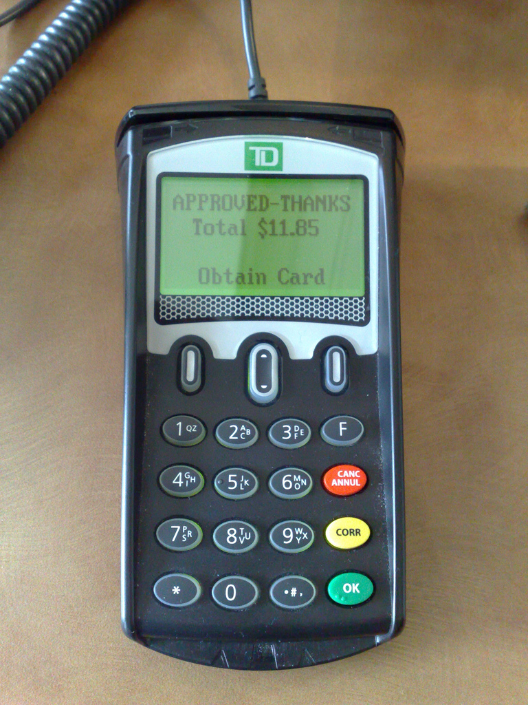
Starting last year many restaurants that use this sort of PIN pad have opted to enable a feature that allows customers to add a tip to the bill by selecting one of three options: nothing, a percentage of the total bill, or a dollar amount. These options are presented on the display as $0, % and $ and you need to press one of the three top buttons to select your choice.
The percentage option is my favourite and so I’m left to press the middle button. But for the longest time, no matter what restaurant I was at, I couldn’t get the middle button to work; I thought the button was broken, but it seemed odd that it would be broken at all restaurants.
It turns out that although the three buttons look the same, they work differently: the right and left buttons are “push in”-style whereas the middle button is a “toggle up or down” button. And if you try to “push in” the middle button, it doesn’t work, and seems like it’s broken.
There’s a subtle indication of this difference in the design of the buttons: the right and left buttons have a white background and the middle button has small “up” and “down” arrows on it. But the indication is so subtle that, especially in a busy restaurant with a line at the cash where you’re not able to study the PIN pad in detail, it’s not enough to signal the difference.
And, indeed, there shouldn’t be a difference: the three buttons to select three equally viable options should operate in the same fashion.
Even though I know about this UI quirk, I still get caught by it most of the time.
About This Blog
 I am Peter Rukavina and this is my blog. I am a writer, letterpress printer, and a curious person.
To learn more about me, read my /now, look at my bio, listen to audio I’ve posted, read presentations and speeches I’ve written, see things I’ve favourited elsewhere, or get in touch (peter@rukavina.net is the quickest way).
I have been writing here since May 1999: you can explore the 25+ years of blog posts in the archive.
![]() You can subscribe to an RSS feed of posts, an RSS feed of comments, an RSS feed of favourites elsewhere, or a podcast RSS feed that just contains audio posts. You can also receive a daily digests of posts by email. I also publish an OPML blogroll.
You can subscribe to an RSS feed of posts, an RSS feed of comments, an RSS feed of favourites elsewhere, or a podcast RSS feed that just contains audio posts. You can also receive a daily digests of posts by email. I also publish an OPML blogroll.
Instagram • YouTube • Vimeo • ORCID • OpenStreetMap • Internet Archive • PEI.art • Drupal • Github.
Comments
You’d think that the last 12
You’d think that the last 12 or so years these things have been ubiquitous would have resulted in a more-or-less uniform interface for those things. Or at least one guy realizing “hey you know LED screens would be way more easy to read for people with low vision.. and why not have a button a user can press to say the screen content out loud?” It’s mind-boggling that they get harder to use with every generation.
So do you push up or down to
So do you push up or down to select the % option (or in fact, do both work)?
@Hilary Good question: I’ve
@Hilary Good question: I’ve only tried “Down”.
Add new comment