
The Globe and Mail unveiled a new design on Monday, and today was my first experience of it:
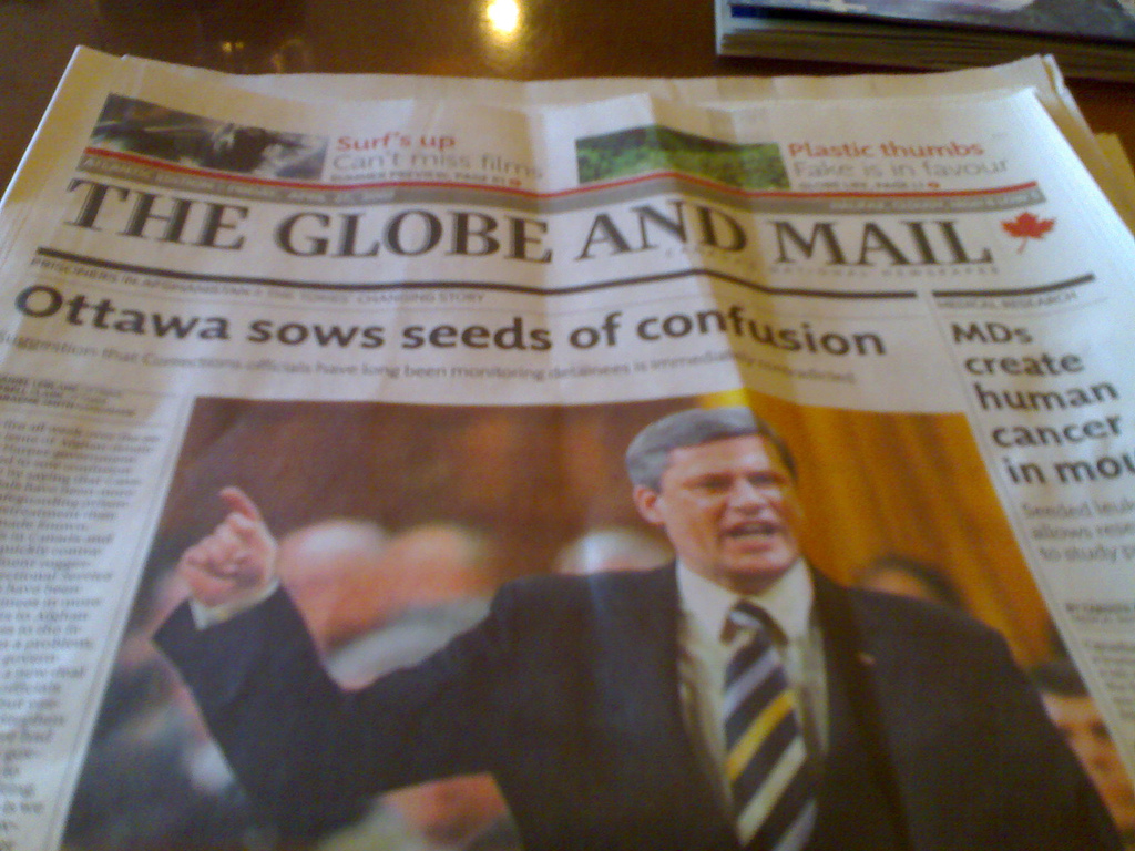
The dominant feature of the new design? It’s all about bold 8-point lines: they’re everywhere.
Back in the day when we wanted to put lines under or around things in the newspaper we used self-adhesive line tape. Because you always wanted to have line tape when you needed it, in a complete range of 1pt, 2pt, 4pt, 6pt, 8pt thicknesses, in the composing room we all used to keep personal caches of the stuff hidden within easy reach. I’ve still got a couple of rolls at home, just in case there’s a sudden need.
The biggest mistake of my professional newspaper career involved 8-point line tape.
Late one Friday afternoon I was charged with pasting up a full-age ad for Sears. The ad was mostly black-and-white, but there were a couple of red 8-point lines in the design, which meant that I had to paste up one sheet with the ad itself, and then overlay a clear sheet of acetate and lay the spot-colour for the red lines on that with 8-point line tape. I would then shoot two negatives for the ad, one for the black ink and one for the red ink.
All was well and good until, at the very last minute, some changes came in from Sears that required moving some parts of the ad around. After I made the changes I shot a new black negative, but I forgot to re-shoot the red one. The result was that the next morning in Saturday’s paper there was a full-page Sears ad with red lines running right through the middle of the text and photos.
Fortunately the newspaper world is nothing if not ephemeral, and by the time Monday rolled around all was forgotten — if, indeed, anyone but me actually noticed.
Reading the new Globe sort of feels like being under assault by 8-point line tape (now applied, of course, by computer). I’m sure the effect will wear off, but because of my tortured relationship with the 8-point line, I don’t think it will ever wear off completely.
About This Blog
 I am Peter Rukavina and this is my blog. I am a writer, letterpress printer, and a curious person.
To learn more about me, read my /now, look at my bio, listen to audio I’ve posted, read presentations and speeches I’ve written, see things I’ve favourited elsewhere, or get in touch (peter@rukavina.net is the quickest way).
I have been writing here since May 1999: you can explore the 25+ years of blog posts in the archive.
![]() You can subscribe to an RSS feed of posts, an RSS feed of comments, an RSS feed of favourites elsewhere, or a podcast RSS feed that just contains audio posts. You can also receive a daily digests of posts by email. I also publish an OPML blogroll.
You can subscribe to an RSS feed of posts, an RSS feed of comments, an RSS feed of favourites elsewhere, or a podcast RSS feed that just contains audio posts. You can also receive a daily digests of posts by email. I also publish an OPML blogroll.
Instagram • YouTube • Vimeo • ORCID • OpenStreetMap • Internet Archive • PEI.art • Drupal • Github.
Comments
The other major change in the
The other major change in the redesign is that they shrunk the size of the paper slightly to 12” (coming to all broadsheets everywhere), which apparently was enabled by a new custom font they had designed for them that was optomized for minimal white space between words while staying easily readable at 9pt. Saves the paper a fair amount of money, which they’ve promised to put back into reporters, etc.
They explained all this in monday’s paper, and had a nice graphic showing off the new fonts, but I can’t seem to find it on the website.
I like the new size but I am
I like the new size but I am with you Peter on the 8 point lines. It may be that I just don’t like the new but I doubt it - I think that there is an aesthetic involved here. Would a web site use 8 point? I doubt it. White space is good and a 2 point line would have provided the illusion of more white space and not distracted the eye from the type.
Add new comment