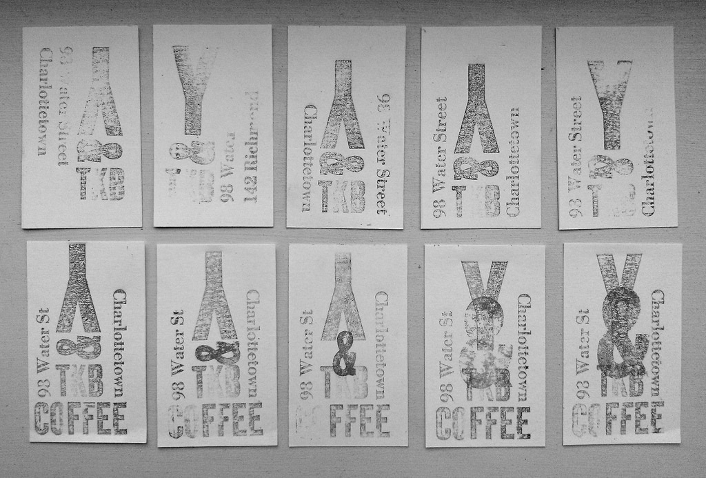
Some experimenting, over the course of the last week, with a business card for Youngfolk & The Kettle Black. I’ve settled on the bottom-right as the design I’ll print (these are all rough proofs pulled with a stamp pad), with the ampersand underprinted in red and everything else in black. I was rather wedded to the “upside down Y” idea for a long time, but as soon as I overlaid the larger ampersand, and filled up some of that volume in the middle, a righways-Y suddenly became a lot more appealing (and, as it happens, a hat-tip to the erstwhile former occupant of 98 Water Street, Café Ampersand).

 I am
I am
Add new comment