
One year ago today I started archiving the energy load and generation data that the Province of PEI makes available at 15 minute intervals on its website. I’ve collected 34,471 data points (if you like you can grab the entire archive as a CSV file for your own analysis).
I’ve been using this data, over the course of the year, to help build my own “peripheral awareness” of the Island’s electricity situation, using tools like this visualization of load vs. generation and this simple gauge showing how much of our load is being met by the wind.
I’ve had conversations with staff at Maritime Electric and the PEI Energy Corporation to try to better understand these numbers, and one of the things that I’ve learned is that “peak load” is an important number when talking electricity: utilities like Maritime Electric are contractually obligated to be able to meet the peak load – the maximum amount of electricity we might all collectively call for at any given time – and they have to build generation capacity or have a reliable import source to meet that obligation.
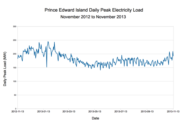
Over the last 365 days the Island’s peak load came on January 23, 2013 at 245.07 megawatts (MW). We had 75 days where the daily peak load was more than 200 MW and the lowest daily peak was 140 MW on May 26, 2013. This late-January peak represents trend away from the traditional “Christmas lights peak” in December and, I am told, comes as a result of an increasing shift toward electric-source heating.
Here’s what that daily peak load for the last 12 months looks like on a graph:
These are important numbers for Islanders to know and understand because it’s the peak, more may any other factors, that drives the cost (and complexity) of meeting our electricity needs.
The report of the PEI Energy Commission is an excellent resource in this regard.
From that report, for example, I learned that the yearly peak in 1977 was 95 MW – meaning that our peak in this year was 2.5x higher than our peak 36 years ago.
And that the capacity of the electric cables to the mainland is 200 MW. Which means that when the load goes over 200 MW – as it did on 20% of days over the last year – we need to make up the difference from local generation, either fossil-fuelled or wind-generated.
The wind, of course, wasn’t a factor in our energy mix back in 1977 and now it’s a significant one. But, as the graph below, showing the daily peak wind generation over the last year, shows, the wind is variable:
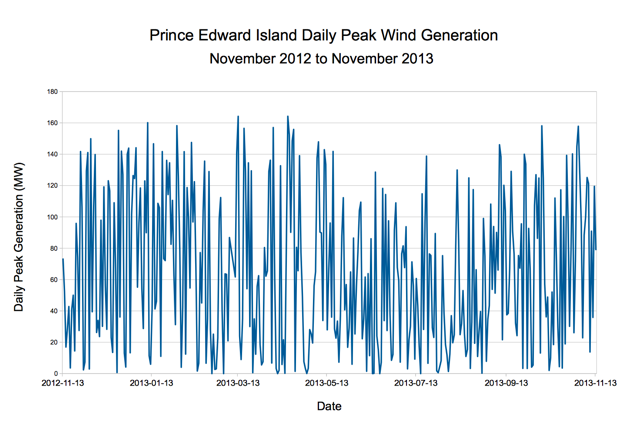
There have been some fantastic days for wind generation – 12 days, for example, where the daily peak was more than 150 MW – but also some bad days for the wind: on 59 days the daily peak was 10 MW or less.
That said, there were 1,546 intervals of fifteen minutes or less over the course of the year where wind generation exceeded load, making PEI, temporarily, an energy exporter. Granted, most of these intervals were in the middle of the night; but on October 8, 2013, for example, we were generating 56 MW more than we were using at 3:00 a.m.
It is de rigueur in energy and “personal analytics” fields these days to believe that the mere fact of monitoring behaviour affects behaviour: if you keep track of how many steps you’re walking every day, you’ll be more inclined to walk more steps every day.
I feel like that’s supported by my own electricity-using behaviour: I seems like I’ve become a more responsible electricity consumer since I started paying attention to PEI’s energy mix – like I’m turning off lights more often, unplugging things that don’t need to be plugged in.
So far, though, the evidence doesn’t really bear this out: here’s a chart showing our monthly electric bill at 100 Prince Street for two years, one in which I wasn’t paying attention to electricity and one in which I was:
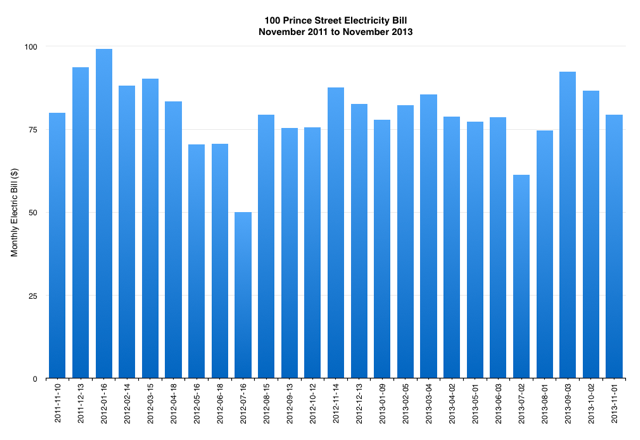
Our total yearly bill for November 2011 to November 2012 was less than a dollar different than the bill for the following year (although, to my credit, the rate per kilowatt hour did incease, on our March 2013 bill, from 12.05 cents to 12.41, so it’s not quite an apples-to-apples comparison).
I’ll keep watching, and keep turning things off: knowing that my vigilance hasn’t really made a dent, at least for a while, will make me ever-more-vigilant.
About This Blog
 I am Peter Rukavina and this is my blog. I am a writer, letterpress printer, and a curious person.
To learn more about me, read my /now, look at my bio, listen to audio I’ve posted, read presentations and speeches I’ve written, or get in touch (peter@rukavina.net is the quickest way).
You can subscribe to an RSS feed of posts, an RSS feed of comments, or a podcast RSS feed that just contains audio posts. You can also receive a daily digests of posts by email.
Comments
Thanks for sharing! Great
Thanks for sharing! Great information. Charts help explain … Can you source Temperature and Wind data to plot against …. come up with correlations ? For the charts, you might try mmm-dd-yy date format — may be easier to differentiate … and add major gridlines .. same reason.
Well Done .. keep it up.
cheers
@steveinpei
Add new comment