
At long last all the bits I needed to gather together to run a real job through my Adana Eight Five press were in place on this holiday Monday: I picked up a couple of “one pound or assorted card stock” packs at DeSerres on Barrington Street in Halifax, my ink and tympan paper arrived from NA Graphics in Colorado last week, and I picked up some low-odour Varsol this morning at Canadian Tire to clean everything up when finished.
As I’d been experimenting with a Pecha Kucha poster and had its type set up in the chase, I started off with that. After a lot of thrashing around with bed and platen adjustments, amount of ink, and the press packing, the best I could pull off was this:

Rather than continue my thrashing about with such a physically large job, I decided to back off and try something more modest. The most complete typeface I have (especially when it comes to numbers-and-punctuation) is a one labelled 14 pt. Temple, so, despite my aversion to script-style faces, I decided to use that. I left the black ink on the press, and used some tiny orange card stock from my new pack, and ended up with this:
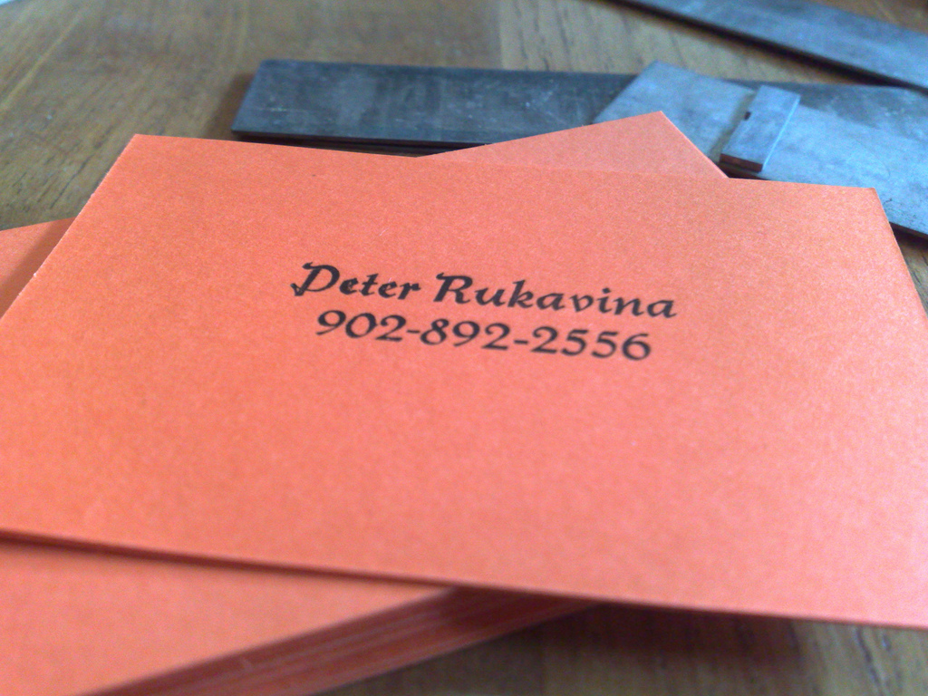
I’m not completely happy with it: the left-hand side, especially the capital “P” and the lower-case letter “e”, are too dark and both letter e are over-inked and slightly filled in. I expect that with a more deliberate make-ready I could achieve better results.
About This Blog
 I am Peter Rukavina and this is my blog. I am a writer, letterpress printer, and a curious person.
To learn more about me, read my /now, look at my bio, listen to audio I’ve posted, read presentations and speeches I’ve written, or get in touch (peter@rukavina.net is the quickest way).
I have been writing here since May 1999: you can explore the 25+ years of blog posts in the archive.
You can subscribe to an RSS feed of posts, an RSS feed of comments, or a podcast RSS feed that just contains audio posts. You can also receive a daily digests of posts by email.
Add new comment