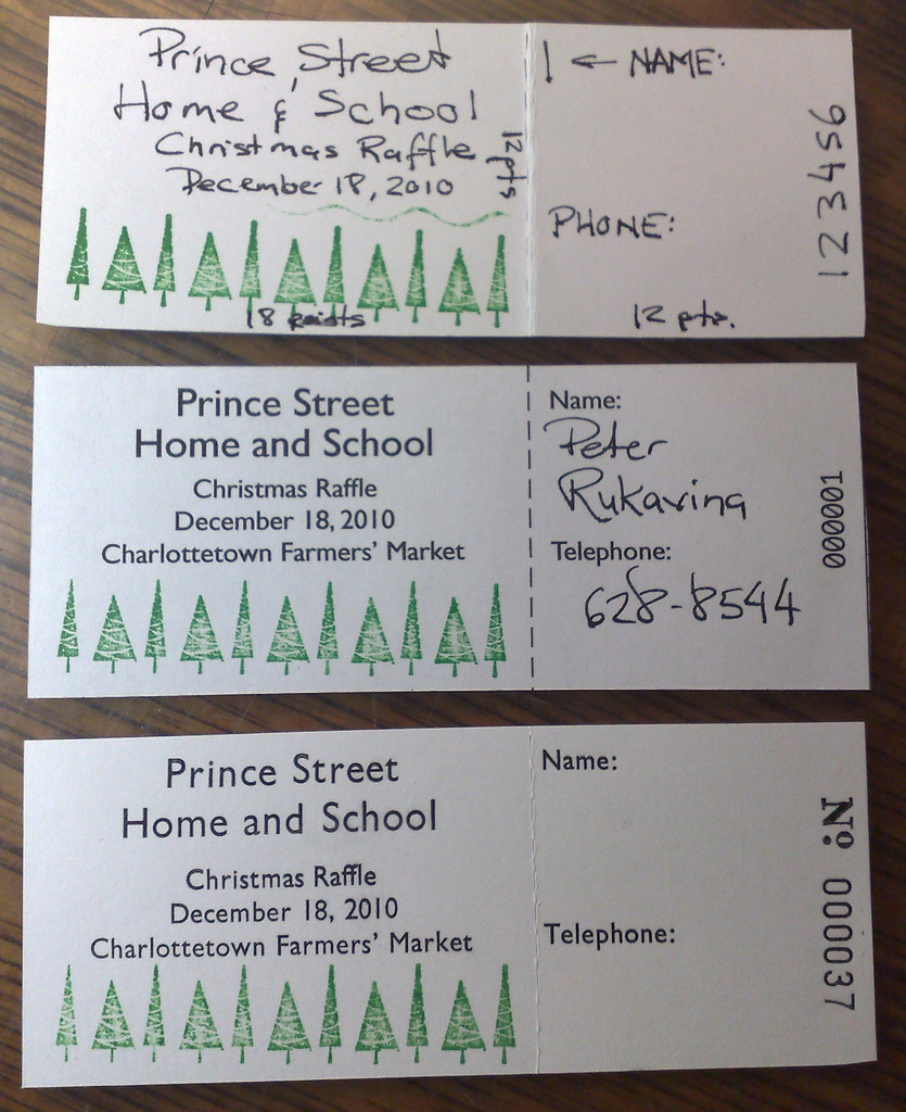
All of the components needed to set my Prince Street School raffle tickets were in place today, so I was able to set all the type and lock everything in place. Here’s a comparison of my original sketch (at the top), a digital mock-up (in the middle; created in OmniGraffle on my Mac and printed on an HP ink jet printer) and the first draft of a ticket printed on my Adana Eight Five letterpress (at the bottom):

I gotta say that the internal Gill Sansness of the analog Gill Sans certainly shines through in the letterpress; it just seems right. And the numbering machine (it came set to 31 – I didn’t actually print 36 copies to get to this one) is everything I hoped it would be.
My favourite part of setting the type was the opportunity to use the ligature for ffl, which I was happy to see came as part of my M&H type.
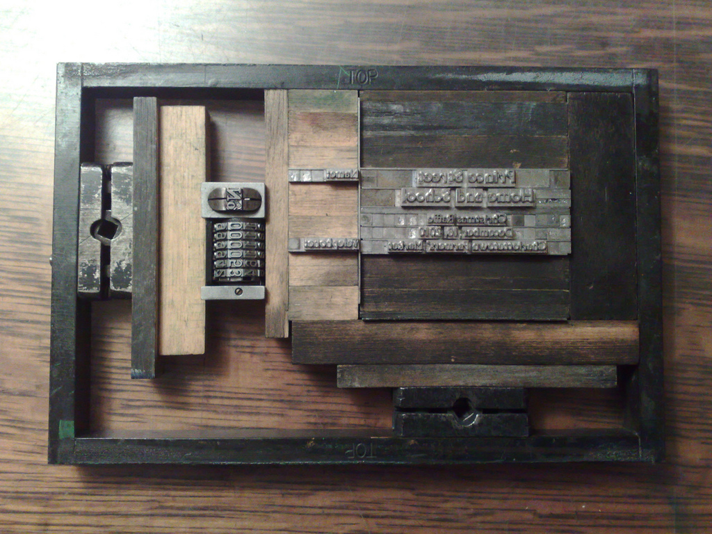
Here’s what the type to produce the ticket looks like:

The only problem is that I mistakenly ordered two 12 inch lengths of perf bar forgetting that perf rule has to be hard steel so as to be able to make perforations. I need a smaller piece to fit into the mix, so Catherine’s going to have a go at it tomorrow morning with her special jewelry tools with hopes that I can pick things up Tuesday night. Stay tuned.
 I am
I am
Comments
Brilliant! That numbering
Brilliant! That numbering machine is just stunning.
Add new comment