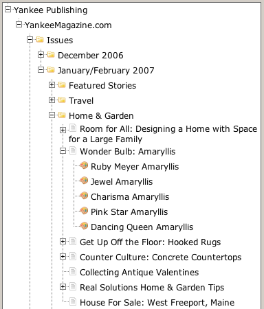
Much of my fall was consumed with the behind-the-scenes development of a new web-based content management system for our longtime client Yankee Publishing. The end result of this work, on the back-end, looks a little like this:

Suffice to say that it’s a completely Web 2.0-buzzword-compliant web-based system for managing online magazine content. On the back-end, editors use the system to manage articles, photos, recipes and travel lsitings; on the front-end side of things, the content automagically squirts out into pages that look like this.
The project has taken me to new levels of intimacy with the Yahoo! User Interface Library, which has proven quite useful as a toolkit for driving things like “drag and drop a photo into an article.” Similarly, a recent infrastructure upgrade on the server-side brought a move to version 5 of PHP, and that move provided the opportunity to recast much of the back-end code in beautiful PHP objects.
The reason for all this work has been the relaunching of YankeeMagazine.com, the companion website to YANKEE magazine. The relaunch of the site provided us with an opportunity to move much closer to complete “separation of content from presentation” nirvana: for the most part the new site consists of XHTML “content” from the content management system rendered inside a brand-new utterly CSS-driven design by Todd Libby.
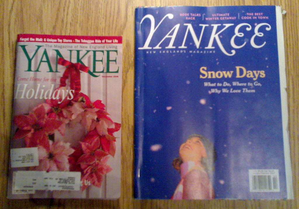
And the reason for all of that is this:

On the right is the December 2006 issue of YANKEE, on the right is a press-proof of the January/February 2007 issue. You’ll notice that the one on the right is bigger. The change, which is explained here by Editor Mel Allen (and here in the Boston Herald) is rather dramatic. Especially when you’ve worked with the old “tiny YANKEE” for ten years, as I have.
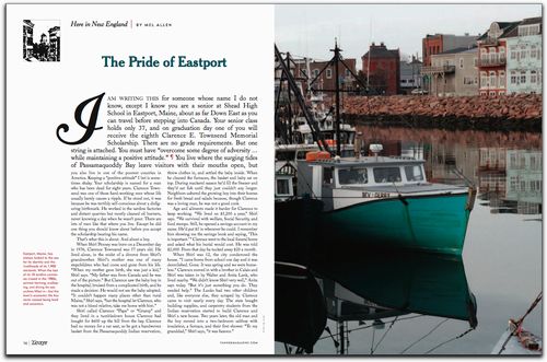
The renovated magazine is bigger, brighter and, I dare say, bolder. The new issue really takes the new size out for a ride — there’s lots of air in the design, and the new typography is a pleasant blend of old and new. Look at this double-page spread, for example (and then read the article here — it brought tears to my eyes):

The new YankeeMagazine.com contains the complete contents of the print magazine. But to truly appreciate it in a form that you can carry in your pocket and read over breakfast, you should probably buy yourself a subscription too.
In the weeks and months to come we’ll be taking the new CMS out for a ride too, adding new features to the site that let articles and photos be sliced and diced in new and interesting ways.
It’s an interesting time to be a friend of YANKEE.
 I am
I am
Comments
Just noticed that this post
Just noticed that this post was #4000 in this blog, a milestone of my very own.
Congrats on #4000.
Congrats on #4000.
Wow, the new site looks great
Wow, the new site looks great and I am intrigued at the use of the Yahoo UI Library.
And nice work on #4000
Hi Peter,I’m excited to hear
Hi Peter,
I’m excited to hear you’re using YUI, and glad it’s working well for you. If you have questions, comments or feedback, don’t hesitate to write, or join our mailinglist at http://groups.yahoo.com/groups…
Congrats on #4000 - that’s amazing.
best,
nate
Nate Koechley
YUI Team, Yahoo! Inc.
The first thing I looked for
The first thing I looked for in the new yankee was Edie Clark on the back page. When I found her still inside, I breathed a sigh of relief.
I love the new yankee! There is better, (larger) easier to read print and pictures. This is a real improvement.
Add new comment