Okay, maybe I exaggerate. A little.
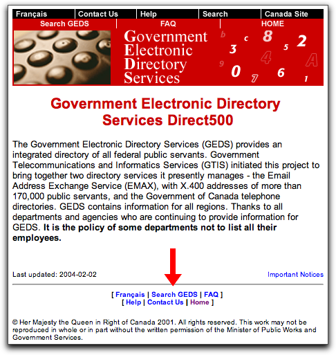
The Canadian federal government, through its Department of Public Works and Government Services, maintains a web-based directory of public servants. They call it GEDS, and this is what you see when you arrive there:

I added the Big Red Arrow myself.
I’ve used this page dozens of times, and every time I do, I get confused about where I actually search.
You would think that this gateway to a valuable, up-to-date resource would have a big “search here” button. Or maybe even a search box right on the page.
But, no: you have to click on the little tiny “Search GEDS” link at the bottom of the page. Granted, that click takes you to a page with a nice search box. But I wonder how many people never find their way there.
 I am
I am
Comments
As someone who uses this
As someone who uses this often, it has always irked me, too.
The government intranet version has a much larger search button, but you still have to go to another page to type in your search criteria.
Federal Government websites are bound by the Common Look and Feel (CLF) standard (http://www.cio-dpi.gc.ca/clf-nsi/index_e.asp); however, there is nothing in the standard which precludes having an easily accessible search function.
The Veterans Affairs external and internal sites (designed by SilverOrange, I believe) have a search box on the main page. This is a site search, not a phone number search — you have to use the main government search page (or the PEI government one, which also includes PEI federal numbers).
As somoene who has used this
As somoene who has used this page several times, I agree with you that it is terribly designed in terms of making the most attractive feature (the search) prominent. Like you it took me years of several false starts to actually find the search area.
However, the search function itself is pretty incredible, and it’s kind of amazing that there’s this pretty comprehensive phone directory that connects you to almost everyone who is paid by your federal tax dollars.
Uh, it looks to me like
Uh, it looks to me like “Search” is right up there at that big black bar at the top of the page. Granted, it’s not the dominant thing on the page as you’d expect from a directory site— but it’s still up there and there are only so many pages to visit on the site.
Search box is at the top
Search box is at the top doofus.
Add new comment