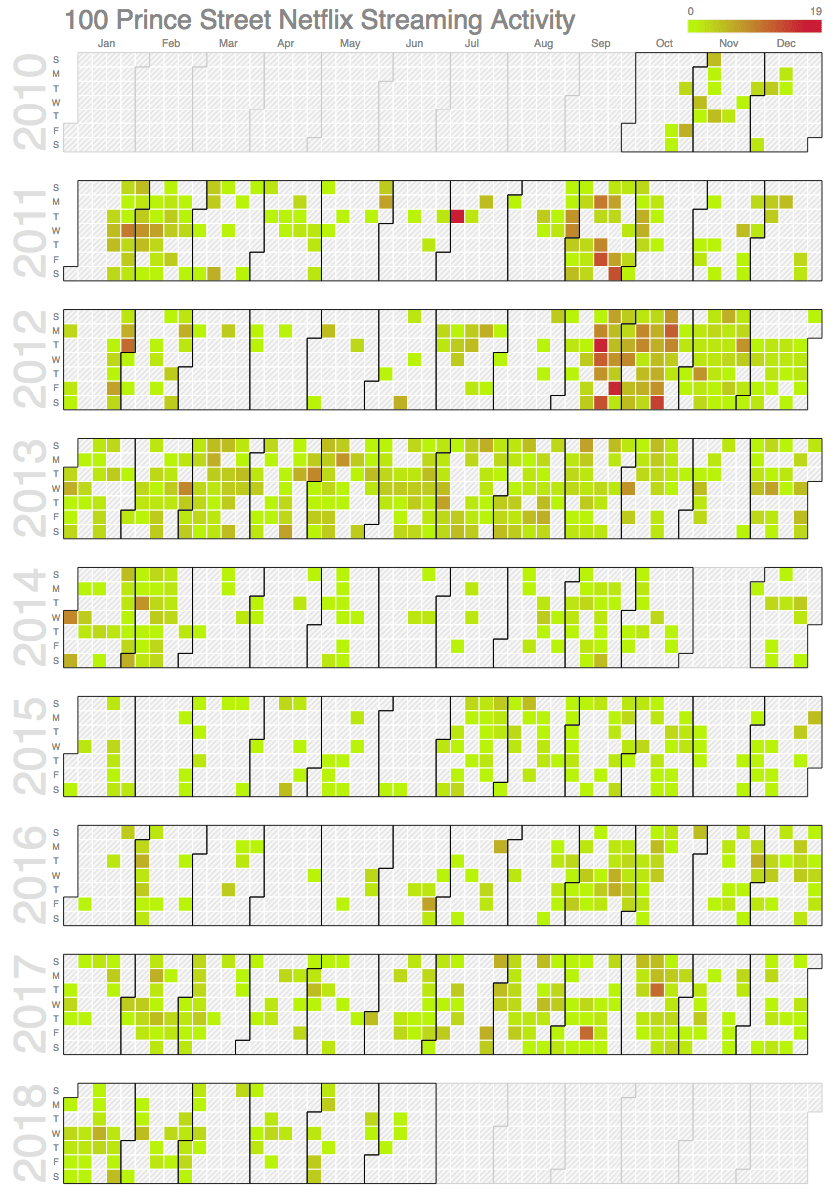
Continuing on from my earlier post about Personal Netflix Analytics, I decided that I wanted to be able to visualize our Netflix streaming activity on a calendar. Here’s how I did it.
I took the Netflix viewing activity CSV file I exported earlier, loaded it up into a spreadsheet, and copied only the dateStr column into a text file called dates.txt that looked like this:
2018-05-13
2018-05-12
2018-05-07
2018-04-30
2018-04-29
2018-04-29
2018-04-29
2018-04-10
2018-04-07
2018-04-07
and continued on for 2,641 lines.
I then used the very (very) useful uniq command, along with awk, to add frequency information to a file activity.txt:
uniq -c dates.txt | awk '{ print $2 "," $1}' > activity.txt
This file contains one row per date, with a second column indicating the number of streams watched that day, like this:
2018-05-13,1
2018-05-12,1
2018-05-07,1
2018-04-30,1
2018-04-29,3
2018-04-10,1
2018-04-07,4
2018-04-06,2
2018-04-05,4
2018-04-04,4
2018-04-02,2
2018-03-18,2
Next, using Google’s Calendar Chart example as my guide, I further massaged the data so that I could paste it into a chart-generating JavaScript:
awk -F'[-,]' '{print "[ new Date(" $1 ", " $2 ", " $3 "), " $4 " ],"}' activity.txt > activity.js
The results starts out like this:
[ new Date(2018, 05, 13), 1 ],
[ new Date(2018, 05, 12), 1 ],
[ new Date(2018, 05, 07), 1 ],
[ new Date(2018, 04, 30), 1 ],
[ new Date(2018, 04, 29), 3 ],
[ new Date(2018, 04, 10), 1 ],
[ new Date(2018, 04, 07), 4 ],
[ new Date(2018, 04, 06), 2 ],
[ new Date(2018, 04, 05), 4 ],
[ new Date(2018, 04, 04), 4 ],
[ new Date(2018, 04, 02), 2 ],
[ new Date(2018, 03, 18), 2 ],
[ new Date(2018, 03, 13), 1 ],
[ new Date(2018, 03, 11), 3 ],
[ new Date(2018, 03, 10), 2 ],
I then simply pasted this into the Google Calendar Chart example, replacing our Netflix history for the Boston Red Sox attendance data. I fiddled with the colour axis a little, and the result was this chart:

The colours in each day’s cell range from green to red; the more red, the more streams we watched that day. The minimum was 1 stream, the maximum, on June 5, 2011, was 19 streams (where someone in the family apparently watched an entire season of Running Wilde in one day).
Here’s a JSFiddle with the HTML and JavaScript so you can play with this, or use it as a basis for your own visualizations.
 I am
I am
Add new comment