
The BBC News website presented two different visualizations of yesterday’s UK elections.
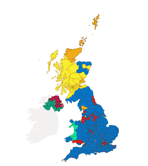
The first is strictly geographical, with the land area of each constituency accurately represented on the map:
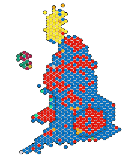
By flipping a switched at the bottom of the map you can see the same results rendered as a “cartogram,” which presents each constituency as the same geographic size, located in roughly the relative area of the country, but not geographically accurate:
The Guardian presented a similar treatment, with each constituency the same size, but presented in a more malleable, and thus more familiar form:
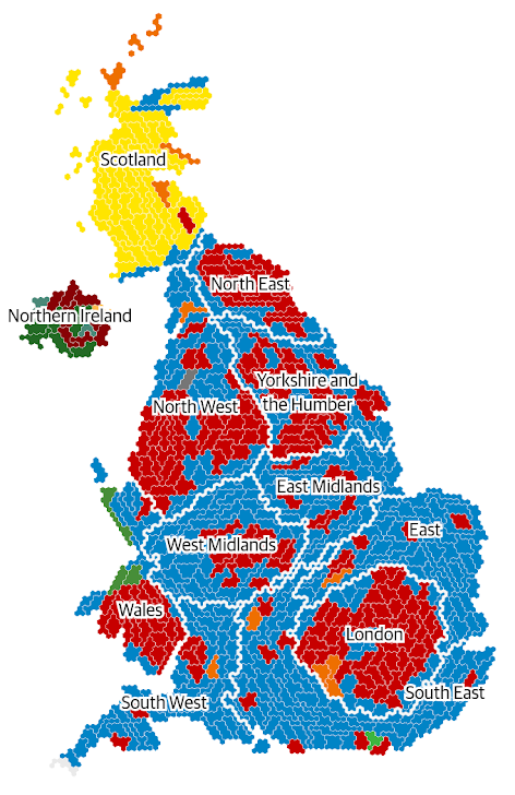
Because of differences in population density, the two approaches tell very different stories.
The Electoral Cartogram of Canada website presents a similar treatment for the 2019 Federal Election here in Canada; in this case, because of higher MP-to-population ratio in places like PEI, the Island has an outsized appearance.
About This Blog
 I am Peter Rukavina and this is my blog. I am a writer, letterpress printer, and a curious person.
To learn more about me, read my /now, look at my bio, listen to audio I’ve posted, read presentations and speeches I’ve written, see things I’ve favourited elsewhere, or get in touch (peter@rukavina.net is the quickest way).
I have been writing here since May 1999: you can explore the 25+ years of blog posts in the archive.
![]() You can subscribe to an RSS feed of posts, an RSS feed of comments, an RSS feed of favourites elsewhere, or a podcast RSS feed that just contains audio posts. You can also receive a daily digests of posts by email. I also publish an OPML blogroll.
You can subscribe to an RSS feed of posts, an RSS feed of comments, an RSS feed of favourites elsewhere, or a podcast RSS feed that just contains audio posts. You can also receive a daily digests of posts by email. I also publish an OPML blogroll.
Instagram • YouTube • Vimeo • ORCID • OpenStreetMap • Internet Archive • PEI.art • Drupal • Github.
Add new comment