Oddly enough for one like me with a career that’s all about patterns and systems, I’m notoriously bad at noticing patterns in my everyday life. Catherine still makes fun of the time, ten years ago, when I realized that sometimes the night sky was bright and sometimes it wasn’t (this despite having built a tool that demonstrates exactly why).
I am also notoriously bad at judging time — Johnny knows that if I say “I’ll be done in 10 minutes” I could emerge anywhere from 5 minutes to 2 hours later.
So if you asked me “what time do you usually arrive at the office,” any answer I’d come up with would be a crazy wild guess at best.
So I decided to find out.
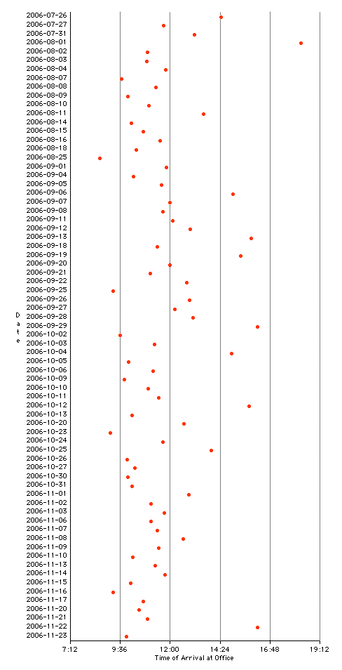
I used the Plazes API to pull a list of my arrival times at the Reinvented Office on weekdays for the past four months. I then charted my “first arrival of the day” on a chart (using AppleWorks of all things) and here’s what I came up with:

I am obviously completely unsuited for a traditional “9 to 5” job.
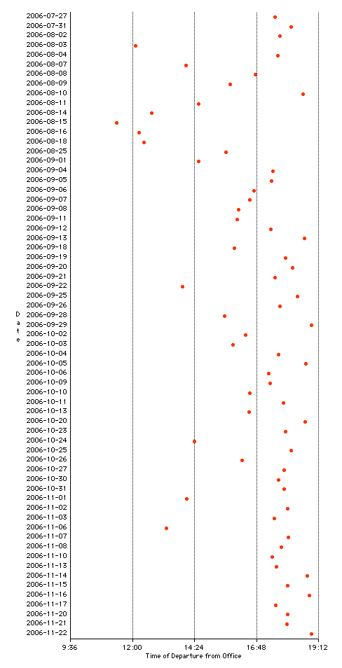
My work departure time is somewhat more consistent, mostly because there is usually a fixed point — 6:00 time for supper and Compass — to shoot for:

The same graph a year or two ago, when I was much less successfully making it home for dinner on time, often working night four or five times a week, would have trended much later in the day.
Of course someone more versed in statistics, and with better tools at hand, could apply trend-lines to the data, and deduce something approximating an answer to the “usual arrival time” question. I’m content, for now, to leave it as a jumbly series of red dots.
 I am
I am
Comments
Could you bin that data and
Could you bin that data and show us the histogram? The data on top looks like it would come out Poisson (not a Gaussian or “Bell”), and the shape of your distribution can tell you a little about the process—in this case, the process of you getting to work. Poisson statistics would suggest a kinship to radioactive decay (which is not to suggest that people ought to limit their exposure to you in the early morning).
“Bin that data and show us
“Bin that data and show us the histogram.” Please explain.
Oddly fascinating. I would
Oddly fascinating. I would like to see both the arrival and departure dots for each day on the same chart, with a line connecting them - so the *amount* of time spent at work is easily visible as well.
I’d like to see your lunch
I’d like to see your lunch locations and times plotted as well.
Binning is what you’re doing,
Binning is what you’re doing, in effect, when you issue letter grades for a multiple choice exam. You put scores of 90 to 100 in a bin called “A”, 80 to 90 in bin called “B”, etc. A histogram is a bar graph of these bins arranged in their natural sequence (e.g. F,D,C,B,A), and it’s what you’re liable to see on your teacher’s door after the exam. The height of the B bin tells you how many students earned a B, for example, and based on how much taller or shorter it is than the A, C, D and F bins, it shows what proportion of the class those B students represent. In that scenario you have just five “fat” bins. But you could grade and graph the same students in thirteen skinnier bins called F,D -, D, D+,C-, C, C+, etc. Your teacher won’t post on the door a histogram like that, and won’t “curve the grades” from it either, if you have less than a couple dozen students covering a wide range of scores. It will be lumpy, gappy and untidy, making it difficult to superimpose a bell curve, and suggesting, furthermore, that this exam didn’t test what students thought they were supposed to study and learn. So you choose the width of your bins according to how much data you have and how spread out it is. At least, you do that if you want to see what shape of curve would nicely superimpose. The distance of various bullet holes from a bulls eye produces a bell shape. But if you draw a circle on the wall where somebody sprayed machine gun fire; and you draw another and another the same size different places on the wall; and you count the bullet holes in each circle; and then bin their scores, you’ll have a Poisson, I believe. Larger circles and/or drawing them on a more densely shot-up wall would give you a bell curve again.
Next week: The Italian
Next week: The Italian Renaissance.
Add new comment