
One of the magazines I remember being around my parents’ living room when I was a kid was Toronto Life. We lived about 90 minutes from Toronto, and because we were up high on the Niagara Escarpment, the city frequently presented itself as a Oz-like vision in the far distance. The magazine was a look inside that Oz, and I found myself unusually engaged with it, an engagement which has stayed with me, even though Toronto is now 24 hours drive away.
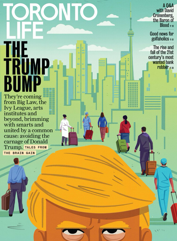
That, and being a student of magazine design, make me particularly interested in the rebranding that was launched in the latest issue. Here’s the before (left) and the after (right):
 | 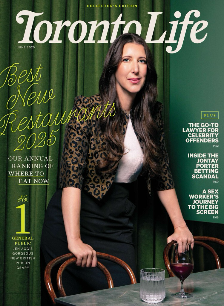 |
The editor explains the “new” logo in the latest issue:
The task of capturing this spirit in a logo fell to Toronto Life’s art director, Colleen Nicholson, and Commercial Type’s Christian Schwartz, who were inspired by the magazine’s debut. The inaugural cover, from 1966, featured Barbara Amiel, then a young writer and budding society fixture, under an orange logo featuring a bohemian “T,” a renegade rainbow “r” and a dignified uptown “L.”
I had some affection for the just-departed design, but the new one is growing on me.
(A reminder: if you’re an Apple News+ subscriber you can read Toronto Life there.)
About This Blog
 I am Peter Rukavina and this is my blog. I am a writer, letterpress printer, and a curious person.
To learn more about me, read my /now, look at my bio, listen to audio I’ve posted, read presentations and speeches I’ve written, see things I’ve favourited elsewhere, or get in touch (peter@rukavina.net is the quickest way).
I have been writing here since May 1999: you can explore the 25+ years of blog posts in the archive.
![]() You can subscribe to an RSS feed of posts, an RSS feed of comments, an RSS feed of favourites elsewhere, or a podcast RSS feed that just contains audio posts. You can also receive a daily digests of posts by email. I also publish an OPML blogroll.
You can subscribe to an RSS feed of posts, an RSS feed of comments, an RSS feed of favourites elsewhere, or a podcast RSS feed that just contains audio posts. You can also receive a daily digests of posts by email. I also publish an OPML blogroll.
Instagram • YouTube • Vimeo • ORCID • OpenStreetMap • Internet Archive • PEI.art • Drupal • Github.
Add new comment