
Of all the things I’ve designed, set and printed for letterpress, this might be my favourite: a Prince Edward Island postcard.
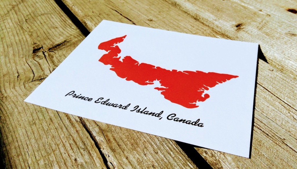
The outline of the Island comes from the collection of letterpress cuts passed on to me by Ian Scott and Daphne Large.
The typeface is a font of Kaufman Bold one that artist Jennifer Brown pulled out of her garage for me, helpfully sorted for use by Christina Clorey. McGrew describes the face, designed by Max R. Kaufmann for American Type Founders in 1936, as having a “contemporary look and high degree of legibility,” which is certainly a quality we should all aspire to in all regards (you may recognize it from “with David Letterman” on the marquee of the Ed Sullivan Theatre in New York City).
On the reverse side–this is a postcard, after all, and deserved the usual accoutrements–is a “Printed on a 1915 Golding letterpress in Charlottetown” caption, a line-rule down the middle to separate message from address, and a box to indicate where the stamp should go:
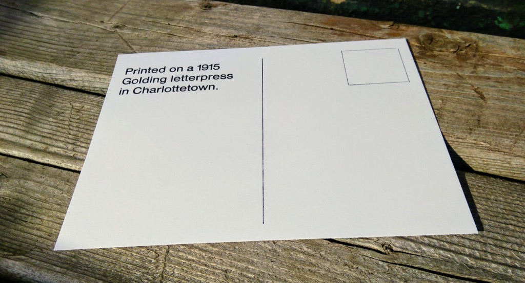
With two sides, and two colours, each postcard took three trips through the Golding Jobber № 8 letterpress to complete. I printed a set of 75, and am pondering what the most appropriate venue for distributing them is.
About This Blog
 I am Peter Rukavina and this is my blog. I am a writer, letterpress printer, and a curious person.
To learn more about me, read my /now, look at my bio, listen to audio I’ve posted, read presentations and speeches I’ve written, see things I’ve favourited elsewhere, or get in touch (peter@rukavina.net is the quickest way).
I have been writing here since May 1999: you can explore the 25+ years of blog posts in the archive.
![]() You can subscribe to an RSS feed of posts, an RSS feed of comments, an RSS feed of favourites elsewhere, or a podcast RSS feed that just contains audio posts. You can also receive a daily digests of posts by email. I also publish an OPML blogroll.
You can subscribe to an RSS feed of posts, an RSS feed of comments, an RSS feed of favourites elsewhere, or a podcast RSS feed that just contains audio posts. You can also receive a daily digests of posts by email. I also publish an OPML blogroll.
Instagram • YouTube • Vimeo • ORCID • OpenStreetMap • Internet Archive • PEI.art • Drupal • Github.
Comments
I love this. I would actually
I love this. I would actually buy and send such a postcard to friends abroad when I am home if I saw this in a store display.
I'm looking to buy pei post
I'm looking to buy pei post cards before I leave pei tomorrow am ,where can I but them .
Add new comment