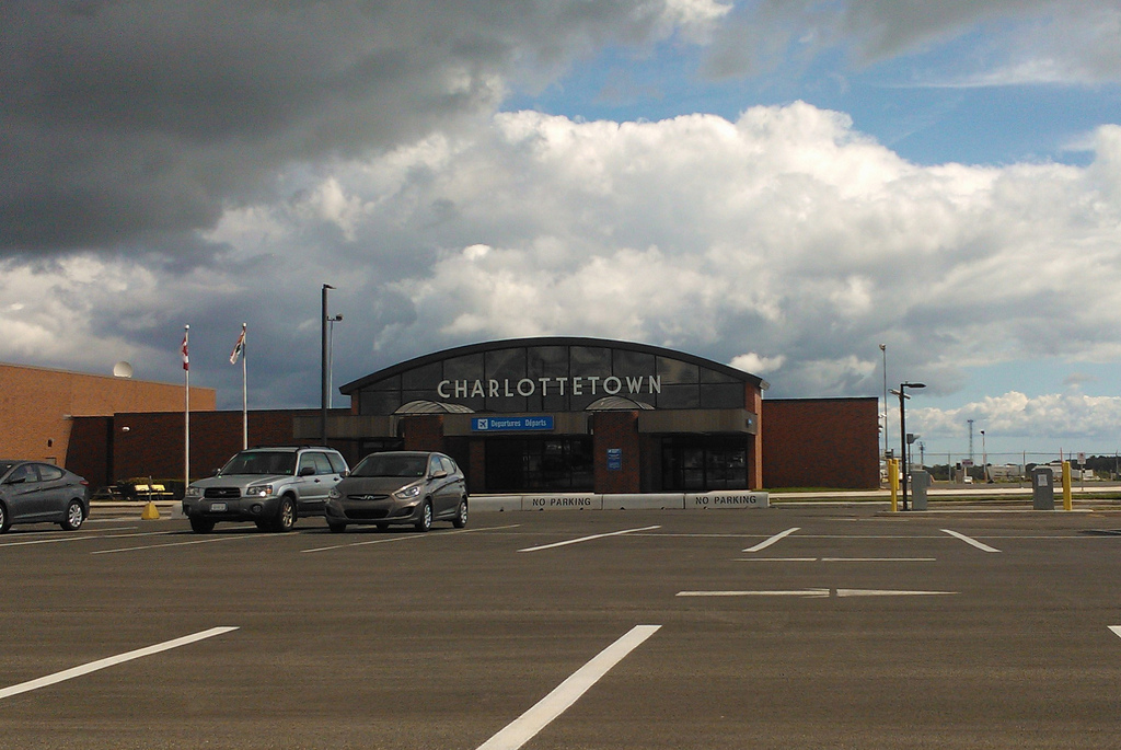
Charlottetown Airport has recently gone through an expansion of the departures area, and this has involved, in part, a redesign of the departures entrance, complete with a new sign.
The design work was by N46, which confirmed for me that the typeface is Market Deco, with a custom “R.” I think it’s perfect for this situation: simultaneously modern and classic, well-proportioned under the arch above it, and a fine signature for the airport. Bravo.
(If the typeface looks familiar to you, take a look at the sign above the Pike Place Market in Seattle; it’s the same face).

 I am
I am
Add new comment