
One small tweak to my experiments with Plazes and NetworkX results in much, much clearer and useful network diagrams (and ones that render in seconds rather than hours): I removed from the graph any node (i.e. any Plazes friend) who has no friends of their own. This means that if I say “you’re my friend,” but you don’t reciprocate, and you don’t have any friends of your own, you don’t show up on the graph. This has the pleasant effect of leaving in place only more “active” Plazes users, who have friends of their own. By separating the wheat from the chaff, so to speak, the true nature of the network is much easier to see. I’ve also modified the graph so that the size of a user’s node is proportional to the number of friends they have. Here’s the graph that results for me:
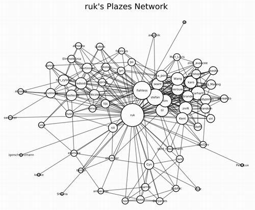
This graphic is actually more than the sum of its parts (rather than an unintelligible rat’s nest of connections): you can clearly see my reboot network (top left), my Plazes crew (top right) and my tiny local network (along the bottom).
You can grab the updated Python code yourself if you want to take this for a ride.
About This Blog
 I am Peter Rukavina and this is my blog. I am a writer, letterpress printer, and a curious person.
To learn more about me, read my /now, look at my bio, listen to audio I’ve posted, read presentations and speeches I’ve written, see things I’ve favourited elsewhere, or get in touch (peter@rukavina.net is the quickest way).
I have been writing here since May 1999: you can explore the 25+ years of blog posts in the archive.
![]() You can subscribe to an RSS feed of posts, an RSS feed of comments, an RSS feed of favourites elsewhere, or a podcast RSS feed that just contains audio posts. You can also receive a daily digests of posts by email. I also publish an OPML blogroll.
You can subscribe to an RSS feed of posts, an RSS feed of comments, an RSS feed of favourites elsewhere, or a podcast RSS feed that just contains audio posts. You can also receive a daily digests of posts by email. I also publish an OPML blogroll.
Instagram • YouTube • Vimeo • ORCID • OpenStreetMap • Internet Archive • PEI.art • Drupal • Github.
Add new comment