
This is A Month of Days, a project I’ve been working on for the last month:
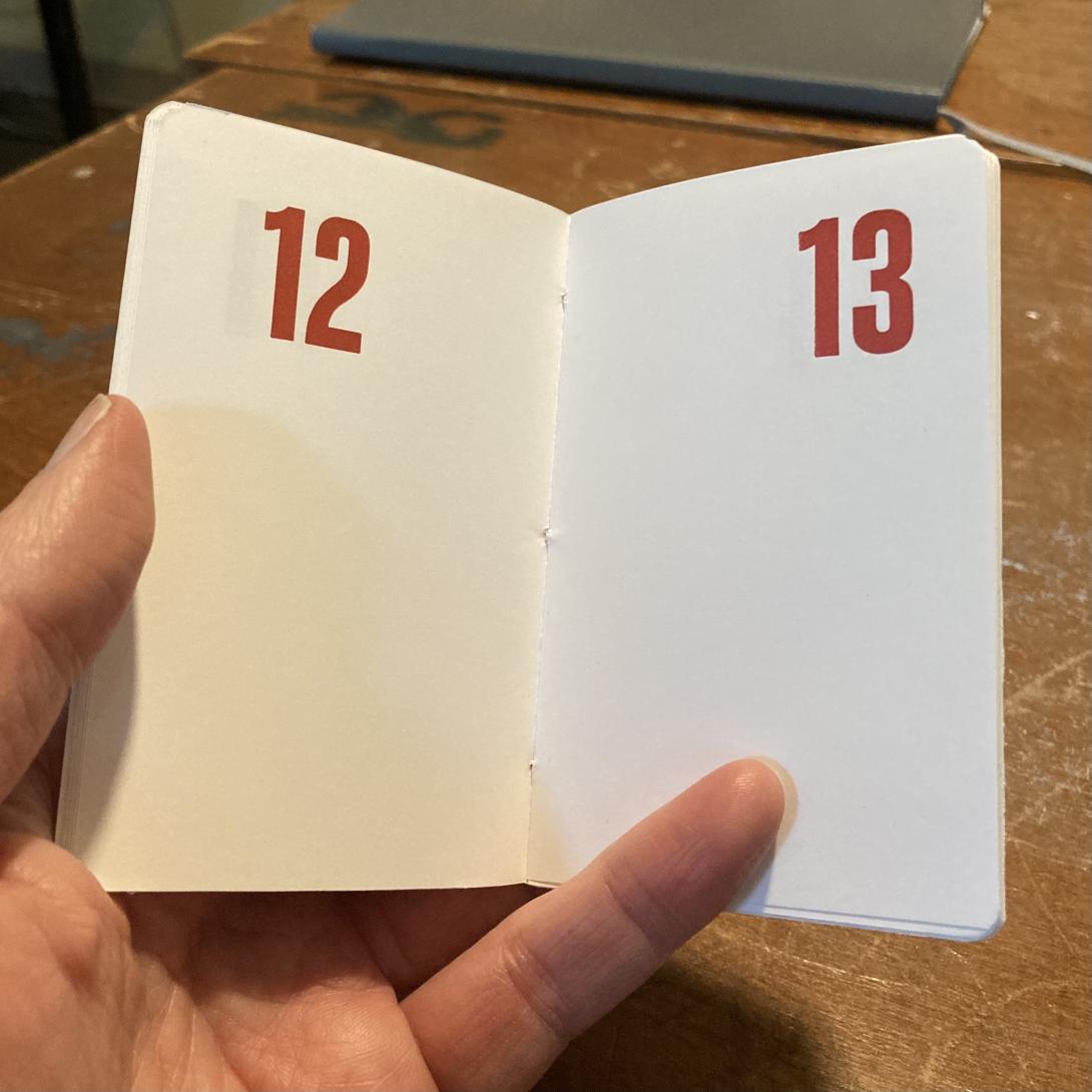
It’s the simplest of all date books: a page per day, numbered in the corner in big bold red Akzidenz Grotesk:
The books are simple; the printing, assembly, and binding were simple steps too, there were just a lot of them.
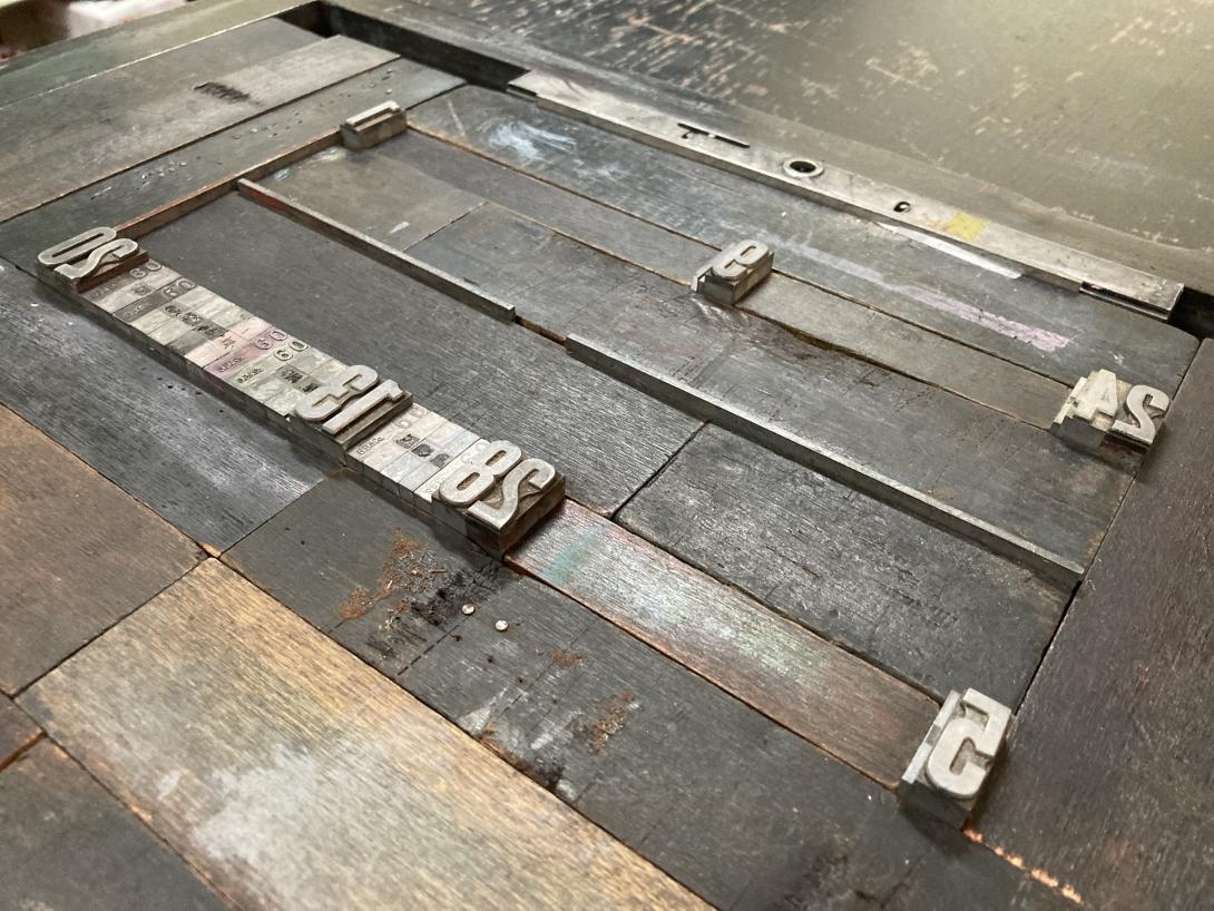
I first had to figure out how to print the numbers on the pages in a way that I could cut and fold larger pages down into signatures that would be paged in the right order.
I made a couple of mock-ups before I got everything sorted, and then set out to set the type for each spread of pages:
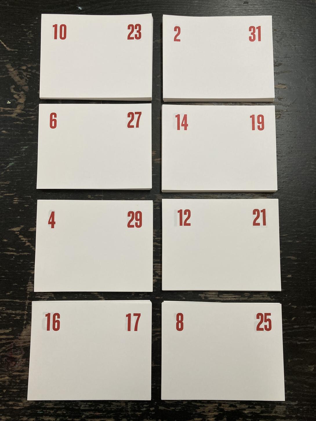
From there it was a lot of printing, setting new numbers for a new spread, and cutting down pages into signatures, a process that resulted in this collection:
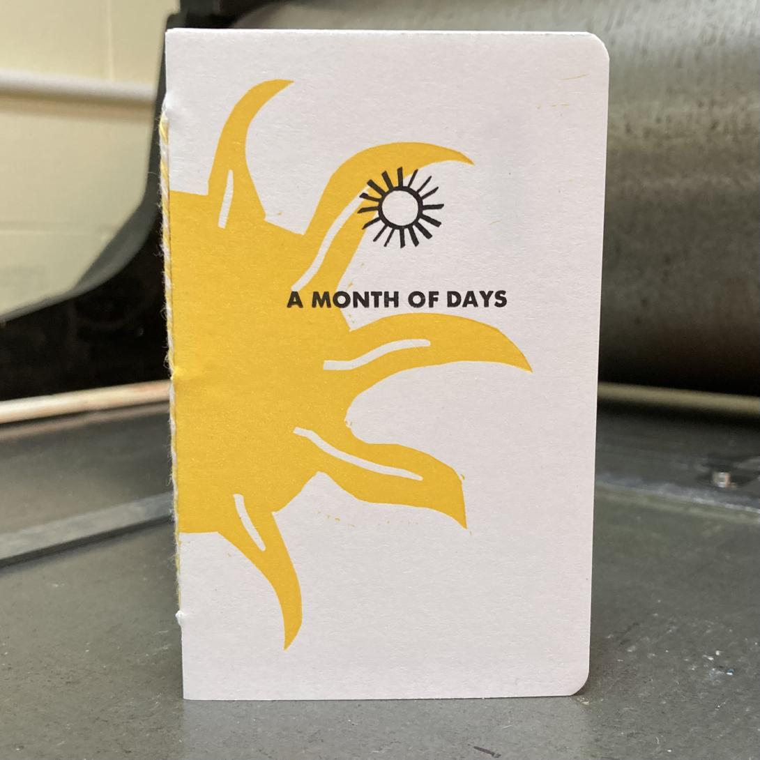
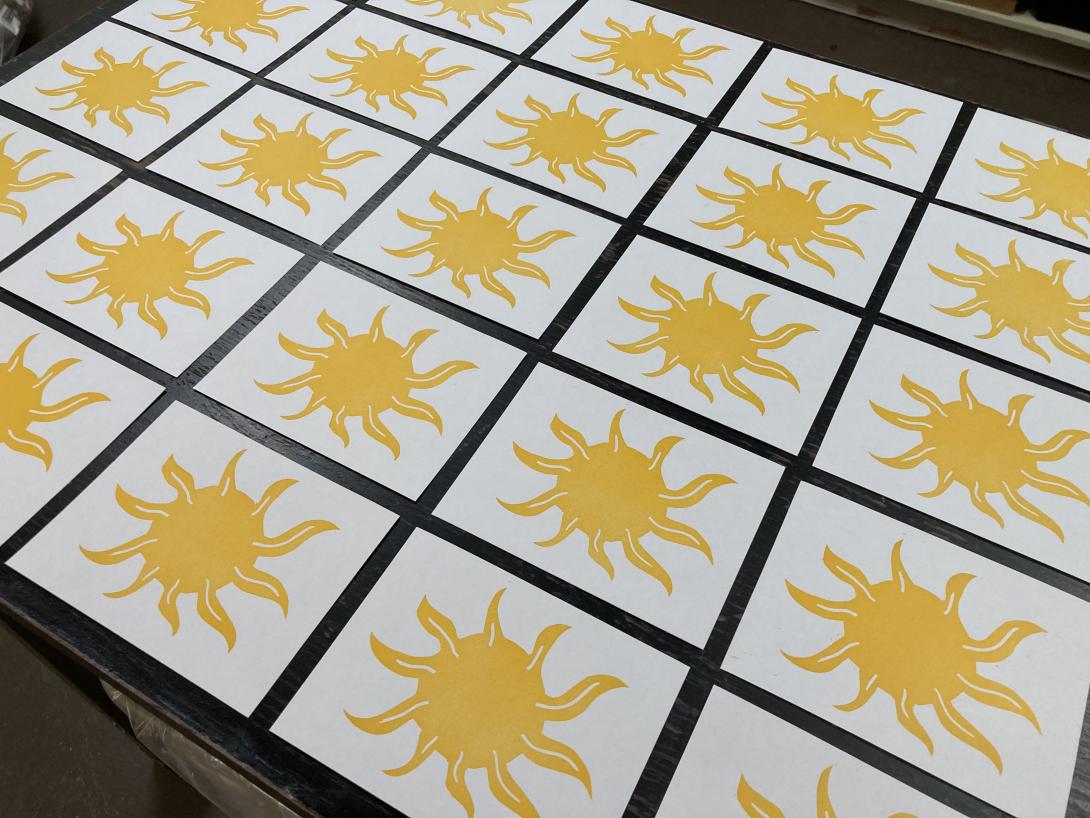
With the pages printed, I set out to design and print a cover. We’ve recently come into the loan of an etching press, and I was keen to try it out, so I carved a lino block of an abstract sun:
I chose a rich Akua Diarylide Yellow ink for the printing, and ran the block through the press on notebook-sized pieces of card stock, to produce:
When the suns had dried, I used the letterpress to print the “fronts” and “backs” of each cover:
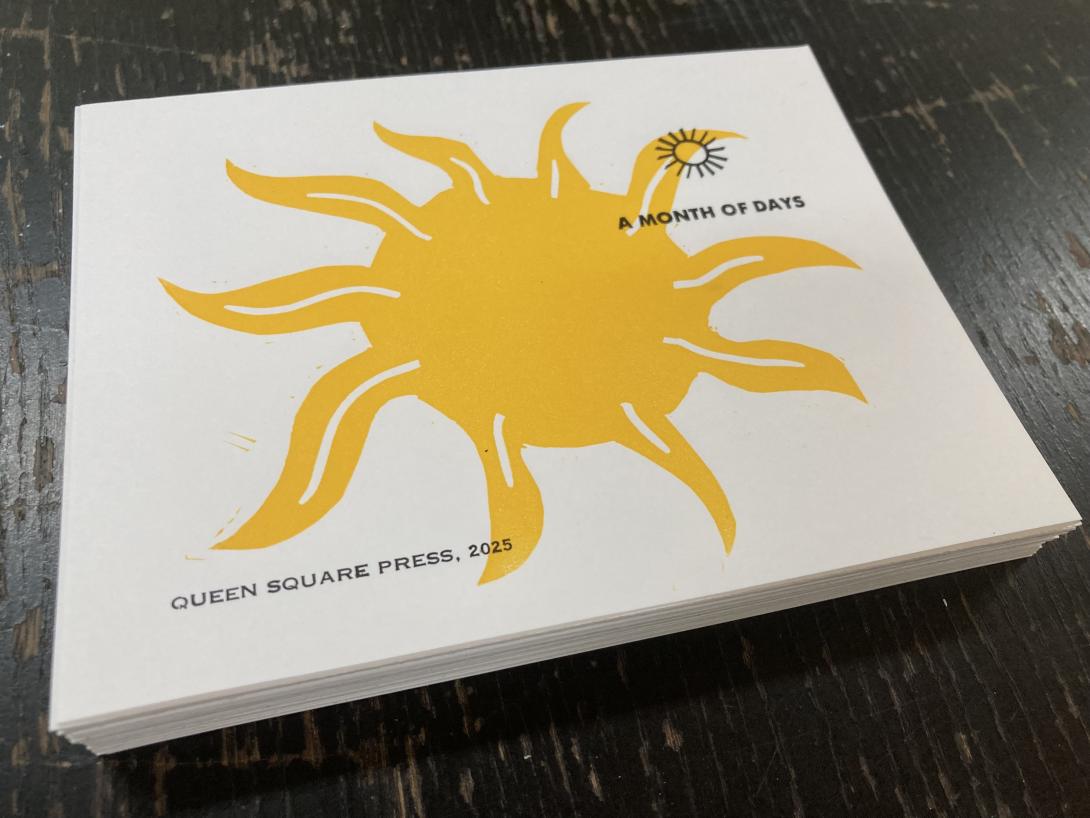
The “A Month of Days” in all caps is from a font of a tiny perfect sans-serif typeface that I acquired somewhere along the way. Above it is an ornament is by Johannes Troyer, circa 1953, cast from the original matrices by Skyline Type Foundry.
On the back is the credit “Queen Square Press, 2025” set in very tiny and fiddly 6 point Spartan, from a font I inherited from Prince County Hospital many years ago.
With the pages and covers printed and dried, all that was left was the assembly: the cover, and each page, got scored and folded, collated into a “book,” and then punch, with an awl, in three places along the spine. I then bound the books together with a simple pamphlet stitch, using bakers twine, and put them overnight in the nipping press to settle.
The final step was to trim the edges, and round the corners:
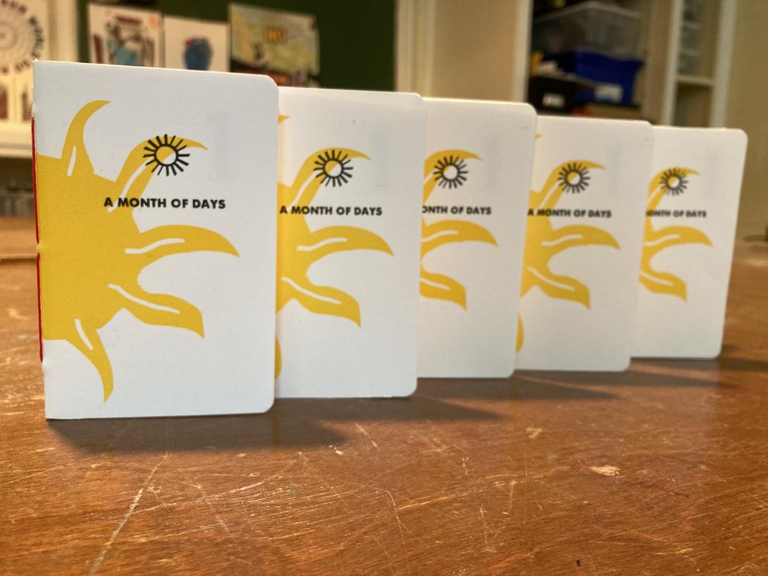
I’ve made a limited edition of 50 notebooks, and they’re available for sale on our online shop now.
About This Blog
 I am Peter Rukavina and this is my blog. I am a writer, letterpress printer, and a curious person.
To learn more about me, read my /now, look at my bio, listen to audio I’ve posted, read presentations and speeches I’ve written, see things I’ve favourited elsewhere, or get in touch (peter@rukavina.net is the quickest way).
I have been writing here since May 1999: you can explore the 25+ years of blog posts in the archive.
![]() You can subscribe to an RSS feed of posts, an RSS feed of comments, an RSS feed of favourites elsewhere, or a podcast RSS feed that just contains audio posts. You can also receive a daily digests of posts by email. I also publish an OPML blogroll.
You can subscribe to an RSS feed of posts, an RSS feed of comments, an RSS feed of favourites elsewhere, or a podcast RSS feed that just contains audio posts. You can also receive a daily digests of posts by email. I also publish an OPML blogroll.
Instagram • YouTube • Vimeo • ORCID • OpenStreetMap • Internet Archive • PEI.art • Drupal • Github.
Add new comment