Every weekend I continue to bluster away on my Adana Eight Five letterpress, each time learning, by trial and error, a little more about how paper and ink and type and pressure relate. And each time I learn how much I don’t know, and how much I need to learn simply by rinsing and repeating, over and over and over.
The hard part of letterpress, I’ve learned, is what’s called the makeready. This is the time after you’ve set the type, but before you start running off “good copies.” In computer programming it would be called the “debugging.” And as with debugging, it can consume a lot of time.
British Letterpress has a good introduction to the term; they write, in part:
[M]akeready is the process of ensuring that each part of the forme receives sufficient ink and pressure to satisfy its individual requirement. Bold, solid areas of type or blocks need more ink-and more pressure-than do light, delicate areas.
Simple enough. But achieving this, especially when, like me, you’ve both a limited array of equipment and supplies and a limited amount of knowledge, is a slow slog.
Mostly this is because the materials of letterpress – type, leading, furniture, chase – are all subject to wear and tear and thus amounts of “inexactness” that need compensating for.
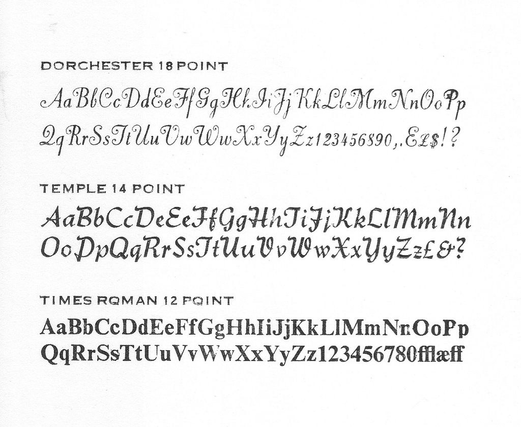
Take a look at this type sample I printed tonight, for example:

This proof is one I printed after perhaps 30 minutes of fussing about, and it’s still far for perfect.
Look at the upper case P in the top line of the Dorchester section, for example: in this typeface the upper case P has a slight overhang that extends over the right edge of the body and, in this case, overlays the body of the lower case P. The effect of this – likely because of wear and tear and accumulated cruft – is to push the P up slightly resulting in a different amount of ink and pressure than the letters before and after. And so, as you can clearly see, it’s too dark. As this is my only upper case P in this font, I’m kind at a loss as to what to do, other than too (somehow) bring its sister letters up to meet it.
Another issue on this same sample is on the top line of the Times Roman section: notice the incomplete printing of the “NnOoPp” letters. This case is a little easier to handle: it seems easier to add pressure than it is to take it away, and one quick hack I’ve found for this is to stick a layer of sticky tape on the tympan (the layer of oiled paper onto which the paper to be printed is set). Many times this seems to be just enough to add the right amount of pressure; in this case I’ve still a way to go in this regard, but it’s a lot better than when I started.
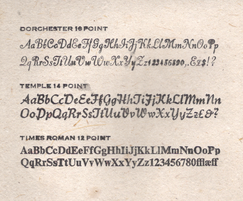
As another experiment – I’d seen it suggested on places like Briar Press – I tried moistening the paper I was to print on before putting it on the press. To do this I consolidated a collection of Windex bottles to free one up, and then lightly spritzed some water on the paper; for this test I used some straw paper I bought at HazelTree this morning. Here’s what resulted:

I seem to have used a little too much water for my own good but, that said, the effect was rather dramatic: the water loosened up the paper such that the type could “bite in” much more effectively. Because of the different faces in the sample, the effect of this was alternatively good and bad: the Dorchester suffered for it, the Temple looks slightly better, and the Times Roman (truth be told it’s Times Roman Bold) was much improved. Some further experimenting with this technique is in order; I may need a more effective (i.e. less rain-like) way of moistening.
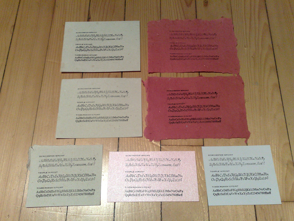
I ended up printing about 2 dozen versions of the type sampler on various weights and types of paper. Here are seven of the most interesting examples:

My favourite, if only because it’s the least likely, was the pink card stock (it’s shiny and has a styrofoam-like quality): it took the ink quite well, especially for the Times Roman.
Learning letterpress is very reminiscent of learning computer programming, another trade in which I’ve no formal education: it’s all about test and iterate, test and iterate. See what works and what doesn’t, and evolve.
Fortunately, like with programming, there’s a good body of guidance on letterpress, both historic and contemporary. There is, however, no substitute for the slog. Which is why if you look in the window at Reinvented HQ on the weekends you’ll likely see my hunched over a case of type or up to my elbows in Varsol.
 I am
I am
Add new comment