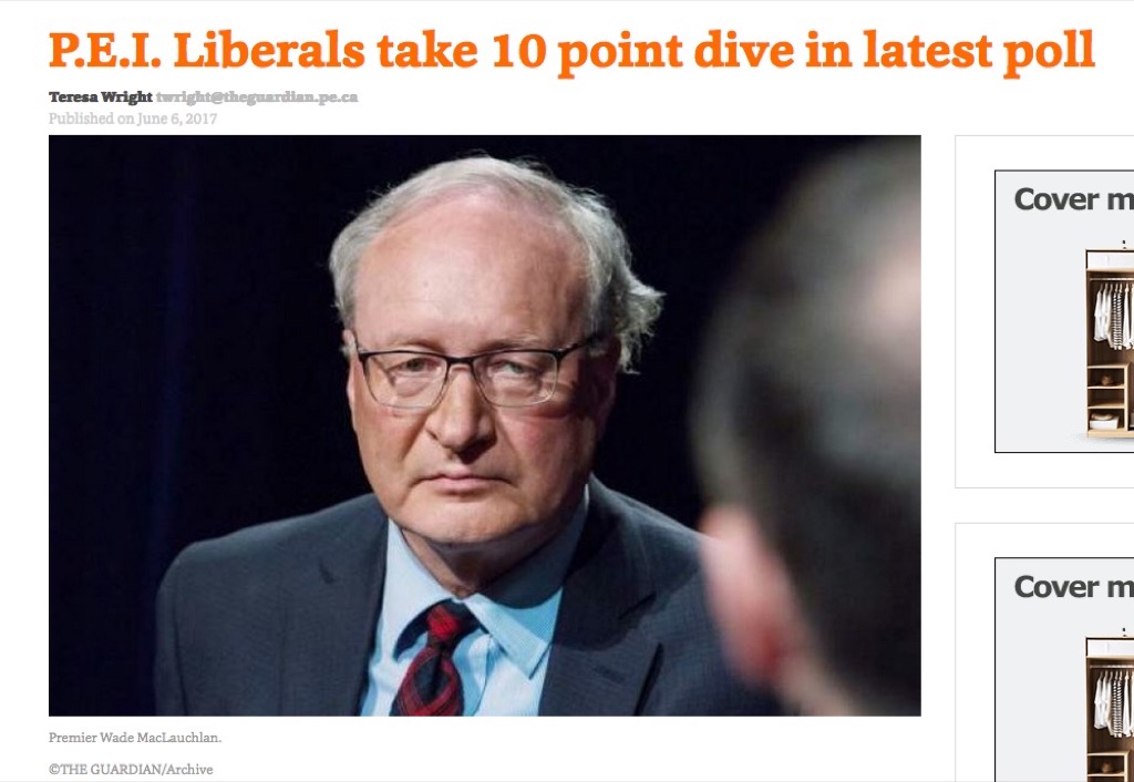
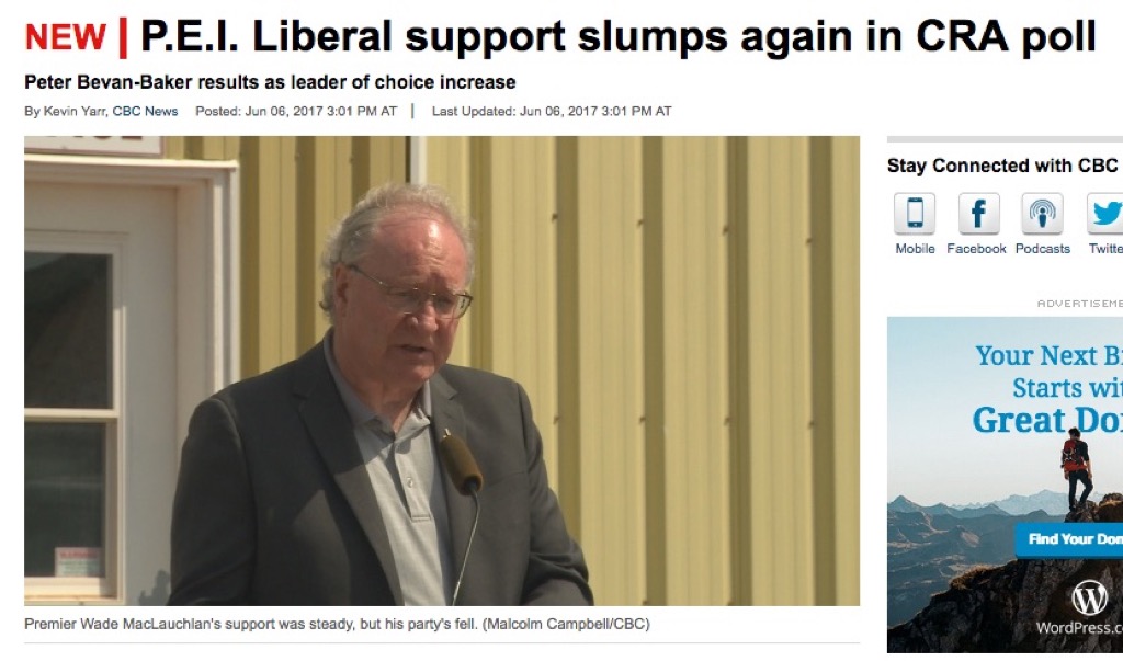
The polling firm CRA released its latest survey of Prince Edward Island voters today, and both the CBC (P.E.I. Liberal support slumps again in CRA poll) and The Guardian (P.E.I. Liberals take 10 point dive in latest poll) ran stories highlighting the decrease in support for the governing Liberals and their Premier Wade MacLauchlan. In both cases, they use what might be charitably called “pained” photos of the Premier to illustrate the stories:


Earlier in the week I learned about an interesting Mozilla Learning project called Hack the News and the X-Ray Goggles bookmarklet that powers it, which allow one to learn about the web by remixing the web. I used this opportunity to explore how the photos that the media used to illustrate their stories have their own politics.
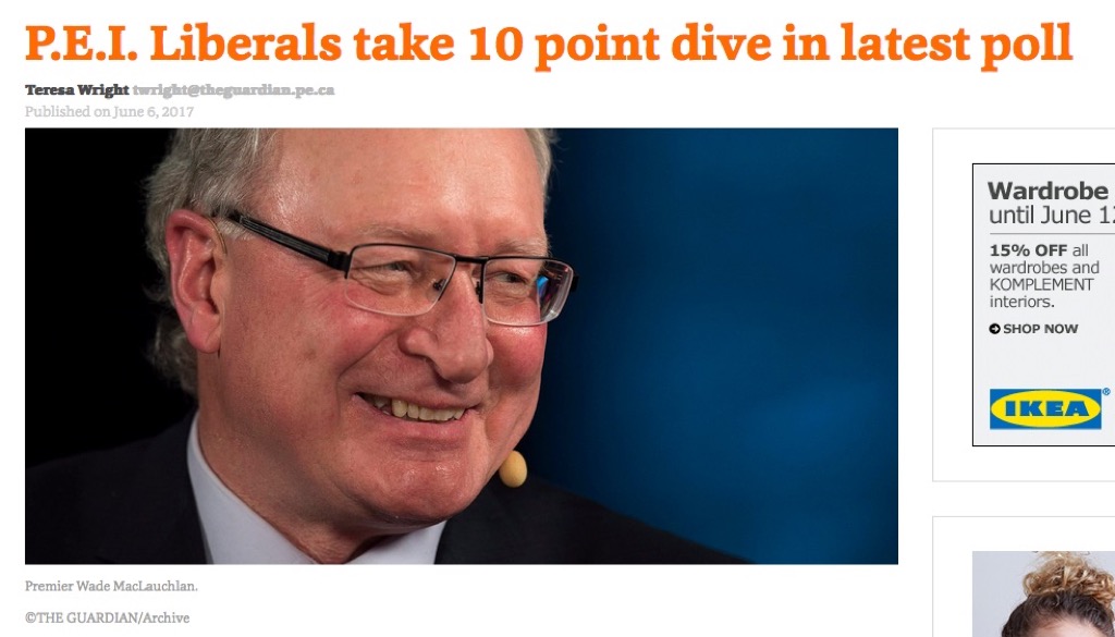
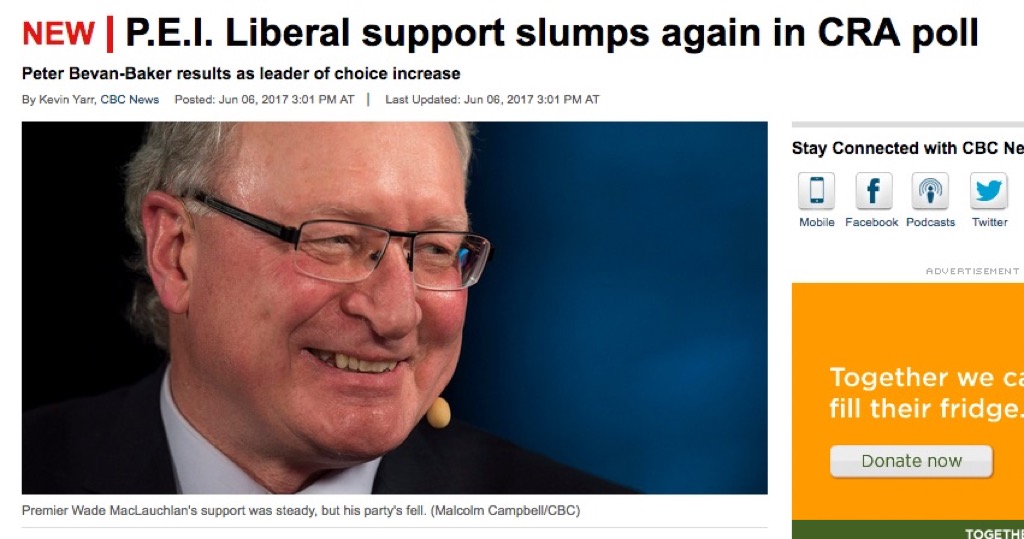
So I found a decidedly less-pained-looking photo of the Premier in the Huffington Post, and dropped it into the CBC and Guardian stories about the CRA poll to get a sense of whether a happier photo changed the way I interpreted the story:


I don’t know about you, but for me the change is palpable: the original stories become stressful to look at by comparison.
I’m not suggesting that the happy-Premier photo is a better choice to illustrate these stories–it’s as dishonest as the photos that were used.
In neither the CBC’s case nor The Guardian’s was the photo used an actual photo of the Premier actually reacting to the actual results of the poll: both are “file photos” and, as such, represent a variant of the same danger represented by using stock photography to illustrate stories that I’ve written about before.
Photography in news stories should be used to enhance the journalism, and, as such, it’s important that photos used bear some relationship to the subject matter of the story; in today’s stories the CBC used a photo taken two weeks ago and The Guardian used a file photo that’s been used as far back as 2015.
I’ve no doubt that the Premier isn’t cracking open Champagne about today’s poll results, but I don’t know that for a fact; that the photographs used in these stories suggest an emotion, where the reporting doesn’t, is wrong, and they should be removed.
 I am
I am
Add new comment