I start with a list of the months, in a text file, months.txt:
JANUARY

FEBRUARY

MARCH

APRIL

MAY

JUNE

JULY

AUGUST

SEPTEMBER

OCTOBER

NOVEMBER

DECEMBER
Using my text editor–Sublime in my case, but you can use anything that supports find-and-replace with regular expressions, I replace:
(.)
with:
$1\n
In other words, I replace every letter with that letter followed by a carriage newline.
Which results in:
J

A

N

U

A

R

Y
F

E

B

R

U

A

R

Y
M

A

R

C

H
A

P

R

I

L
M

A

Y
J

U

N

E
J

U

L

Y
A

U

G

U

S

T
S

E

P

T

E

M

B

E

R
O

C

T

O

B

E

R
N

O

V

E

M

B

E

R
D

E

C

E

M

B

E

R
Finally I use some sort and uniq magic to product a frequency count:
# sort months.txt | uniq -c

  11

   7 A

   5 B

   3 C

   1 D

  11 E

   1 F

   1 G

   1 H

   1 I

   3 J

   2 L

   5 M

   3 N

   3 O

   2 P

   9 R

   2 S

   3 T

   6 U

   1 V

   4 Y
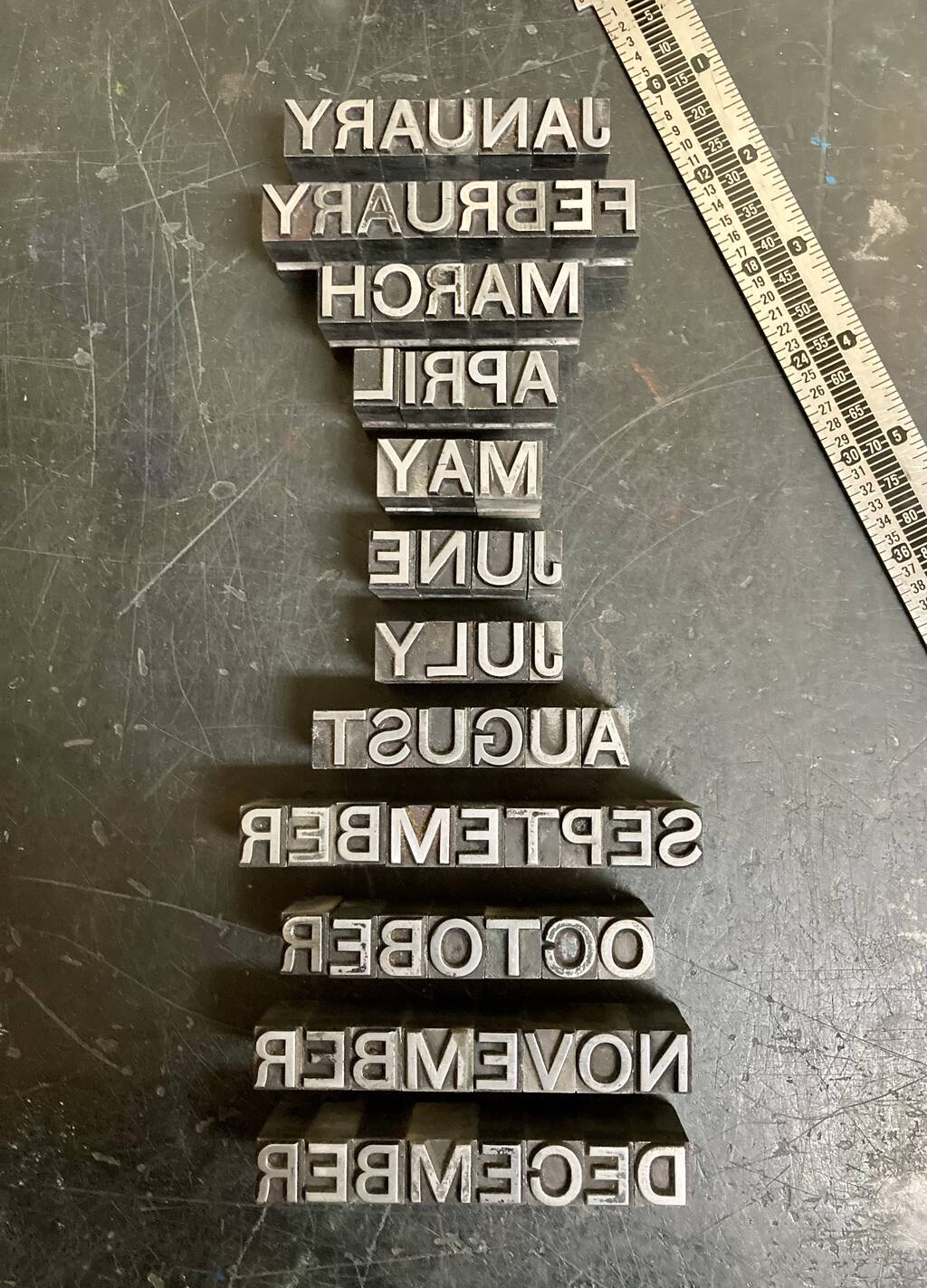
I’m now set to set type, knowing I need a font with at least 11 Es, 9 Rs, and so on.
And here’s the result:

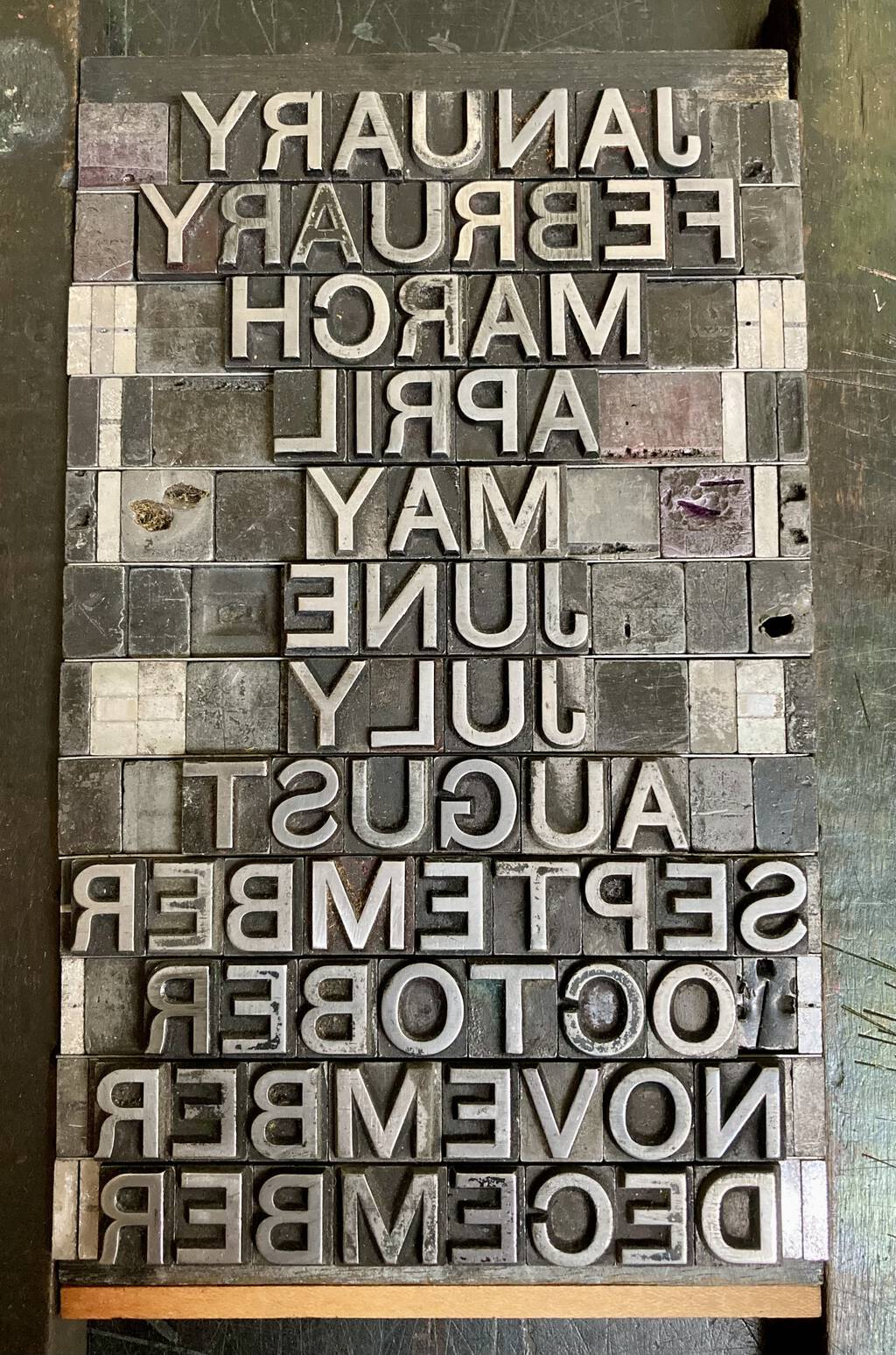
Driven to a rectangle (where, as it turns out, the real shortages–of space material–emerged):

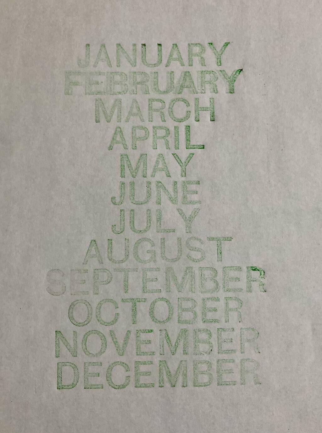
And a proof pulled:

 I am
I am
Comments
Very effective inventory prep
Very effective inventory prep. Regarding the font, the 'J' is quite narrow and positioned near the 'U' makes the latter look very wide/fat.
It would surprise me if there has not been a typesetter somewhere, finding themselves short of spacers, thought of attempting the start of a movement to revise spellings of May, June and July, possibly April, to bring more word-length consistency. Apriling (two l's?), Maymish, Junery, Julyful.
This is the second thought I had in this vein recently. A few months ago I posited to myself and Twitter that they should be Pumpkins and Squashkins. This might be a more gainful movement than editing the months.
I am perplexed by the J in
I am perplexed by the J in this typeface (which seems like Helvetica otherwise): it’s a weird outlier.
A solution: write the names
A solution: write the names of the months in Italian
May becomes Maggio, June, Giugno, July, Luglio.
Thus, more letters.
Add new comment