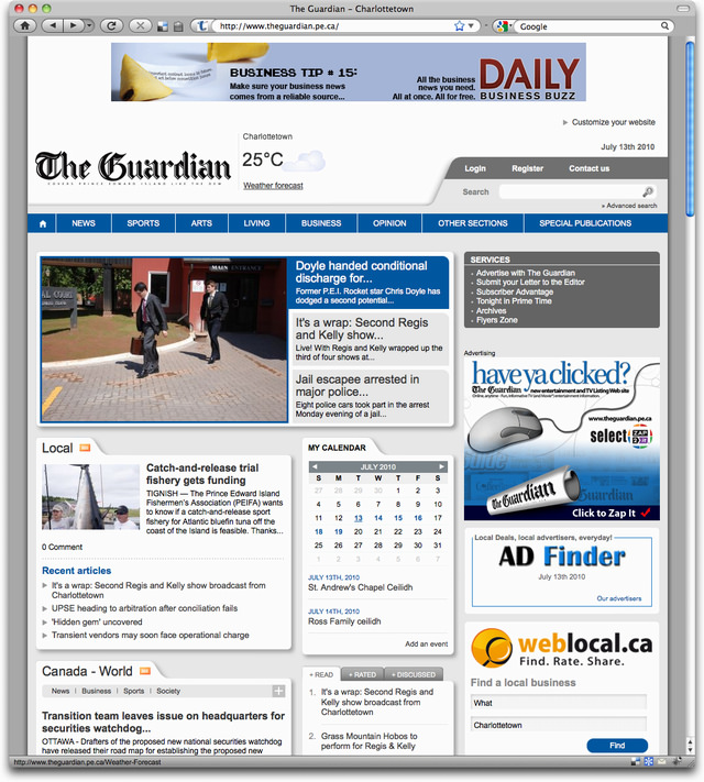
The Charlottetown Guardian released a new design for its website today. Here’s what it looked like before:

And here’s the new version:

The Charlottetown Guardian released a new design for its website today. Here’s what it looked like before:

And here’s the new version:

Comments
Not a terrible redesign, but
Not a terrible redesign, but they need to lose the pagers on individual articles. Eg:
http://www.theguardian.pe.ca/N…
They’ve managed to stuff an
They’ve managed to stuff an unbelievable amount of non-information on every page, not to mention leading with an ad rather than the actual page header is very Geocities, circa 1997, when websites were free with a catch.
Add new comment