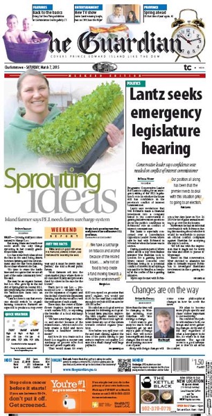
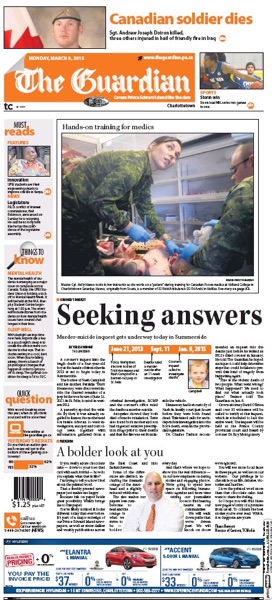
The Charlottetown Guardian unveiled its new design this morning, part of a redesign of all of parent company TC Media’s local newspapers called “Project Orange” internally. On the left is Saturday’s pre-redesign cover; on the right is this morning’s newly-orange front:
 |
 |
It’s an interesting – and somewhat bizarre – move to paint all the company’s papers with the same orange brush (the exception is the Journal-Pioneer in Summerside which is turning blue instead of orange), especially given that one of The Guardian’s strengths locally has always been that, despite its rotating cast of parent companies, it’s always been strongly identified as a local paper, not an “outlet” of a corporate brand.
That this morning’s Guardian looks an awful lot like this morning’s Telegram in far-away St. John’s might make sense of some sort of corporate synergasm way, but I’m not sure why it’s required or even preferable when looked at from the ground. Doesn’t our community deserve a newspaper designed and built by Islanders for Islanders? What’s the upside for the reader in brand unification?
There’s also the issue of the web and the attention span: the redesign brings with it a collection of the short and snappy – the “quick questions” and the “things to know” and related factoid boxes – and an aversion to the beautiful grey expanse of type the defined The Guardian – and newspapers in general – for a good part of their lifetime. The aversion to grey isn’t new here, of course, and it’s not unique to TC Media: big photos and fact boxes have been a part of The Guardian’s recent incarnations, albeit to a less dramatic extent.
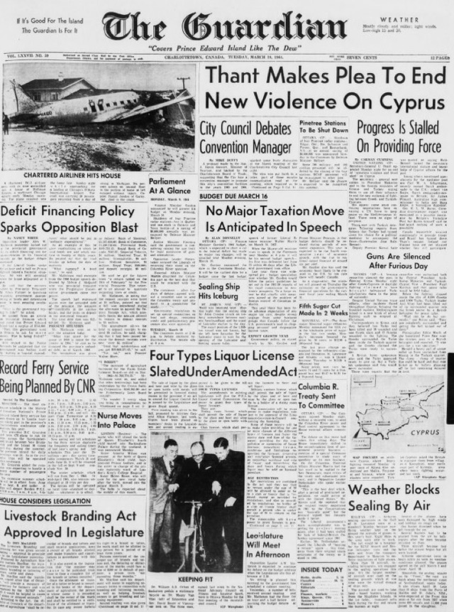
Philosophically I’m on a different page from where newspaper design is heading; I think the reaction to the web should be to go long and go deep and go grey and go big. In that I am, alas, perhaps alone. But man was 1964 ever a great year for newspaper design on Prince Edward Island:

 I am
I am
Comments
Looking at their website
Looking at their website earlier today I thought perhaps it was halloween again.
Add new comment