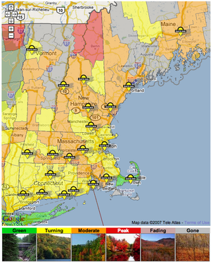
The project of the week has been the Interactive Foliage Map, the anchor of Yankee’s foliage website.
For the past three years this map has run as an old-school MapServer-based application. It worked well for the time, but in the age of slippy-slidy interactive maps, it was showing its age.
The challenge was to somehow leverage our existing foliage infrastructure (yes, we have foliage infrastructure) that is based on collecting foliage reports on a county-by-county basis across New England as the basis for generating a colour-coded map.
The week started with some experimenting with generating county polygons, an effort aided greatly by this helpful PHP script that converts census county boundary files into sets of Google-friendly vertices.
This was all very promising on a single-county basis. But when scaled up to a New England-wide level — 247 counties with about 300,000 vertices — it all went to hell. That’s a lot of heavy lifting for JavaScript to do; too much, in fact, as interacting with the map, even on a peppy laptop with a powerful processor, was a slow as molasses.
I thought about doing some work to come up with a simplified set of county polygons, but decided to look elsewhere before launching into that.
Fortunately at this point I came across this very helpful resource from the Commonwealth of Massachusetts, a bit of well-documented JavaScript that lets layers from a Web Map Service (WMS) be overlaid on Google Maps.
A quick re-compile of our MapServer install to turn it into a WMS server and I was in business. It took me a little while to grok WMS, but once I did, I had foliage on my map in about an hour.
The idea here, in essence, is that the WMS server becomes an additional “tile making engine” for the Google Map, generating graphic images of the same sort that Google itself generates for the map and satellite layers. Because the hard work is being done server-side, and is bolstered by Google’s pre-fetching algorithms (that fetch neighbouring map tiles before you need them), it all appears quite magical when it’s working.
Once the magic was in place, the map got wrapped in some of the JavaScript and AJAX goodness that drives the Best Western map on Yankee’s main site (the magic there is clustering the Best Western markers differently at each zoom level so that two hotels never overlap each other).
Moving forward, the ability to drop any WMS layer on a custom Google Map — just look at the variety of WMS layers from Natural Resources Canada, for example — opens up a lot of interesting doors for cool map mashups.
The Interactive Foliage Map is a beta testing right now, and is scheduled to go live next week; you’re welcome to take it for a ride.
 I am
I am
Comments
Great job! Thats a
Great job! Thats a wonderfully smooth process and the visual display with the overlay is just right. To kick in two cents, I found that at 1024x768, the legend is off the bottom of the screen and I would have grasped the chart instantly with the colour legend blocks at the top (or even the side) rather than the bottom of the map. Just my simple take. Thanks for sharing.
Add new comment