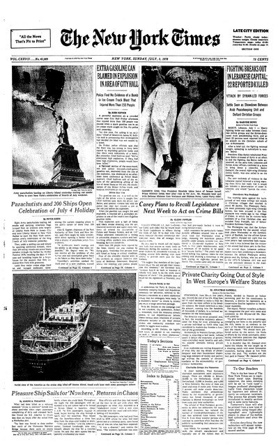
Here is the front page of the New York Times from July 2, 1978, an auspicious day for the paper as it was the last day that the paper was composed from hot metal type using Linotype and Ludlow machines:

The story of that final day is well-told in the film Farewell – ETAOIN SHRDLU, which has been digitized by PrintingFilms.com and made available online.
The last act of the film, started at about 22:36 cover the mechanics of the post-hot-metal newspaper page composition process – a trade that I apprenticed in 1990 – using the paper of March 2, 1980 as an example.
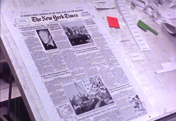
Here’s a still from the film showing that edition’s front page on the paste up board:

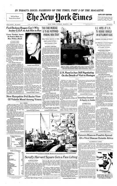
And here’s that same page, as it’s available today on the New York Times website:

The phototypesetting process that the Times graduated to in 1978 is a process I once knew backward and forward: from 1991 to 1993 it was the trade I learned at the Peterborough Examiner.
What you see the printers in the film doing – keyboarding text, operating a phototypesetting machine, trimming the developed result, waxing and pasting up, with an editor at the shoulder – was the stuff of my everyday life for almost two years (an abbreviated apprenticeship, given historical practice, as I came to the position with some digital and keyboarding skills).
What’s interesting, looking back 37 years after the moved from hot type to cold, is that the reaction of the hardened old printers in the film to the transition is much the same reaction I had when, only a few months after I left my paper, there was a transition from phototypesetting and paste-up to completely digital pagination.
While this could be chalked up simply to nostalgia, I think there’s something to be said for the old ways: the interplay between page editor and printer that you see in the film a 9:40 is a relationship I know very well, and the film does a good job at describing and demonstrating how symbiotic a partnership it was:
The closest cooperation is needed, between the page editor and the makeup; together, they almost talk the type into the page form, coax it, cajole it, make it fit, as they work against the clock.
With the transition from hot type to cold type to digital, that “closest cooperation” has been diminished and then diminished again. It’s still there in some form, but the physical aspect of it – coax it, cajole it, make it fit – is gone now, and with it the “talking the type,” the patter between printer and editor that went with it. I’ve always held that those conversations were the heart of the newspaper.
Which is why I shed a tear or two watching Farewell ETAOIN SHRDLU: it’s a look at the wake for both a technology and an approach to newspapering, neither of which will ever return.
 I am
I am
Comments
Is there any way I could
Is there any way I could purchase a copy of the last New York Times July 2 , 1978 printed with the linotype. My son was so fascinated with the film. I would like to frame it for him as a gift. I hope you reply! Thank You!
While the machines primarily…
While the machines primarily and predominantly used may have been Linotype, many of the fonts came from a rival company, Intertype. The headline type in that final "hot metal" issue were, in order:
- ('A' headline styles, on columns 3 and 6): 30 point Latin Extra Condensed No. 2 (a spacier version of Latin Extra Condensed [which had been used by The Times from May 13, 1921 to Sept. 6, 1976]; this variant was first introduced the day The Times went from eight columns to six on Sept. 7, 1976) and 14 point News Gothic Condensed (also introduced that day)
- 24 point Cheltenham Bold Italic (called "Cheltonian" by Intertype)
- 24 point Bookman Italic (only available in that size from Intertype, which called that font "Bookface")
- 24 point Antique No. 1 (available from both Linotype and Intertype, that font has often been confused with Bookman, and indeed The Times itself, in its last years of using computer type versions of these old typefaces up to October 2003 when all their headline styles were Cheltenhamized, referred to it as Bookman Antique; 12 and 8 point sizes were also used in the "To Our Readers" notice about this being the last issue set in hot metal type)
The text body type was 8.5 point Imperial with Italic and Bold, used by The Times since July 3, 1967 (and the 7 point size in their TV and radio listings section since July 2 of that year - 11 years before this issue).
Add new comment