
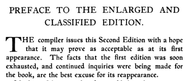
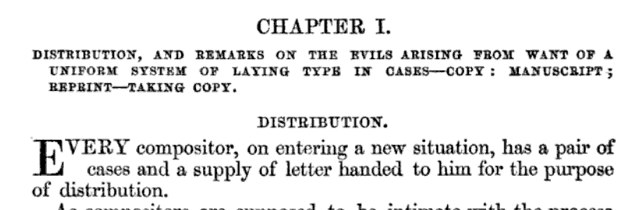
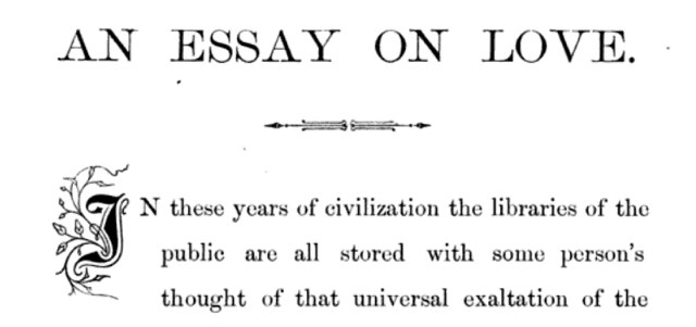
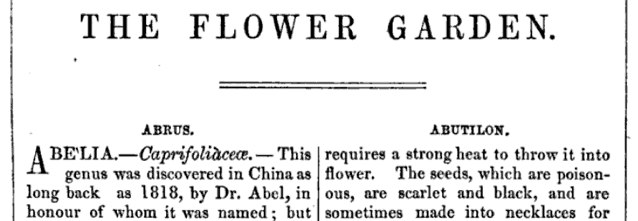
Google Books is a treasure-trove of books from the 19th century, and thus a good place to turn if you are, as I, setting metal type and trying to get a feel for spacing drop caps. Here are some examples I’ve found tonight showing some interesting variations.
Common to these is that (1) the second line is indented slighly, (2) the first word of the paragraph beyond the drop cap is set in small caps (or simply all in caps), (3) the drop cap itself has its cap height aligned with the cap height of the remainder of the first word and (4) there isn’t much regard for where the baseline of the drop cap falls:


The Ladies’ Companion to the Flower-garden
About This Blog
 I am Peter Rukavina and this is my blog. I am a writer, letterpress printer, and a curious person.
To learn more about me, read my /now, look at my bio, listen to audio I’ve posted, read presentations and speeches I’ve written, or get in touch (peter@rukavina.net is the quickest way).
I have been writing here since May 1999: you can explore the 25+ years of blog posts in the archive.
You can subscribe to an RSS feed of posts, an RSS feed of comments, or a podcast RSS feed that just contains audio posts. You can also receive a daily digests of posts by email.
Add new comment