
Tonight I went up to the attic and dug out the large Rubbermaid container that holds my “design archive” — the collected output of 8 years of an off-and-on career as a freelance graphic designer that ended with our move to Prince Edward Island in 1993. I’m going to scan some of the items from the Rubbermaid, and splash them here, if only so that if I lose the container, I’ll have some record.
I should preface the series with an admission of fraud: I am not, nor was I ever, really a graphic designer. I mean in the sense that (a) I received any training in the art, (b) accepted any feedback about what I did, or (c) can actually do anything other than sometimes clever manipulation of type.
On a lark I once took the Rubbermaid into the Ontario College of Art “portfolio day” where you could have your work critiqued in anticipation of applying to art college somewhere. The very kind adjudicator praised me for my “typographical sense,” but was left silent when I admitted that that’s all there was. I couldn’t draw a cat, or a horse. And moving outside of the safe confines of black and white wasn’t something I was comfortable with.
So maybe I was a “dual color type manipulator for hire” rather than a graphic designer.
In any case, here’s what I manipulated…
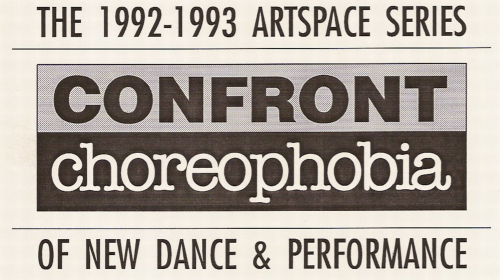
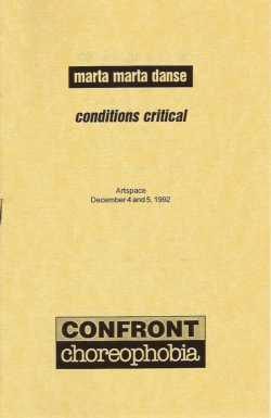
This was a logo for the 1992 season of what later became Peterborough New Dance. I came up both with the design and with the “confront choreophobia” tagline itself, which I remain quite fond of for its double and triple entendres. Here’s an example of how it was used in a 1992 program for marta marta danse:
About This Blog
 I am Peter Rukavina and this is my blog. I am a writer, letterpress printer, and a curious person.
To learn more about me, read my /now, look at my bio, listen to audio I’ve posted, read presentations and speeches I’ve written, see things I’ve favourited elsewhere, or get in touch (peter@rukavina.net is the quickest way).
I have been writing here since May 1999: you can explore the 25+ years of blog posts in the archive.
![]() You can subscribe to an RSS feed of posts, an RSS feed of comments, an RSS feed of favourites elsewhere, or a podcast RSS feed that just contains audio posts. You can also receive a daily digests of posts by email. I also publish an OPML blogroll.
You can subscribe to an RSS feed of posts, an RSS feed of comments, an RSS feed of favourites elsewhere, or a podcast RSS feed that just contains audio posts. You can also receive a daily digests of posts by email. I also publish an OPML blogroll.
Instagram • YouTube • Vimeo • ORCID • OpenStreetMap • Internet Archive • PEI.art • Drupal • Github.
Add new comment