
GO Transit, which runs trains and buses in Southern Ontario, was the public transportation backbone of my childhood. It was born shortly after I was, in the mid-1960s, and its footprint and the footprints of my youth expanded in lock step.
I used to take the GO Bus from Murray’s Variety in Aldershot into Hamilton every Saturday morning when I was a teenager, to go to the YMCA.
When my family would go to the Canadian National Exhibition in Toronto, we’d take the GO Train and get off at the “Exhibition” stop.
Later, I commuted to work every day, as an 18 year old, from the Fairview station in Burlington to Union Station in Toronto and then took the subway up to the Royal Ontario Museum.
And, now that my parents have moved back to Burlington, I can take the UP Express from Pearson Airport to Union Station, transfer to the GO Train and walk 10 minutes from the same Fairview station to their house.
In other words, when I think about “commuting by public transit,” it’s GO Transit that’s the template in my mind.
Which is all to say: what’s up with the green!?
The colour that means “GO” to me is Pantone 354C, a colour described as “a meadow hue that perfectly matches that of Ontario’s highway signs”:

In 2013, GO recoloured itself in two-tone green, using Pantone 364C and Pantone 376C


While I’m never one to argue that brands should never change, what appears to have been missed in this switch is that the new colour scheme and the old colour scheme clash dreadfully.
Because the GO network includes hundreds of buses and trains and signs and stations, the switch is still in progress 4 years later (colours are updated in “ongoing refurbishing”).
This means that you regularly see clashing coaches like this on GO Train platforms:
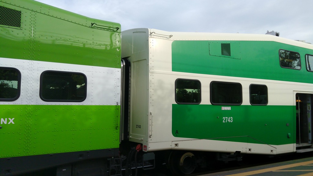
Design needs to consider both the old, the new, and the delta, and this is clearly a case where the assumption was that we’d all just avert our eyes and live with the clash during the delta.
It’s a shame: with a little more savvy the delta could have been seamless.
About This Blog
 I am Peter Rukavina and this is my blog. I am a writer, letterpress printer, and a curious person.
To learn more about me, read my /now, look at my bio, listen to audio I’ve posted, read presentations and speeches I’ve written, see things I’ve favourited elsewhere, or get in touch (peter@rukavina.net is the quickest way).
I have been writing here since May 1999: you can explore the 25+ years of blog posts in the archive.
![]() You can subscribe to an RSS feed of posts, an RSS feed of comments, an RSS feed of favourites elsewhere, or a podcast RSS feed that just contains audio posts. You can also receive a daily digests of posts by email. I also publish an OPML blogroll.
You can subscribe to an RSS feed of posts, an RSS feed of comments, an RSS feed of favourites elsewhere, or a podcast RSS feed that just contains audio posts. You can also receive a daily digests of posts by email. I also publish an OPML blogroll.
Instagram • YouTube • Vimeo • ORCID • OpenStreetMap • Internet Archive • PEI.art • Drupal • Github.
Add new comment