I’ve been thinking of developing a side business card-printing service that would be highly constrained: one typeface, one ink colour, one name, one paper. My working assumption is that, in a world of business cards jam-packed with logos and telephone numbers and Instagram handles, there’s a market for something that goes in the opposite direction.
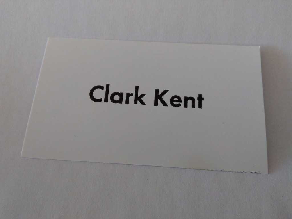
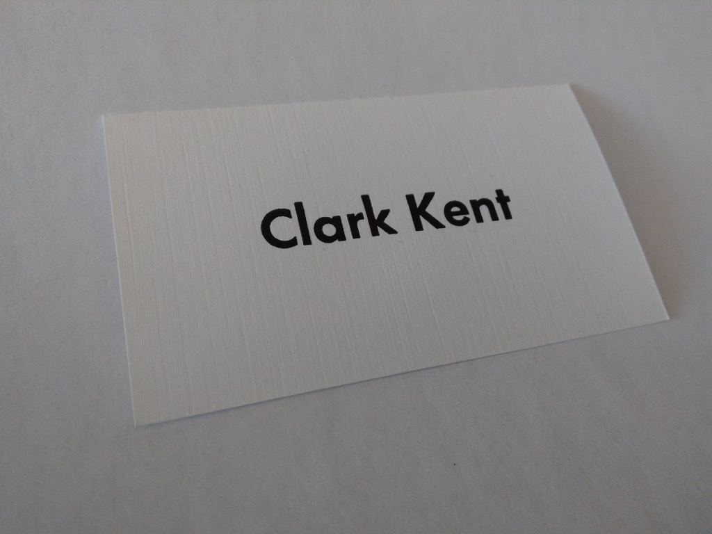
By way of prototyping the idea, I printed up some Clark Kent cards in 30 point Futura Bold (purchased two years ago from Letterpress Things). in black ink, on two different types of paper, both of which I inherited from Campbell’s Printing when I bought their Golding Jobber № 8.
The first run was on a glossy card stock; the type bites slightly into the paper and there’s a pleasant shimmer to the ink:

The second run was on textured card stock; the effect is more muted, but it’s pleasant to hold in the hand and feels like it will live up to more wear and tear than the glossy stock:

I could use some more prototyping work on this project, so if you’d like me to give a go at your name, please let me know and, as capacity and time allows, I’ll see what I can do, no charge.
 I am
I am
Comments
Clark Kent Works at The Daily
Clark Kent Works at The Daily Planet.
If you want to practice on a
If you want to practice on a long name with a hyphen, I volunteer mine!
Add new comment