
Several weeks ago my friend Elmine wrote about a notepad emblazoned with Brilliant Ideas, in part:
None of the ideas I wrote down were brilliant. That’s because the branding of this note pad is totally wrong. Ideas are never brilliant. It’s a thing I have to keep reminding myself of every single working day. The brilliance is in the execution.
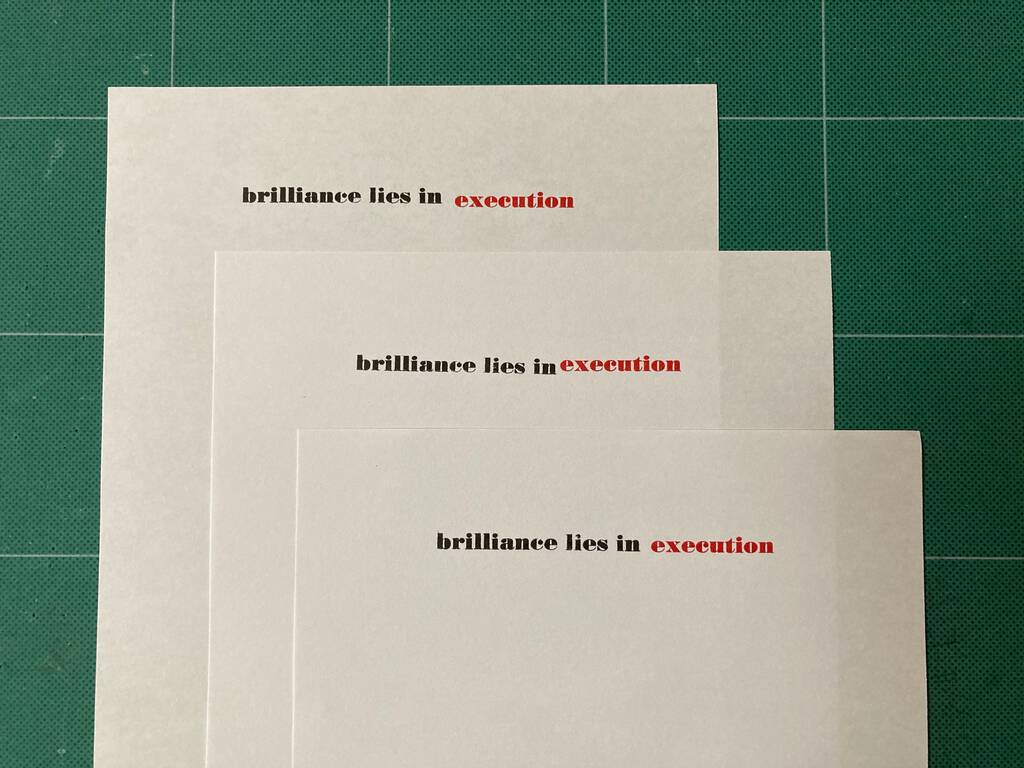
I was struck by how right she was, and decided to commemorate this in letterpress, creating a “brilliance lies in execution” notepad for Elmine.
The best-laid plans of mice and men often go awry, and my audacious decision to make this a two-colour job failed, with the colour registration all over the place, due a combination of floppy paper, high humidity, and my own inexperience:
After trying my best at this, I realized it was never going to work, and was left with a stack of notepad paper with only the black “brilliance lies in” imprinted.
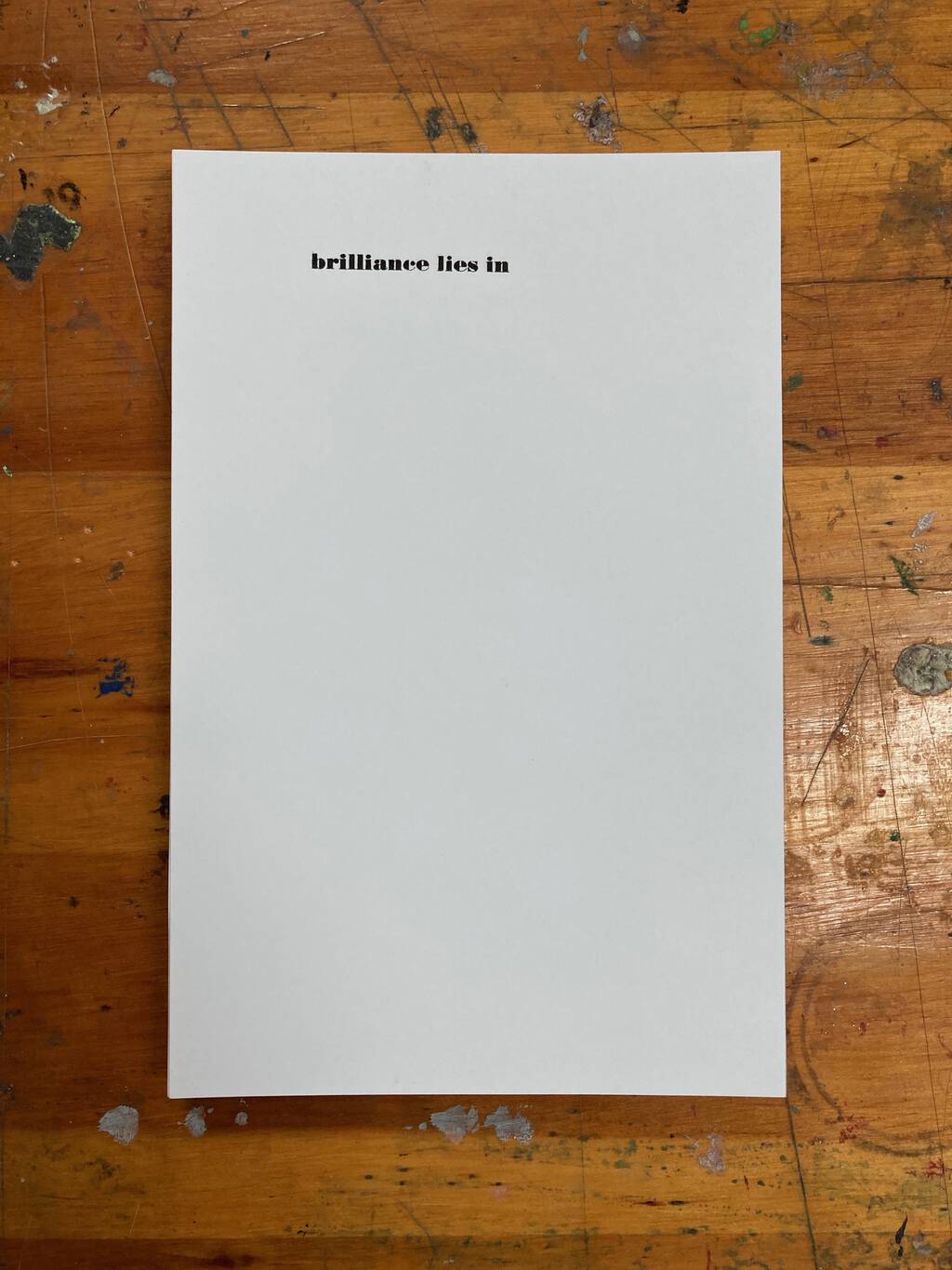
And so I sent that to Elmine, reasoning, after the fact, it was far more appropriate to allow her to fill her own answer to that prompt, on a case by case basis.
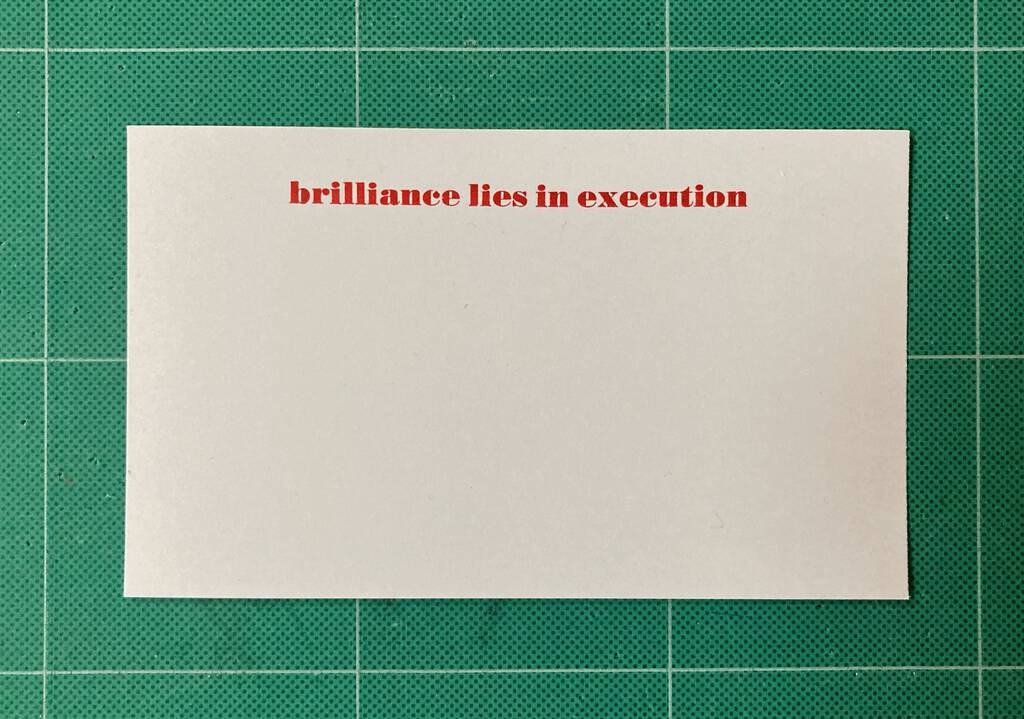
With the type still at the ready, and red ink still on the press, I opted to execute, so to speak, with some lovely Clairefontaine Exacompta index cards (available at The Bookmark), all in red:
Perhaps brilliance lies in both execution and adaptability?
About This Blog
 I am Peter Rukavina and this is my blog. I am a writer, letterpress printer, and a curious person.
To learn more about me, read my /now, look at my bio, listen to audio I’ve posted, read presentations and speeches I’ve written, see things I’ve favourited elsewhere, or get in touch (peter@rukavina.net is the quickest way).
I have been writing here since May 1999: you can explore the 25+ years of blog posts in the archive.
![]() You can subscribe to an RSS feed of posts, an RSS feed of comments, an RSS feed of favourites elsewhere, or a podcast RSS feed that just contains audio posts. You can also receive a daily digests of posts by email. I also publish an OPML blogroll.
You can subscribe to an RSS feed of posts, an RSS feed of comments, an RSS feed of favourites elsewhere, or a podcast RSS feed that just contains audio posts. You can also receive a daily digests of posts by email. I also publish an OPML blogroll.
Instagram • YouTube • Vimeo • ORCID • OpenStreetMap • Internet Archive • PEI.art • Drupal • Github.
Comments
Actually I think that having
Actually I think that having the two color, with the "execution" slightly off, proves the point really well.
Add new comment