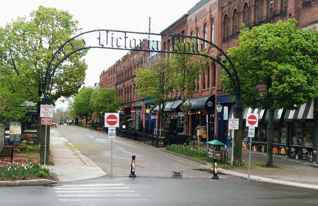
Remember the entrance to Victoria Row last year, with its crazy oversignage that looked like this:

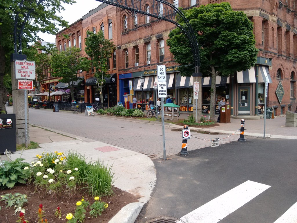
Well, the City of Charlottetown has kicked the crazy up a notch this year, adding even more unwelcoming signage:

If the trend continues, next year we’ll see flashing electronic “YOU ARE NOT WANTED HERE” signs.
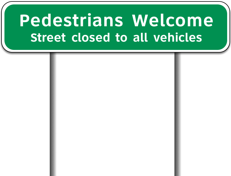
As last year, I humbly offer an alternative:

 I am
I am
Comments
What explanation might there
What explanation might there be for the increasing number of signs ? Did cars attempt to enter the street? Is it an example of saying something louder when people don't get your message?
I think the root of the issue
I think the root of the issue is that this is being conducted in a design vacuum. The size of the city government means that there’s no design capacity internally, so decisions about signage like this aren’t made under any sort of design oversight, but rather on the spur of the moment and reaction solely to workaday and political concerns.
Exploring pedestrian tourists
Exploring pedestrian tourists are likely to walk by when confronted with the unwelcoming "Road Closed" sign at the center and two "Do Not Enter" signs on either side of Victoria Row. Would anyone visiting a new city feel comfortable wandering up a street with those signs in place? Downtown Water Street, with its eclectic local shops, restaurants, and open patio, appears to have become the open and friendly place to be for Charlottetown residents and tourists alike.
Add new comment