
Corner of Kent and Queen.
Waiting for the “Don’t Walk” to turn to “Walk.”
An older woman comes up to me: “You wouldn’t have a loonie, would you?”
I reach into my pocket: I do. I hand her the loonie.
She says “Thanks” and walks on.
From an essay by Arjen Oosterman in issue #22 of Volume magazine:
Although tourism isn’t the subject of this issue, the impact it has on everyone’s image and understanding of the city is. This promotional and commercial image of the city, this image for an external world, tends to become a self-image – internalized, one could say. And it is the implied simplification that is most disadvantageous, not so say dangerous. Promotional image becomes ideal, ideal becomes program. A city cannot afford to reduce its complexity to a tagline.
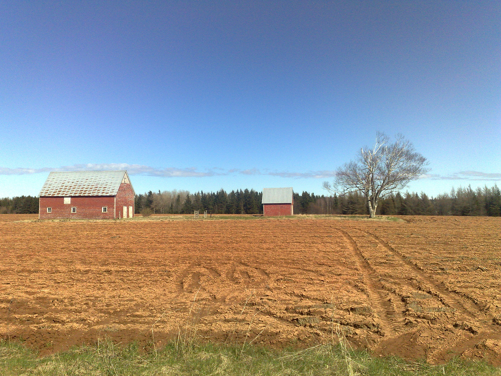
See also Walk & Sea Charlottetown.
Proof not only that my parents read my blog, but that they are the greatest parents ever, here’s the belated birthday gift I received today:

In the years I’ve been playing with concepts for presenting Charlottetown public transit schedule information (map, mobile, printable, poster, phone), I’ve often wished for a way of presenting schedule information that breaks out of the columnar or tabular “here’s the times it leaves” format.
Recently I’ve been experimenting with a round bus schedule, with hopes that it ups the “at a glance” quotient. There are some significant challenges to such a design, the big one being that there are only 12 hours on a clock face and the transit system day runs for longer that 12 hours.
Here’s an early draft of what I’m thinking about. It captures on a portion of the University Avenue line, showing departure times from Confederation Centre from the first run at 6:45 a.m. and moving around until the 6:10 p.m. run, thus leaving off the last five runs of the day.
It’s by no means perfected – the tick marks on the clock face are too prominent, and I’m not sure I’ve effectively communicated the AM/PM combination (or maybe I’ve communicated it too much?). But I do like its “at a glanceness.”
I welcome suggestions for tweaks, or for completely different takes on the same design challenge.
My trip to the USA earlier this month was my first trip after switching from pre-paid “Pay As You Go” service from Rogers Wireless to a regular monthly account. And where on previous trips I’d avoided using my mobile altogether, on this trip I decided to experiment and see what additional roaming charges I’d incur if I went about something approximately regular usage.
And so while I didn’t spend hours on the phone calling home, I was fairly liberal with calling friends and colleagues in the US, sending text messages, and making occasional use of data (mostly for local search and maps in Brooklyn).
Over the course of 6 days traveling, I incurred $37.52 in extra charges on top of my regular $50/month bill, as follows:
- $2.13 for adding “Call Display” to my account (pro-rated portion of the $8/month fee for this service), added so that I could see who was calling me while traveling and decide whether or not to answer the call.
- $13.32 for 9 minutes of voice calling (a rate of about $1.50/minute).
- $9.17 for using 1523KB of data.
- $4.50 for sending 6 text messages within the US.
- $1.00 for sending 2 text messages from Canada to the US.
- $4.10 for sending 14 text messages within Canada.
- $3.30 for receiving 22 text messages while in the US.
I’m not complaining about the charges – I could have mitigated some of them by pre-paying some minutes in a “roaming pack” if I’d wanted – but what irks me is that there was no way for me to monitor my roaming charges while I was on the road.
Rogers only adds these up, customer service tells me, at the “end of the billing cycle,” so I had to have faith that I wasn’t accidentally racking up hundreds of dollars worth of roaming fees; it was only a call to Rogers’ customer service that produced information about the breakdown of the charges.
Although the detailed analysis of New York neighbourhoods was mostly lost on me – I stopped reading once I came across sentences like “the average two-bedroom rental is $2,275,” something that, from here in Prince Edward Island, seems like science fiction – I quite enjoyed the introduction to New York magazine’s The Best Places to Live in NYC issue (emphasis mine):
Neighborhoods are like geologic formations, carved out by a million insignificant decisions, a million vague sensations that I’m comfortable here. They are constantly in flux, shaped by currents of migration, prosperity, and decline, by a developer’s ambition, and by the random flutterings of fashion. That’s true now, as areas that were once grim and bedraggled get refurbished. It was true a century ago, when the subway bound the farthest reaches of Brooklyn to Manhattan’s breast. And it was true when the city was hardly more than a rustic Dutch hamlet.
I like the way that paragraph captures the true nature of neighbourhoods, how they are a product of a chaotic swirl of individual actions and impressions rather than a product of deliberate planning. Planning can nudge and help to shape, but ultimately it’s a small part of how neighbourhoods come to be, and how they feel.
I went up to Canadian Tire this morning and used a backlog of Canadian Tire money to assemble a set of tools along with things like rags and penetrating oil, to help me nurse the Adana Eight Five back to life. I got things unstuck enough to actually move the works:
I’d appreciate any advice anyone has to offer on the best way to degunkify the parts of the press that are caked with a combination of dried ink, grease and dirt. The ink disc is particularly covered in crud and I don’t want to ruin it by going at it with someone too abrasive.
A week after my letterpress workshop in New York, I’ve managed to acquire the lend of a press to get me started on my own letterpress adventures. I put the call out for help only four days ago, and the Island, incredibly interconnected as it is, responded in spades: I’ve got two offers of metal type, pointers to a couple of small presses, and offers of tours of a few printing shops both here and away.
Best of all, though, was the kind lend of an Adana Eight Five, pictured below, from my friend Joan, who salvaged it from the old Prince County Hospital before it was torn down. Along with the press there’s a good collection of type and accessories, and the press itself seems to be in fairly good shape (although it could use some new rollers, which are still available from several sources).
The last job, evident from the ink on the tympan, was an appointment card for a Summerside doctor. Seems that the last time it might have been used was in the mid-1990s (if you know more about the press, please get in touch; would be nice to know its backstory).
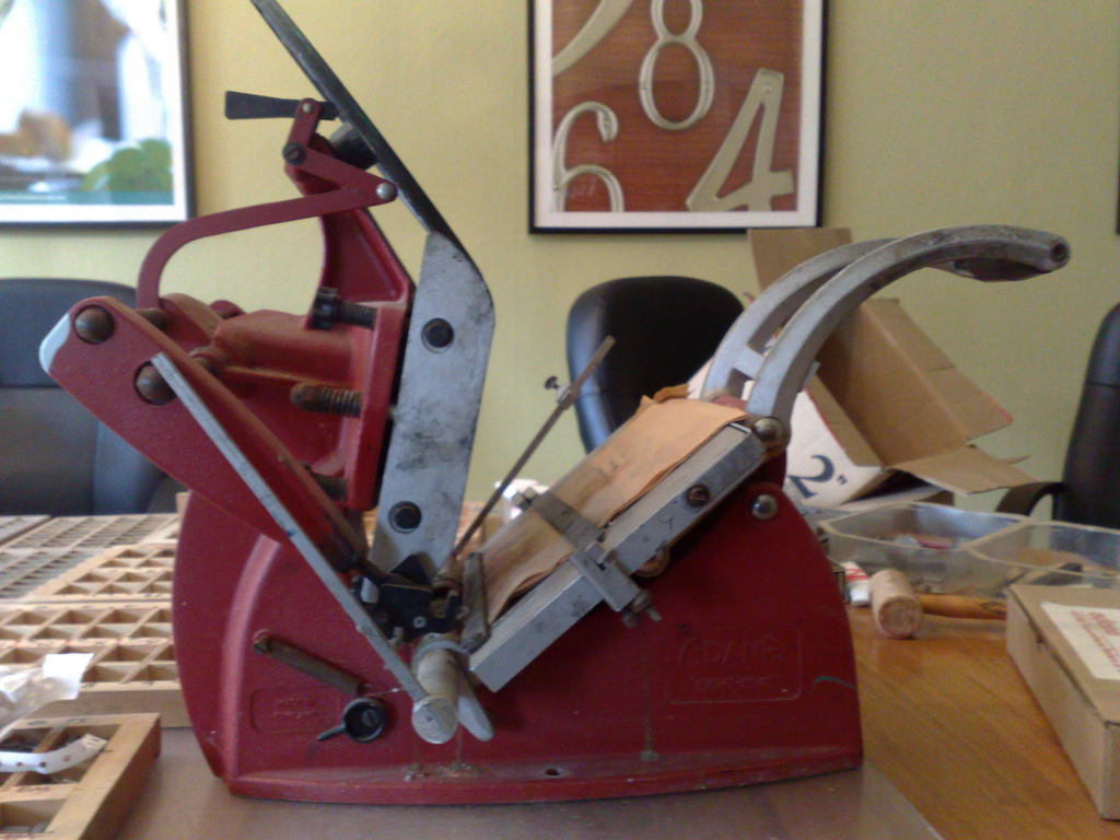
Next steps: get the press cleaned up and oiled, make sure all the parts are present, find the right sized key to operate the quoins, and set some type. Stay tuned.
This cheque for $56.00 arrived in the mail yesterday. As this is the season we tend to get bills for things like house insurance, I put off opening it for a while. Imagine my surprise when it was a cheque from our insurance company to us, not a bill!
“As a Mutual, when the company succeeds we all benefit. This past year was very profitable. This Special Mutual Rebate is your share of our excess profits. Enjoy!”
If you’re in the market for house insurance on Prince Edward Island, you can get the same service by switching to PEI Mutual Insurance.
About This Blog
 I am Peter Rukavina and this is my blog. I am a writer, letterpress printer, and a curious person.
To learn more about me, read my /now, look at my bio, listen to audio I’ve posted, read presentations and speeches I’ve written, or get in touch (peter@rukavina.net is the quickest way).
I have been writing here since May 1999: you can explore the 25+ years of blog posts in the archive.
You can subscribe to an RSS feed of posts, an RSS feed of comments, or a podcast RSS feed that just contains audio posts. You can also receive a daily digests of posts by email.