Spoon River Anthology

We’ve been taking Laurie Murphy’s “Improv Performance Fundamentals” classes this fall, and the semester culminated on Monday night with a showcase for friends and family at The Haviland Club. My brother Mike recorded this short snippet of my part in Spoon River Anthology, which started off our performance.

My character was Gertie Masterson, a miner with a very low, gravely voice, a voice in which he vested his masculinity. At this part in the scene, however, he was under the influence of helium, provided at his wedding (in the mine) by another character (a true case of “you had to be there”). It was great fun.

What is grief?

I met Ann Faison earlier this fall through Transforming Family, where I facilitate a monthly peer support group for parents of autistic trans and non-binary children.

Ann hosts a podcast, Are we there yet?, where she explores adolescent grief, and she invited me to be a guest. The episode we recorded, which she aptly titled What is grief?, came out on Friday and you can find it here (Spotify, Apple Podcasts).

Here’s how Ann summarized the interview:

When I started to interview Peter Rukavina for this episode, I had no idea we were going to be exploring such overarching questions about grief. The story of raising his daughter Olivia after her mother died is extraordinary because of Olivia’s intersectionality. Olivia is autistic and came out as trans in the wake of her mother’s death, so her experience of grief, and Peter’s, were multi-layered and complicated in ways I had never considered previously. Listening to Peter talk about raising Olivia throughout the many years of his wife’s illness, I was struck by his clarity and even-handed thinking around grief. He is careful not to make assumptions about Olivia’s emotional life and is mindful of the opportunities as well as the challenges that loss and grief have afforded him.

Ann was a kind and patient interviewer, and I learned a lot from the experience. 

The one where I am unable to withstand the flaky numeros…

I have long held that serif typefaces are the only true typefaces to properly read body text.

This comes as a result of fealty to the elegance of a good serif, attachment to some classic typefaces (Bodoni, University of California Old Style, Baskerville), but mostly from the kind of assholishness that comes from holding on to an irrational idea for too long (I got into an argument with someone about this years and years ago, and, the more I argued, the more I dug a deep hole for myself from which I could not escape).

Things came to a head this week: I published a post that contained an inordinate number of numero signs. In the typeface that had long been used here for body text, Vollkorn, these rendered inelegantly for reasons I never got to the bottom of.

Unable to withstand the flaky numeros any longer, I played with a few serif faces, all of which were wrong in some way (or simply less readable). Then I read of a new release of the sans serif Inter, and decided, on a lark, to try it out.

And I loved it.

So here it shall remain, in all its dreamy irrational lack of serif.

The Making of a Coffee Cup Print

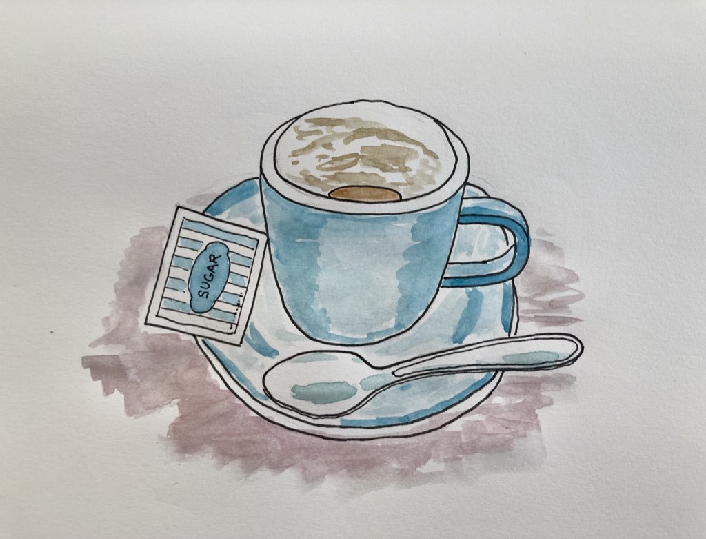
In August I made this watercolour sketch of a coffee cup at Receiver Coffee Brass Shop (it was a good cup of coffee!):

Watercolour sketch of a coffee cup on a saucer with a packet of sugar

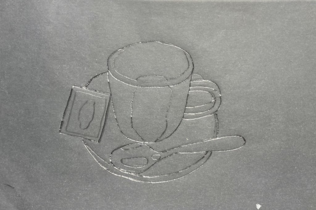
When we arrived at the relief printing workshop in Maria Doering’s studio a week ago, I pulled the sketch out of my notebook as a starting point for my first experiment with carving and printing.

To begin, I placed a piece of tracing paper over the sketch, and traced the cup, the saucer, the spoon, and the sugar packet:

Tracing paper sketch of the coffee cup.

Using carbon paper, I then transferred this trace onto a piece of Marmoleum (a 4”x6” piece of regular everyday linoleum floor tile), and started carving:

Marmoleum cut of coffee cup

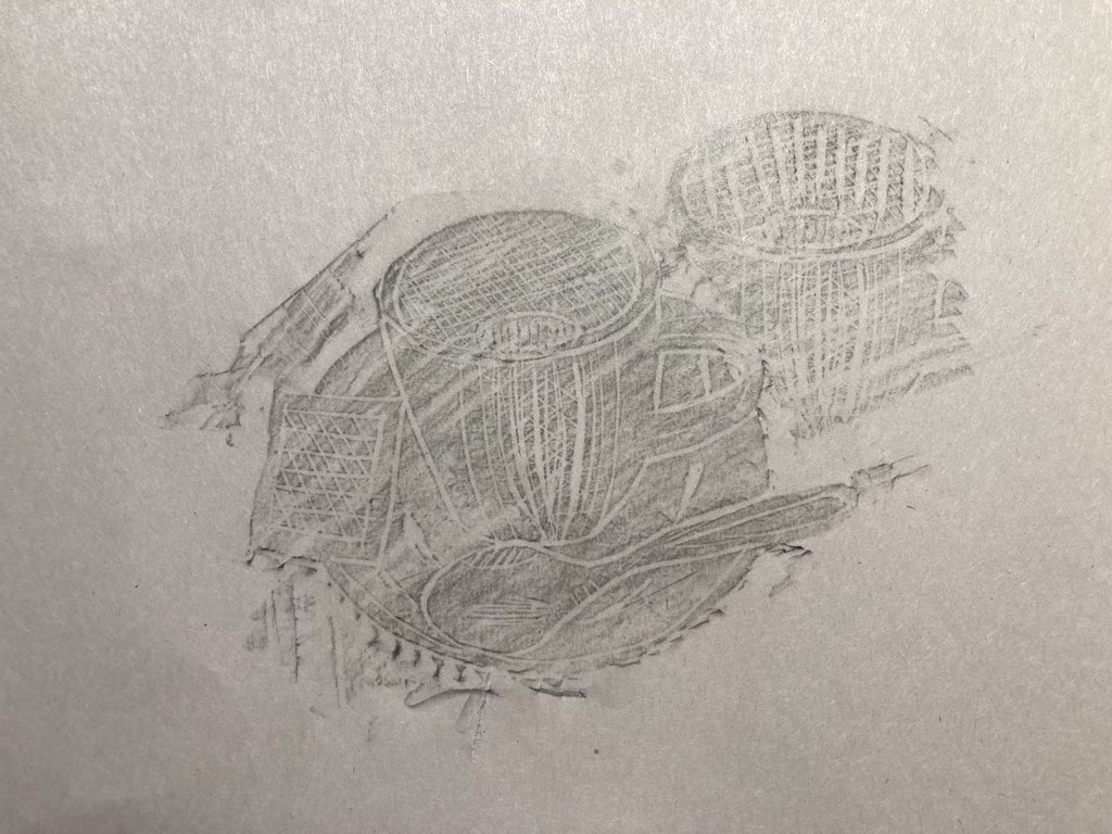
As I was carving, I’d occasionally take a pencil rubbing, using newsprint, to get a sense of my progress:

Pencil rubbing of the carved block.

Once I’d finished carving, I laid the finished block on Maria’s flatbed press, and pulled a proof on newsprint:

Proof of the coffee cup, on newsprint.

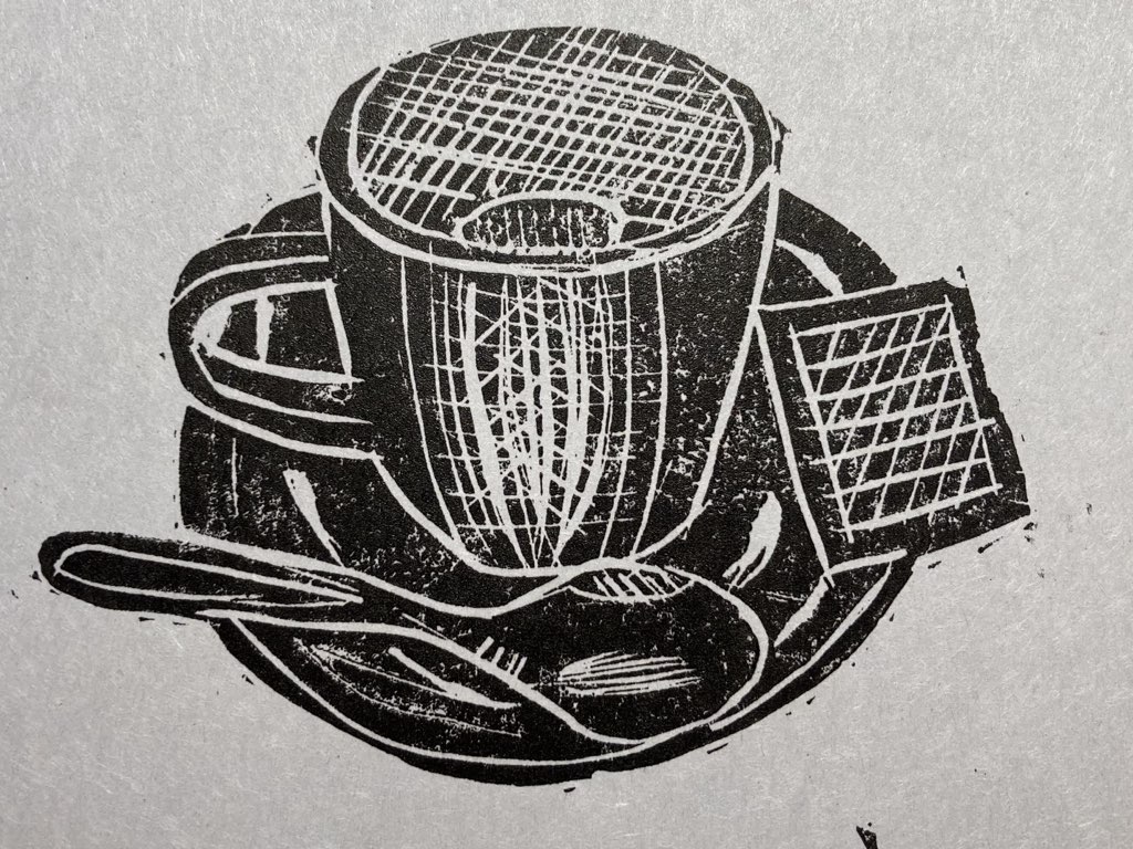
(You would think, after more than a decade of letterpress printing, I’d remember that relief printing always flips the image right-to-left!).

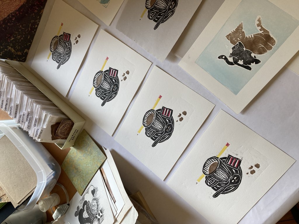
After some cleanup of the edges, I pulled four prints onto Fabriano paper:

Finished coffee cup print.

Four finished prints.

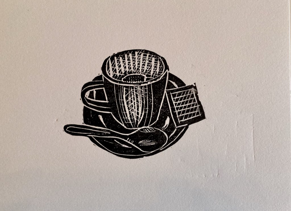
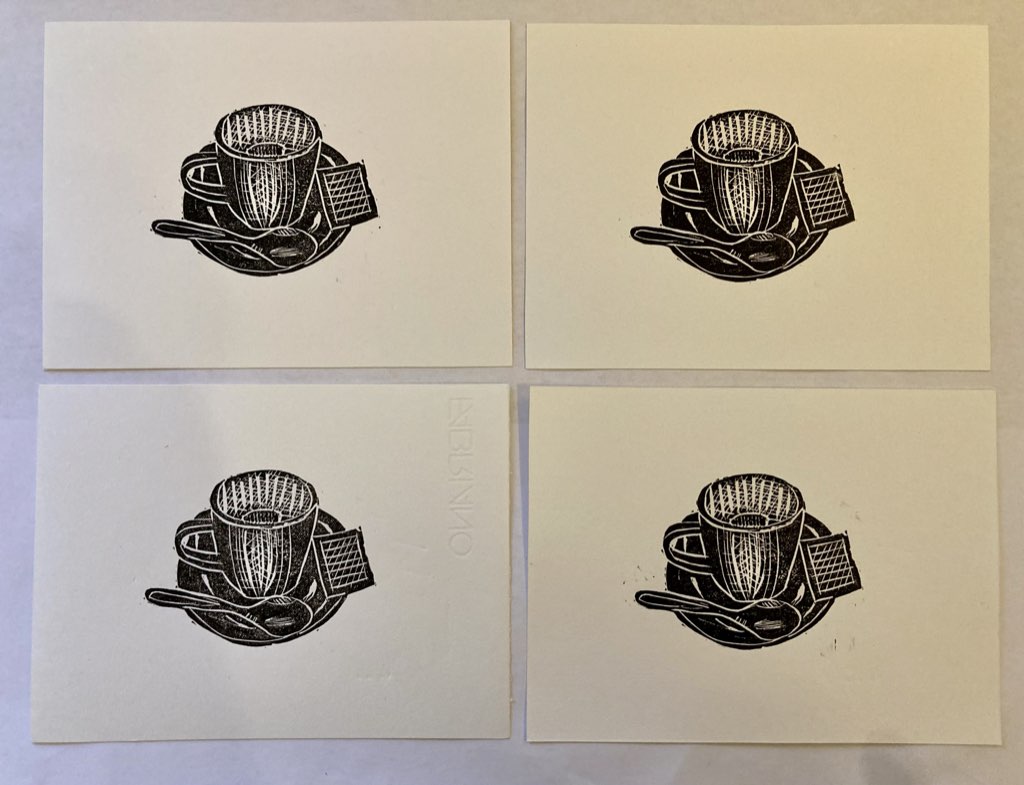
Along the way I learned a lot about inking, cleanup, pressure, registration, and working to avoid extraneous impressions on the paper (which you can see plenty of in the prints here).

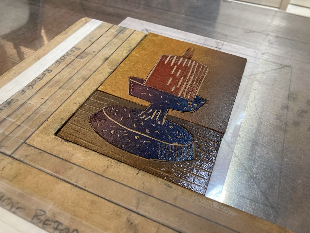
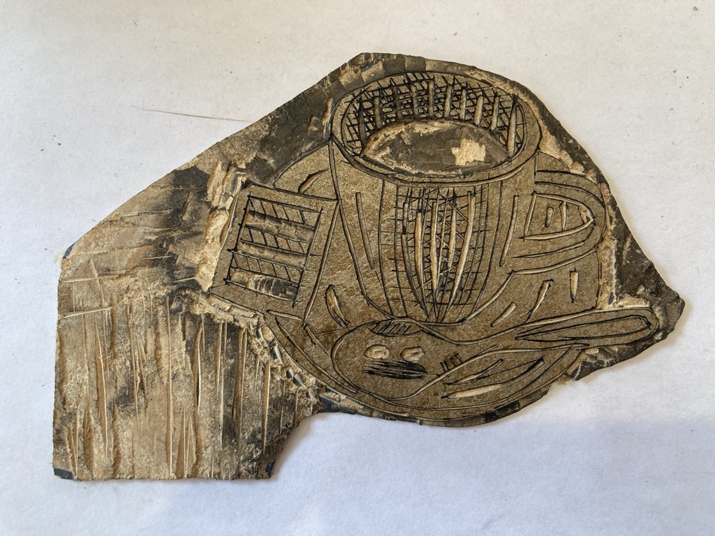
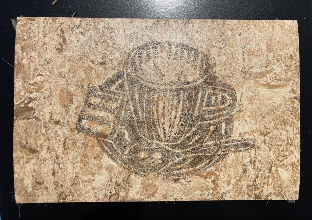
If you look carefully at the image of the carved block above, you’ll see that it actually has more carved from it than in the prints I made on Monday; that’s because on Thursday, the final day of the workshop, we focused on multi-block printing — combining more than one block, using different colours of ink, to produce a multi-colour image.

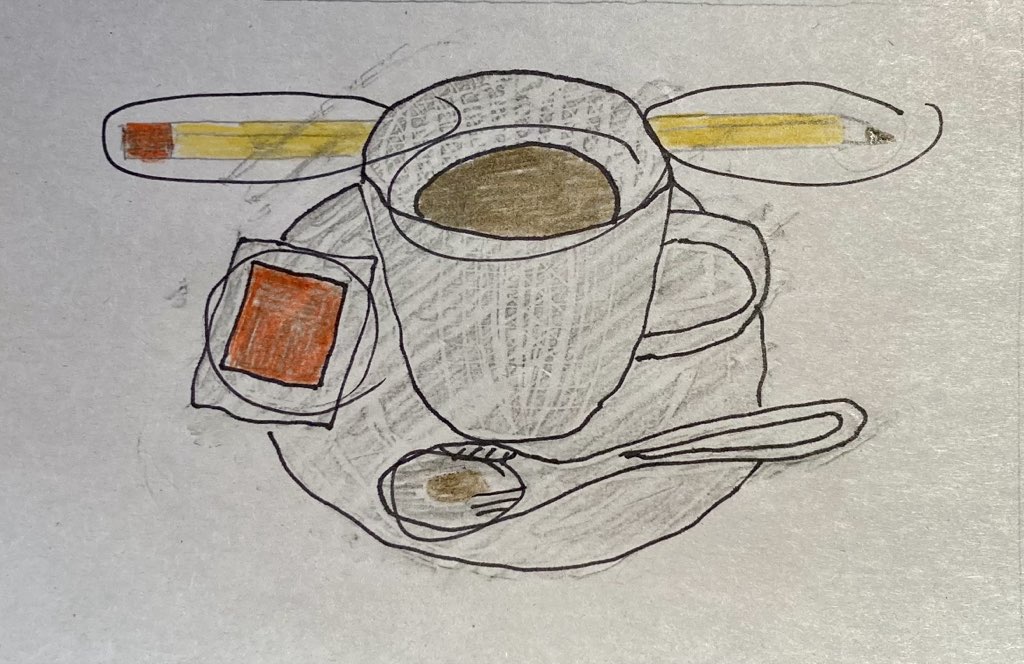
I decided to use the same coffee cup block as the starting point for the multi-block print, and to start I carved out some of the centre of the cup (to make room for coffee, to be printed in brown), and of the sugar packet (to be printed in red). I also planned to add a pencil in the background, and as a guide to all this I made a sketch:

The Plan for the multi-block print.

Once I’d finished upgrading the original block, I transferred that image to a second piece of Marmoleum by pulling a print onto newsprint, and then laying the inky newsprint on a fresh piece and running it through the press again, resulting in this:

Image transferred to the second block.

With this ghostly image of the original on the second block, I was ready to carve away everything that I didn’t want to print, which is to say, what was left would be only the areas I wanted to add to the black and white. It was a lot of carving, and when I was done the second block looked like this:

Second block, with ink, ready to print.

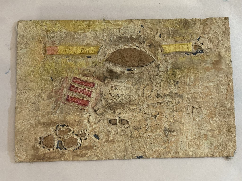
Notice that there are different colours of ink on this second block: red for the sugar and the eraser on the pencil, yellow for the pencil, brown for the coffee in the cup (and, as an additional flourish, some coffee on the spoon and spilled on the “table” beside). This was done by “spot inking” the block, using small precision ink rollers, something I had to do before each print pulled (along with all the “cleaning the ink I mistakenly rolled onto places there should be no ink”).

After printing four prints in black, I let these dry, and then printed the colour layer, to produce this:

The final multi-colour print.

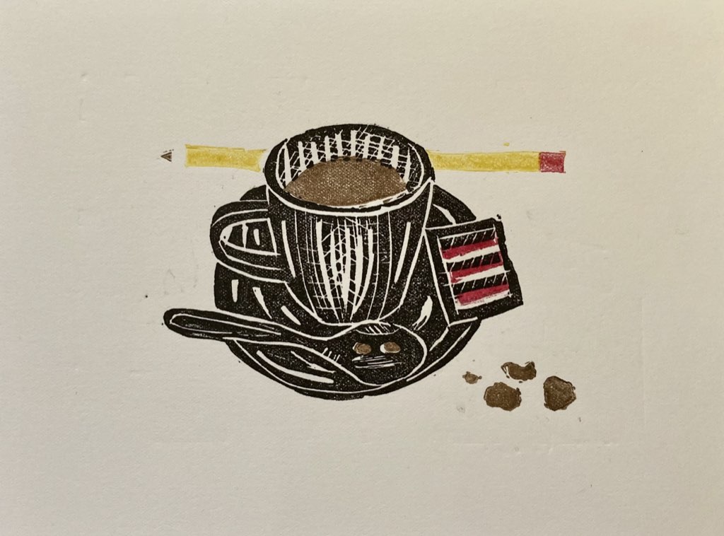
There’s all sorts of dissatisfying fiddly bits in that final result, due a combination of inaccurate registration, impressions of the non-printing parts of the block onto the paper, and a less-vibrant-then-desired pencil yellow, but, from several days on, and with fresher eyes, I’m proud of the result inasmuch as this was my first go.

Four copies of the final coffee cup print, set to dry.

Maria is a patient teacher, and her workshop, in her cozy home-based studio, was well-resourced, with a small group of 5 nascent relief printers gathered around her dining room table carving blocks together. 

The experience was a lovely gift from Lisa to me, an artistic portal through which to pass from wage-earning into sabbatical; that I got to carve and print along side her (and, for two of the days, with young L. joining us), and to see her own beautiful creations, and flowering creativity, made it all the better.

We’re clearing space in the letterpress shop for some continuing experiments in relief printing: we bought up a set of carving tools at Lee Valley, ordered a sample pack of Akua inks for delivery, and picked up a collection of lino blocks at Deserres before heading home.

Stay tuned for more!

Upgrading My Brain

I read Want To Upgrade Your Brain? Stop Doing These 7 Things Immediately

Item № 1 is Starting Your Day Too Slow, with a bulleted list of guidance:

Do you want to train your brain to be fast, in a flow state? Here’s how:

  • Wake up
  • Get out of bed
  • Make your bed
  • Get hydrated
  • Move on to your #1 task AS QUICKLY AS POSSIBLE

We woke up at 6:09 a.m. this morning after a better-than-normal sleep (№ 5, Failing to Rest, “If you want really, really good focus, and really, really good sleep…”). I was less groggy than normal, and mindful that, to succeed in life (I learned), I needed to not start my day too slowly.

Fortunately, Lisa got up to do yoga (№ 7, Not Engaging in Physical Activity, “You have to get your body running at a high level to support your brain…”), which removed my opportunity to remain in languid cuddle.

And so I woke up.

I got out of bed.

I made the bed (I did not make the bed).

I got hydrated.

(I set the coffee maker to run).

Have I moved on to my #1 task AS QUICKLY AS POSSIBLE?

When I say your #1 task, I mean important work that can change your life. Train your brain that you are capable of doing that task first. Because you are!

No, I have not. 

Or maybe I have. Writing is important. It does change my life. And I’m doing it before I’ve done anything other than wake up, get out of bed, not make the bed, get hydrated (and make the coffee).

I made the coffee with coffee from Costco. Because, as of Friday, I’m a Costco Gold Star member, a level of societal achievement I never ever thought I’d reach (yes, the Costco system has been relentlessly sending agents to convert me for years, but I’m speaking of a larger “oh, I have access to all the same tools and programs that normal people do” achievement). 

I was near a Costco because we decamped to Dartmouth for a week, to learn the basics of relief printing from Maria Doering. Which meant that, a week ago, I was doing things like this all day:

Linocut print of a candle, chopped into sections for jigsaw inking.

Lisa’s yoga is done. It’s 6:53. The coffee is ready. L. is being awoken above me. It’s time to make breakfast (from № 7, “Eat better nutrition. Put whole foods into your body. Get your nutrition dialed in.”).

The day is about to start. Or it already has.

Publish.

2018-2023 Electric Vehicle Statistics for Prince Edward Island

I requested an update from the Department of Transportation and Infrastructure, Highway Safety on the latest electric vehicle statistics for Prince Edward Island, and they kindly provided a breakdown for the last six years:

Vehicle Type 2018 2019 2020 2021 2022 2023
Battery Electric 20 41 76 198 525 751
Hybrid 564 643 642 923 1161 1566
Plug-in Hybrid 16 27 54 100 177 311
Total 600 711 772 1221 1863 2628
Total Vehicles 114,188 122,084 88,634 100,191 95,082 n/a
% Electric 0.52% 0.58% 0.87% 1.22% 1.96% n/a

While there has been growth over these years in the proportion of total vehicles registered that are electric or hybrid (when I bought my Kia Soul EV in 2019, it alone represented 2.4% of the electric vehicle fleet on PEI, it’s now only 0.13%), it’s still a relative pittance.

Prince Edward Island’s Net Zero Framework calls for “Transition to Zero-Emission Vehicles and other Non-emitting Fuel Sources” as a key lever in the path forward to net zero by 2040, with specific goals of  zero-emission vehicles accounting for 100% of light-duty dealership sales by 2035, and zero-emission vehicles accounting for greater than 60% of PEI’s registered passenger vehicles by 2040.

Pages