
As someone who used to make up the front page of a daily newspaper using bits of paper and wax, I take more than a usual interest in the design of newspaper front pages. And so it was interesting to see the redesigned Ottawa citizen today.
Here’s Saturday’s paper, with the old design, on the left, compared to today’s paper, with the new design, on the right:
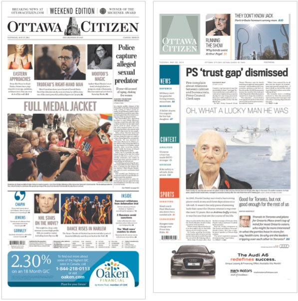
The new design certainly owes a lot to the USA Today redesign from 2012, albeit using squares rather than circles and a calmer colour palette. I was always a fan of the old flag – the “Ottawa” and “Citizen” separated by a rendering of the clock tower on Parliament Hill – but I admire the newly-conceived “works as an icon” version too. I’d love to get my hands on a paper copy; I’ll have to wait until it arrives at the public library later this week.

Comments